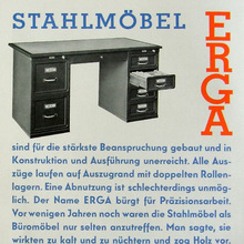
Stempel’s original spans 14 styles, incl. halbfett (bold, 1929),
zart (light, 1930), mager (regular) and licht
(open, 1931), schmalfett (bold condensed, 1932), fett (heavy,
1933), two italic weights (1935/36), the condensed
Memphis-Universal (three weights, first two in 1938)
and Memphis-Luna
(shadow-only, 1937). Memphis-Buchschrift
(two weights, 1932) is a version
optimized for text sizes. Sold by Continental
in the US as Girder. [Wetzig 1926–40] [Reichardt 2011] Lots of alternates,
most notably a round-top ‘A’, but also italic swash caps. Adopted
by Linotype in 13 styles (four weights with italics, two “Lining”
small caps weights, three Condensed weights) in 1933–38. The Extra
Bold versions were designed by C.H. Griffith [McGrew 1993]. Some details of the Linotype
version are quite different from Stempel’s. See also
Karnak
(Ludlow), Cairo (Intertype), and Ward
(Monotype).
A version with some differences was made by Idźkowski as Nil, in four styles
(cienki, półgruby, gruby, wąski) [More…
Stempel’s original spans 14 styles, incl. halbfett (bold, 1929), zart (light, 1930), mager (regular) and licht (open, 1931), schmalfett (bold condensed, 1932), fett (heavy, 1933), two italic weights (1935/36), the condensed Memphis-Universal (three weights, first two in 1938) and Memphis-Luna (shadow-only, 1937). Memphis-Buchschrift (two weights, 1932) is a version optimized for text sizes. Sold by Continental in the US as Girder. [Wetzig 1926–40] [Reichardt 2011] Lots of alternates, most notably a round-top ‘A’, but also italic swash caps. Adopted by Linotype in 13 styles (four weights with italics, two “Lining” small caps weights, three Condensed weights) in 1933–38. The Extra Bold versions were designed by C.H. Griffith [McGrew 1993]. Some details of the Linotype version are quite different from Stempel’s. See also Karnak (Ludlow), Cairo (Intertype), and Ward (Monotype).
A version with some differences was made by Idźkowski as Nil, in four styles (cienki, półgruby, gruby, wąski) [Reichardt 2011].
Berthold Fototypes offered a Girder Heavy which is different from their Memphis Medium in many details, most notably in ‘i/j’ (round dot), ‘f’ (descending), ‘a b d g p q’ (counters not round), ‘h m n t’ (one-sided base serifs), ‘r’ (conventional shoulder), ‘R’ (straight leg), ‘Q’ (like in Stymie/Rockwell).
Among the various digital versions, Bitstream’s Geometric Slabserif 703 is the only one to include the Condensed weights.


