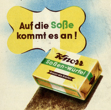
Issued by Stempel as Elegant-Grotesk in three
weights (mager, halbfett, fett) in 1928. A two-line open style
(licht) was
added in 1929, a normal in 1936, and two italic weights in 1938
[Bertheau] [Wetzig 1926–40]. Adopted for the Linotype.
[Archiv,
1930] Bauer accused Stempel of plagiarizing their
Futura. [Hansert]
Stempel claimed the typeface was inspired by Möhring’s
lettering for the
cover of Gebrauchsgraphik 12/1926 [Gebrauchsgraphik
March 1929]. Mager, normal, and halbfett came in two variants:
series I has pointed spurs in ‘a b d g n’ etc., while series II
shows more conventional rectangular shapes (see Guildford/Windlesham). Alternates: ‘J’ with/without
top bar, two-story ‘a’. The latter is shown as default in series II
[Reichardt/Hoefer].
Distributed by Caslon Machinery Ltd., sole agents of Stempel in
Great Britain, as Elegant Sans [Ulrich].
Also offered under the name Guildford Sans by Caslon
(like series I, but with two-story
‘a’) [1934
specimen] and later by Stephenson Blake. Also cast by
Magyar [Reichardt 2011]. Dutreix had a
version named Universelles (= series I) [Corpus
typographique français] also sold by Vanderborght as
Antique Élégante.
Digital revivals by COUP for a
single project (2008, unreleased), More…
Issued by Stempel as Elegant-Grotesk in three weights (mager, halbfett, fett) in 1928. A two-line open style (licht) was added in 1929, a normal in 1936, and two italic weights in 1938 [Bertheau] [Wetzig 1926–40]. Adopted for the Linotype. [Archiv, 1930] Bauer accused Stempel of plagiarizing their Futura. [Hansert] Stempel claimed the typeface was inspired by Möhring’s lettering for the cover of Gebrauchsgraphik 12/1926 [Gebrauchsgraphik March 1929]. Mager, normal, and halbfett came in two variants: series I has pointed spurs in ‘a b d g n’ etc., while series II shows more conventional rectangular shapes (see Guildford/Windlesham). Alternates: ‘J’ with/without top bar, two-story ‘a’. The latter is shown as default in series II [Reichardt/Hoefer].
Distributed by Caslon Machinery Ltd., sole agents of Stempel in Great Britain, as Elegant Sans [Ulrich]. Also offered under the name Guildford Sans by Caslon (like series I, but with two-story ‘a’) [1934 specimen] and later by Stephenson Blake. Also cast by Magyar [Reichardt 2011]. Dutreix had a version named Universelles (= series I) [Corpus typographique français] also sold by Vanderborght as Antique Élégante.
Digital revivals by COUP for a single project (2008, unreleased), by Jo De Baerdemaeker as ST Elegant Contemporary (commissioned by Sara De Bondt for the Contemporary Art Centre in Nottingham, 2009), by Harry Gassel (unreleased, 2012), and by Florian Paizs as Elegant Lux (2014). Inspired Wahoo, a custom design by Klim for Lotto New Zealand (2013). See also Red Rooster’s Guildford (2011) and Matthieu Cortat’s Battling (2012, used for sample, based on Universelles).


