
Channel: A Compilation of Output Recordings series of album covers (2000–2005)

Front cover of Channel 1, released June 2000
Channel is a series of leftfield, electro and electroclash music compilation mixes released between 2000 to 2005. The channels range from one to four and feature a roster of British and international artists in a tracklist of 10 to 15 tracks, including Yello, LCD Soundsystem, Lopazz, and others.
Trevor Jackson, the founder of the now-defunct “highly acclaimed” Output Recordings (1996–2006), was known for designing the covers himself in the independent label’s art director role.
The first in this installment (released in June 2000) features a hot pink background (except fluorescent orange in the 2005 copies, not pictured) and text set in Berthold’s Akzidenz-Grotesk Bold, which was also used for the CD-R version (not pictured) released with Source UK, a tradename of the French label Source, but in a background of silver filled on the cover and the text being aligned on the centre above.
However, from Channel 2 to Channel 4, the band names on the front and track names on the back are a circus maelstrom of fonts with various backgrounds, including monochrome in two variants (one being white and black, the second being black on white) and metallic gold (pictured) and metallic silver (not pictured).
These fonts include classics from the metal type era as well as the 1970s/80s dry-transfer and phototypesetting years (including designs by ITC, Letraset, Mecanorma, VGC, Fotostar/Fascimile Fonts, and Photo-Lettering) in the styles of Art Deco, Victorian, Art Nouveau, geometric, etc. Note especially the early use of Tank by Canadian type designer Ray Larabie (in the 2004 compilation cover which by the way was possibly inspired by ITC Machine from 1970) and Boback from Nathan Williams’ Baseline Fonts foundry (not released until 2006) [edit: it’s probably the earlier Serifedsans].

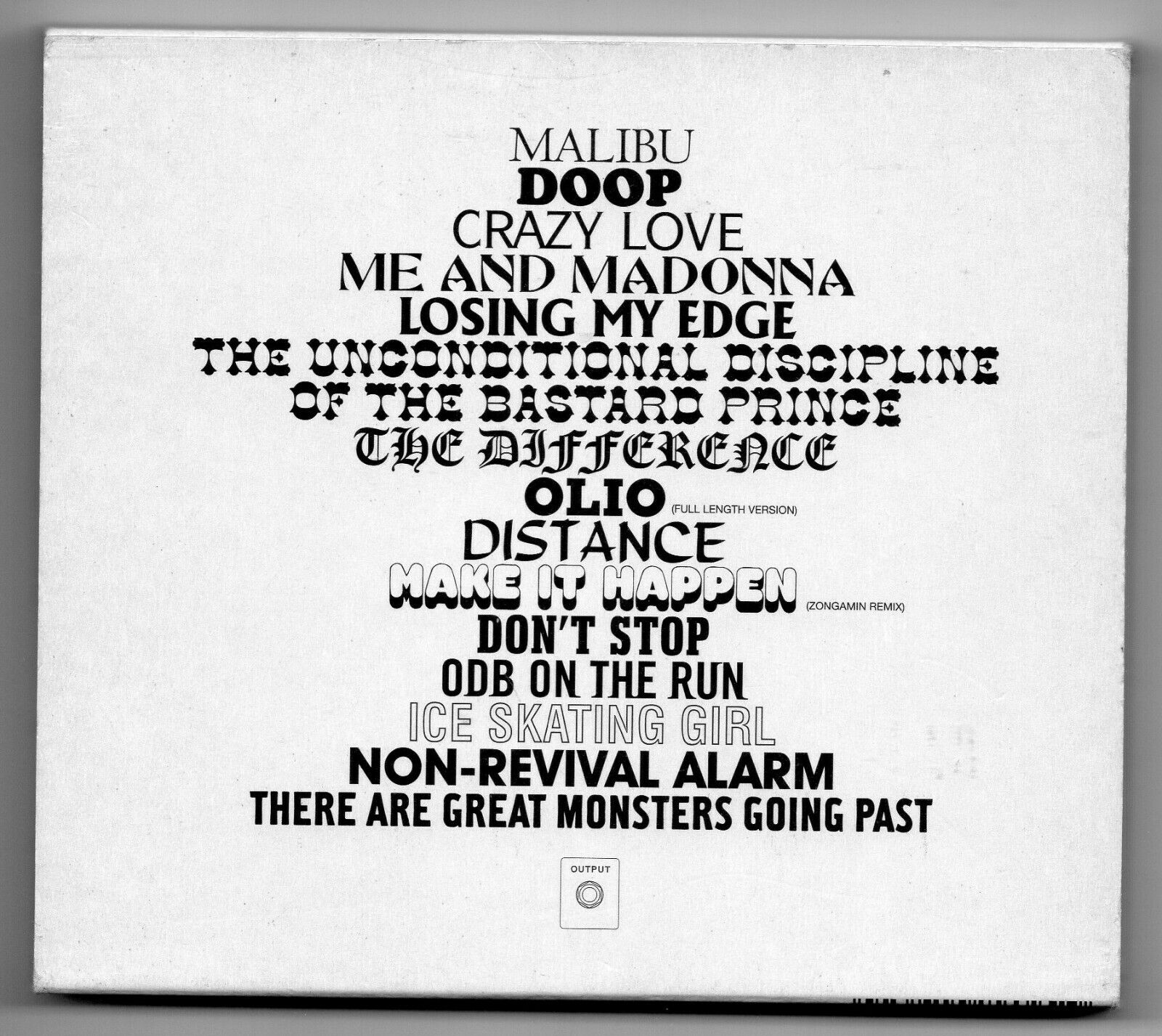
Back cover, in left-aligned text and two columns
![Channel Two, released April 2003: Centaur (Bruce Rogers, Monotype, 1928), Cooper Black (Oswald Bruce Cooper, Barnhart Brothers and Spindler, 1922), (Aldo Novarese, 1984), Abbot Old Style (Joseph W. Phinney, ATF, 1901), Albertus (Berthold Wolpe, Monotype, 1936), Cottonwood (Barbara Lind et al., Adobe, 1989), Old English (Monotype, an adaptation of ATF Cloister Black, 1904), Memphis Bold (Rudolf Wolf, 1931), Studio (Dick Dooijes and Dolf Overbeek, Amsterdam Type Foundry, 1946), Too Much Shadow (Bill Seifert, VGC, 1974), Karnak Bold Condensed (Robert Hunter Middleton, Ludlow, 1931), Boback (Baseline Fonts, released ca. 2006, documented early use of an Alternate Gothic with serifs on the bottom) [edit: it’s probably the earlier ], Helvetica Condensed (outlined, Stempel/Linotype), ITC Avant Garde Gothic (Herb Lubalin and Tom Carnase, 1970) and Hamilton (Font Bureau, 1993).](https://fiu-original.b-cdn.net/fontsinuse.com/use-images/160/160846/160846.jpeg?filename=s-l1600.jpg)
Channel Two, released April 2003: Centaur (Bruce Rogers, Monotype, 1928), Cooper Black (Oswald Bruce Cooper, Barnhart Brothers and Spindler, 1922), ITC Symbol (Aldo Novarese, 1984), Abbot Old Style (Joseph W. Phinney, ATF, 1901), Albertus (Berthold Wolpe, Monotype, 1936), Cottonwood (Barbara Lind et al., Adobe, 1989), Old English (Monotype, an adaptation of ATF Cloister Black, 1904), Memphis Bold (Rudolf Wolf, 1931), Studio (Dick Dooijes and Dolf Overbeek, Amsterdam Type Foundry, 1946), Too Much Shadow (Bill Seifert, VGC, 1974), Karnak Bold Condensed (Robert Hunter Middleton, Ludlow, 1931), Boback (Baseline Fonts, released ca. 2006, documented early use of an Alternate Gothic with serifs on the bottom) [edit: it’s probably the earlier Serifedsans], Helvetica Condensed (outlined, Stempel/Linotype), ITC Avant Garde Gothic (Herb Lubalin and Tom Carnase, 1970) and Hamilton (Font Bureau, 1993).
Back cover

Channel 3, released in June 2004 (pictured behind is the pink cover): Agraphicus (VGC before 1982, digitized by WSI in 1996 as Arruba), Tank (Ray Larabie of Typodermic, 2004 – the year this album was released in), ITC Busorama (Herb Lubalin and Tom Carnase, the creators of Avant Garde Gothic, 1970), Buxom (Bob Trogman of Fotostar/Fascimile, 1975), ITC Pioneer (Ronné Bonder, 1970), ITC Serif Gothic (Herb Lubalin and Tony Di Spigna, 1972), a condensed sans (probably a bolder style of FF Meta or similar), Shatter (Vic Carless, Letraset, 1973), Futura Black (Paul Renner, Bauer, 1929), Clarendon (Hermann Eidenbenz, Haas, 1953), Umbra (Robert H. Middleton, Ludlow, 1932), ITC American Typewriter Light (Tony Stan and Joel Kaden, 1974), and Raphael (Central Type Foundry, 1885)
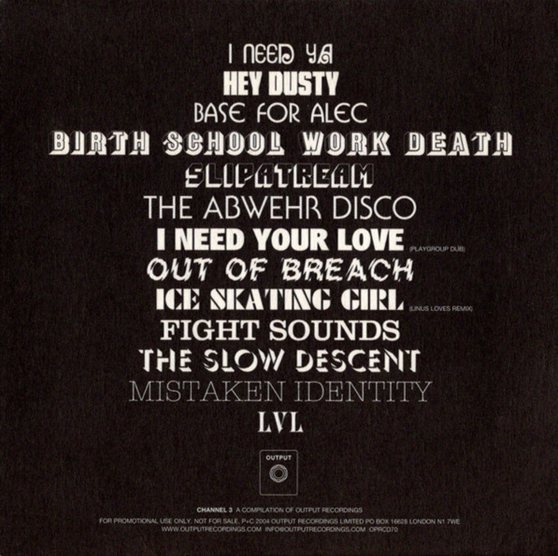
Back cover with copyright and remix text in Helvetica (Max Miedinger, Haas, 1957)

Example spread of booklet that comes with the tracklist
Channel 4, released in September 2005: Fiorello (Photo-Lettering Inc., before 1965), Futura Light (Paul Renner, Bauer, 1927), Blackline (Wolf Magin, Berthold, 1973), Shotgun (J. Looney, VGC, 1972), ITC Busorama (see Channel 3 for info, here used with the asymmetrical A), ITC Zapf International (Hermann Zapf, 1977), Isabella (Herman Ihlenburg; MacKellar, Smiths and Jordan; 1892), Novel Gothic (shaded variant as seen in Solotype’s 3-D and Shaded Alphabets; Charles H. Becker and Morris F. Benton, ATF, 1928), Creeper (origin unknown), Sauce (unknown), University Roman (Letraset, 1972), Cooper Black (outlined variant) and ITC Serif Gothic Bold.

Back cover

Spine


")


")


")


</cite> record labels")
")


6 Comments on “Channel: A Compilation of Output Recordings series of album covers (2000–2005)”
My mind was thinking that I forgot to cite Rosita (another digitization? of Agraphicus by Brendel). The metadata cites that it was made in October 1994.
And according to Luc Devroye’s VGC list, the other digital lookalikes for this Agraphicus appear to be Corruga Display (SoftKey SSi), and Acropolis (Fontbank).
Canon/Greenstreet/Summitsoft also claims Brendel Rosita too.
Yes, but have you looked at these fonts? They are all poorly drawn and produced, with inconsistent stroke widths, alignment issues, bumpy transitions, mismatched diacritics, and erratic spacing. I have yet to see one that does the original some justice (and that was a whimsical nine day wonder to begin with).
Not yet Flo… but I haven’t heard of these names before. It could be poorly done digitizations of that heluva rare face from VGC :-{
But keep in mind anyway.
I think The Rapture/I Need Your Love is using Red Rooster’s Glasgow Pro Extra Bold.
Yes, that looks like a match. Thanks, Bryson!
I have taken the opportunity to consolidate the various Glasgows on one page, and added a bit of info about its not-so-ethical origins: it started out as one of Brendel’s copies, or close followers, of contemporary releases, in this case of Georg Salden’s groundbreaking Polo.
No idea which of the many versions was used here. It looks like Red Rooster had one as early as in 1992. According to their website, the Pro was “completely redrawn and produced by Steve Jackaman (ITF) and Ashley Muir in 2010” – thus after Channel 3 came out in 2004.