Politico website
Politico is an American political-journalism company founded in 2007. The Jubilat typeface family by Darden Studio plays a major role in the visual identity of Politico’s online presence.
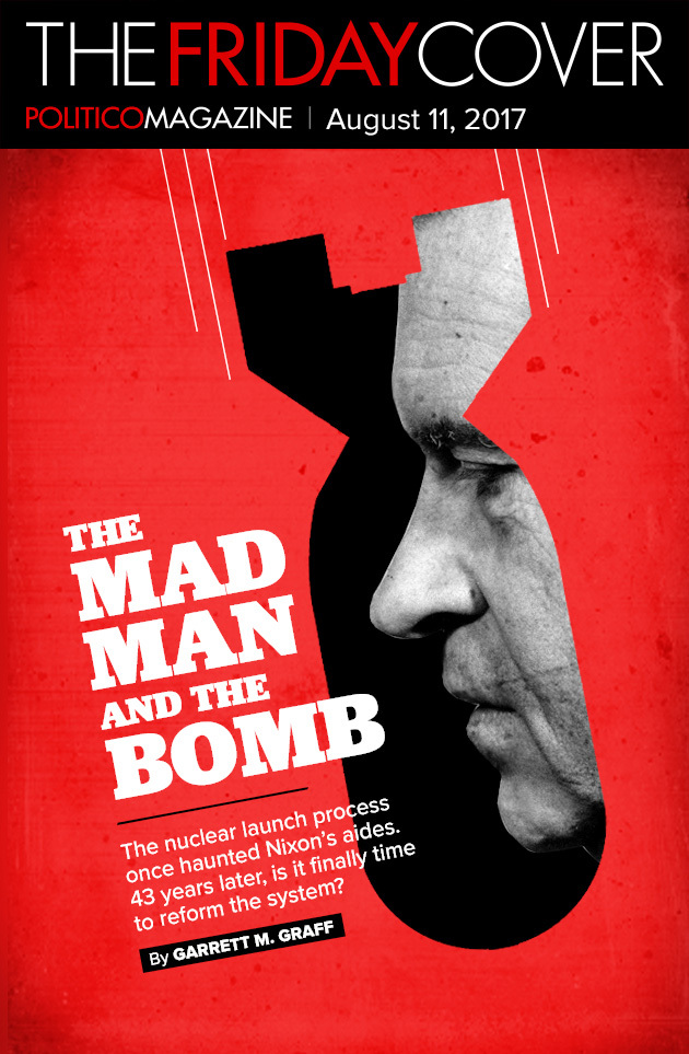
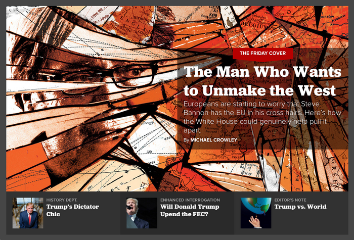
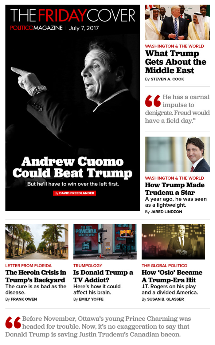
Led by creative director Janet Michaud (since 2016 together with art director Erin Aulov), Politico’s design team has made outstanding use of Jubilat Bold as the primary headline face in the magazine ever since the introduction of this format in 2013. We are happy to see how the hefty slab serif helps to lend reliability and gravitas to Politico’s “home for ambitious, distinctive journalism about the people, ideas, and institutions that matter most in Washington—and beyond.” Jubilat also adorns The Friday Cover, an email digest of the week’s best from the magazine.
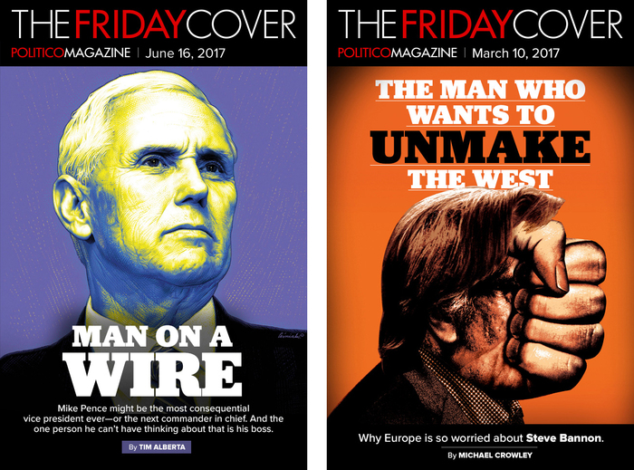
Jubilat again is paired with Proxima Nova as secondary typeface. The logos of Politico Magazine and The Friday Cover are in tightly spaced caps from Futura, with words separated by color rather than spaces.

The Friday Cover typically goes with Jubilat Bold and Black, for maximum impact, often in center-aligned settings. Different sizes and colors as well as changes between all-caps and mixed-case settings make for a varied and yet consistent look.
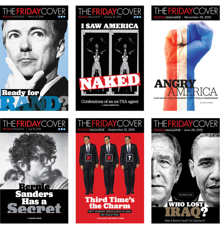
In its early years, The Friday Cover frequently featured several of Jubilat’s eleven weights, sometimes contrasting the strongly modulated Bold with the almost monolinear Light, see e.g. “Angry America”.
The typographic treatment used to be more variable, too, including overlapping glyphs, type on an angle, and different alignments.
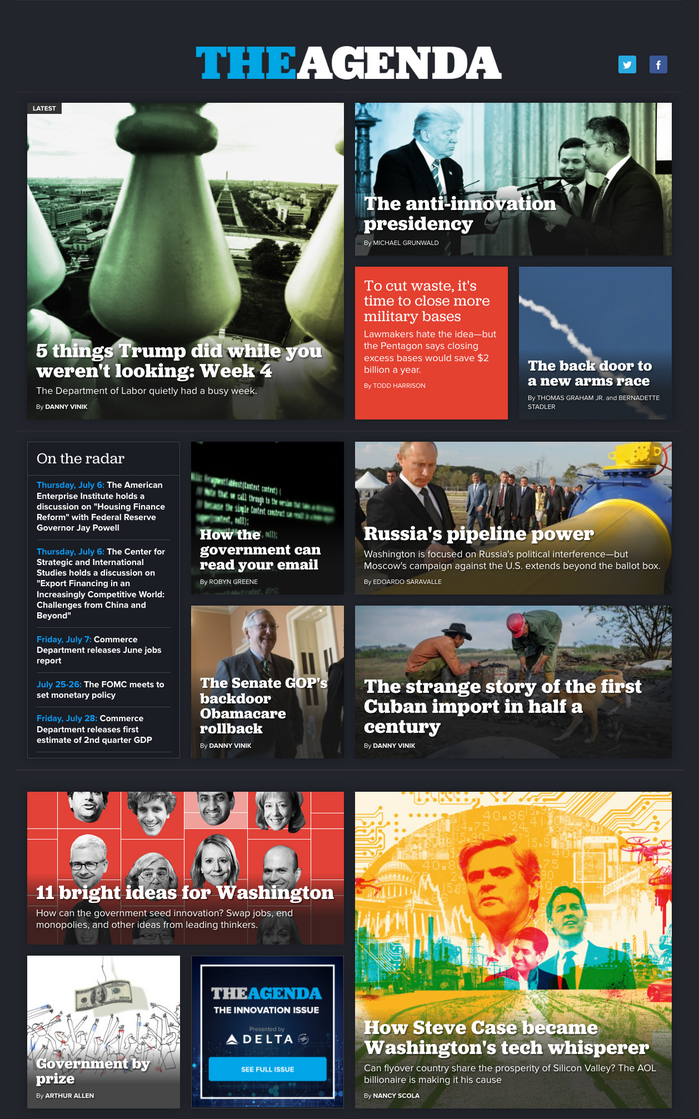
Furthermore, Jubilat is the typographic mainstay of The Agenda, Politico’s “home for the daily conversation around the ideas reshaping the country”, launched in June 2015 and initially art directed by Heather Barber. The typeface here appears in the all-caps logo as well as in headlines of various sizes, in regular and bold weights. Taking advantage of its sturdy forms, the designers use it reversed against colors and images.
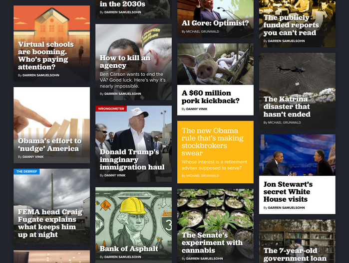
The Agenda’s article teasers are arranged on a four-column grid. When placed on images, white Jubilat Bold get a subtle shadow treatment. The regular weight is used for articles without images.
Formats
- Web (4546)
Designers/Agencies
- Janet Michaud (1)
- Erin Aulov (1)
- Heather Barber (1)
Tagged with
- Politico (2)
- United States (99)
- journalism (61)
- newspaper websites (30)
- magazine websites (77)
- email newsletters (13)
- magazine covers (1187)
- magazine logos (432)
- illustration (1271)
- series (930)
- all caps (5979)
- reversed type (2921)
- reversed type on an image (1018)
- underlined (624)
- center-aligned text (1567)
- typeface combinations (3135)
- US politics (2)
- pull quotes (140)
- type on an angle (1068)
- high profile (583)
Artwork location
- United States (8318)
- Washington, D. C. (64)

