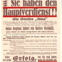
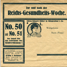
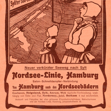
Schelter
& Giesecke’s Romanisch a.k.a. Romanische
Antiqua includes Nr. 20 (1889*) with Kursiv (1896), halbfett
(1895) with (obliqued) Kursiv (1898), schmal halbfett (1897), breit
mager with Kursiv (1898), a light Nr. 22 (1902), and schmal (1904).
[Wetzig 1926–40] *) Apparently an error: other sources date the
release of Romanisch to 1896. [S&G
1912 specimen,
Archiv] The halbfett was registered April 1895. [Reichsanzeiger]
Some styles available with Cyrillics. Adopted for the Typograph
[Wetzig 1926–40]. The halbfett is based on
De
Vinne [Bertheau 1995].
Romanisch Nr. 20 was also named
Anker-Romanisch, probably to distinguish it from
other similarly named faces (S&G’s logo shows an anchor). Comes
with
nested capital ligatures.
Tasso is an open version. Together with the
halbfett, it forms the bichromatic set
Tizian [S&G: Antiqua-Schriften]. The
poster equivalents were Noah, Neptun (schmal
halbfett), Norium (open), with Nikodemus
being a solid Cyrillic style. [S&G:
Plakatschriften] Noah and
Norium combined was named Nomen.
[specimen]
Alt-Romanisch, Borghese, and
Ratisbona are spin-offs with novelty glyphs for
some letters.
Numerous recuts, incl. by Riegerl & Weißenborn in Leipzig (see
Romana), who
provided matrices to Böttger, Klinkhardt, Rühl, Theinhardt, Müller
& Hölemann, and Amsterdam before 1900; and by Berthold (Lateinisch,
1899)
[Bertheau 1995] which led to
a lawsuit that was setted in favor of S&G. [Archiv, July
1904] In 1908, S&G complained about Enschedé’s copy Romein letter (series
57) [More…
Schelter & Giesecke’s Romanisch a.k.a. Romanische Antiqua includes Nr. 20 (1889*) with Kursiv (1896), halbfett (1895) with (obliqued) Kursiv (1898), schmal halbfett (1897), breit mager with Kursiv (1898), a light Nr. 22 (1902), and schmal (1904). [Wetzig 1926–40] *) Apparently an error: other sources date the release of Romanisch to 1896. [S&G 1912 specimen, Archiv] The halbfett was registered April 1895. [Reichsanzeiger] Some styles available with Cyrillics. Adopted for the Typograph [Wetzig 1926–40]. The halbfett is based on De Vinne [Bertheau 1995].
Romanisch Nr. 20 was also named Anker-Romanisch, probably to distinguish it from other similarly named faces (S&G’s logo shows an anchor). Comes with nested capital ligatures.
Tasso is an open version. Together with the halbfett, it forms the bichromatic set Tizian [S&G: Antiqua-Schriften]. The poster equivalents were Noah, Neptun (schmal halbfett), Norium (open), with Nikodemus being a solid Cyrillic style. [S&G: Plakatschriften] Noah and Norium combined was named Nomen. [specimen] Alt-Romanisch, Borghese, and Ratisbona are spin-offs with novelty glyphs for some letters.
Numerous recuts, incl. by Riegerl & Weißenborn in Leipzig (see Romana), who provided matrices to Böttger, Klinkhardt, Rühl, Theinhardt, Müller & Hölemann, and Amsterdam before 1900; and by Berthold (Lateinisch, 1899) [Bertheau 1995] which led to a lawsuit that was setted in favor of S&G. [Archiv, July 1904] In 1908, S&G complained about Enschedé’s copy Romein letter (series 57) [Lane & Lommen 1998]. Later shown as Romaansch (Serie 157, roman and italic). [1932 sample] Not to be confused with Amsterdam’s Romaansch, see Romana.
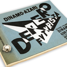
Cast by Nebiolo (and also by FTC? [Reichardt]) as Raffaello (Serie 105, roman, italic, bold, condensed). [specimen] Grimoldi had the design as Padova.
For a digital approximation, see Rando. A digitization of the Italic is included in Gerhard Helzel’s Lateinisch. Everybody Loves Romana is a digitization of Romanisch halbfett by Julia Ma (Yale School of Art, unreleased).


