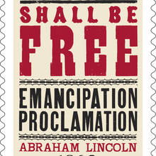
Designed for the renowned printer Theodore Low De Vinne and first released by Central
Type Foundry around 1892. Credited variously to Gustav F. Schroeder
and
Nicholas J. Werner, though
Werner attributed the design to Schroeder (who possibly
completed the design before his 1891 move to California) and then
extended the family with Italic and Condensed styles for
Central.
Other additions include Extra Condensed (ATF), Extended (ATF,
1896), Compressed, Extra Compressed, Bold (BB&S, 1898/1899),
Title (Keystone; bold, but not as wide as BB&S’s). [McGrew 1993] See also De
Vinne Open and De
Vinne Shaded. Disappears from ATF catalogs after
1923.
Alternate non-descending ‘R’s in most styles except the
original one;
high-waisted ‘M’; wide-bottomed ‘S’ and ‘s’. And perhaps an
alternate
‘G’ with lower waist.
Adopted by Monotype as De Vinne (Series 131), with
De Vinne Italic
(aka Bold Face or Bold Italic, Series
167) and De Vinne Condensed (Series 21). [Alembic
Press] [Wetzig 1926–40]
Also cast in Germany by Hoffmeister [1895
specimen] (as Amerikanische Mediäval)
[1900,
1902 mentions] and Woellmer (as Antique; later:
Antike) [1900
specimen], both w/ open style that can be combined
in bicolor settings. Woellmer’s Antike had
3 widths plus 1 italic as well as Cyrillics. [Wetzig 1926–40] Hoffmeister’s
Amerikanische Mediäval was continued by Stempel
and also had a Kursiv. [Wetzig 1926–40]
Issued by FTF as Elzévir Gras Large, Canadiennes
(for Condensed), Chicago Large
(Extended), and Lyonnaises
(Italic). By Tetterode/Amsterdam as Vette
Romaansch and Smalle Romaansch
(Condensed). E. Gursch had Elzevir, which included swash initials.
Ludwig & Mayer’s Römisch halbfett and schmal halbfett
appear to be direct copies, too, and are marked as originating in
America [Wetzig 1926–40]. See also Schelter &
Giesecke’s Romanisch.
Phototype revivals include Devinne by
Photo-Lettering (Bold, Italic No. 2, Condensed No. 2, Outline; before 1969) [PLINC One Liner 1971], DeVille by TypeSpectra (1974), and
Devinne by Lettergraphics (Bold, Extra Bold, Black)
[Lettergraphics 1976]. The latter is
probably identical to the styles carried by Castcraft as
Devinne Agency. [Castcraft 1978] Face
Photosetting adopted Devinne No. 113 (regular) and
Devinne No. More…
Designed for the renowned printer Theodore Low De Vinne and first released by Central Type Foundry around 1892. Credited variously to Gustav F. Schroeder and Nicholas J. Werner, though Werner attributed the design to Schroeder (who possibly completed the design before his 1891 move to California) and then extended the family with Italic and Condensed styles for Central.
Other additions include Extra Condensed (ATF), Extended (ATF, 1896), Compressed, Extra Compressed, Bold (BB&S, 1898/1899), Title (Keystone; bold, but not as wide as BB&S’s). [McGrew 1993] See also De Vinne Open and De Vinne Shaded. Disappears from ATF catalogs after 1923.
Alternate non-descending ‘R’s in most styles except the original one; high-waisted ‘M’; wide-bottomed ‘S’ and ‘s’. And perhaps an alternate ‘G’ with lower waist.
Adopted by Monotype as De Vinne (Series 131), with De Vinne Italic
(aka Bold Face or Bold Italic, Series 167) and De Vinne Condensed (Series 21). [Alembic Press] [Wetzig 1926–40]
Also cast in Germany by Hoffmeister [1895 specimen] (as Amerikanische Mediäval) [1900, 1902 mentions] and Woellmer (as Antique; later: Antike) [1900 specimen], both w/ open style that can be combined in bicolor settings. Woellmer’s Antike had 3 widths plus 1 italic as well as Cyrillics. [Wetzig 1926–40] Hoffmeister’s Amerikanische Mediäval was continued by Stempel and also had a Kursiv. [Wetzig 1926–40]
Issued by FTF as Elzévir Gras Large, Canadiennes (for Condensed), Chicago Large (Extended), and Lyonnaises (Italic). By Tetterode/Amsterdam as Vette Romaansch and Smalle Romaansch (Condensed). E. Gursch had Elzevir, which included swash initials. Ludwig & Mayer’s Römisch halbfett and schmal halbfett appear to be direct copies, too, and are marked as originating in America [Wetzig 1926–40]. See also Schelter & Giesecke’s Romanisch.
Phototype revivals include Devinne by Photo-Lettering (Bold, Italic No. 2, Condensed No. 2, Outline; before 1969) [PLINC One Liner 1971], DeVille by TypeSpectra (1974), and Devinne by Lettergraphics (Bold, Extra Bold, Black) [Lettergraphics 1976]. The latter is probably identical to the styles carried by Castcraft as Devinne Agency. [Castcraft 1978] Face Photosetting adopted Devinne No. 113 (regular) and Devinne No. 97 (condensed) from DeLittle’s woodtype around 1981. [undated catalog] For Typeshop’s De Vinne Serial, see Denver.
Digital revivals include Publication JNL (Jeff Levine, 2010, with De Vinne Stencil JNL), Tedlo Roman NF (Nick's Fonts, 2014), a rough wood facsimile (Jordan Davies, Wooden Type Fonts, 2015), and Roslindale (DJR, 2017–). See also similar designs under the Romana name. M & H still casts in metal the Monotype version, which was known as No. 11 or Devinne.
Not to be confused with DeVinne Ornamental or Linotype’s De Vinne which are distinct designs.


