Martyr! is a novel by Iranian-American writer Kaveh Akbar that combines modern situations with traditional imagery. For the jacket, prolific cover designer Linda Huang did what she does so well: pick a striking and relevant typeface and let it do a lot of the work.
License: All Rights Reserved.
Left: Salem, as advertised in the Inland Printer, Vol. 28, No. 2 (November, 1901). Right: Daria Cohen’s reinterpretation, Zangezi (2018), with additional weights, italics, and condensed (2021).
Her choice was ZangeziCondensed, a fresh, fashion-forward take on Salem, in which Daria Cohen took a turn-of-the-century dazzler, narrowed it, and increased its stroke contrast, giving it even more spike and sparkle than it already had. The idiosyncratic type is the perfect companion to the contemporary use of antique illustration. Huang also deftly delivers the commercial necessities – a blurb and “a novel” – in an inconspicuous way.
Despite its heavy themes, I found Akbar’s novel to be insanely funny,” Huang told Literary Hub. “I cackled many times while reading the manuscript. More than anything, I wanted to evoke this unique tragi-comedic tone on the cover. One of the central, recurring images is this Iranian ‘Angel of Death’ warrior. I experimented with scale and ultimately found the warrior in miniature to be most striking, with ‘a novel’ set in a deadpan speech bubble. I was also lucky to stumble upon the perfect decorative typeface to activate all that negative space. To me, humor is one of the most alluring qualities in a book (and really, in life) so it was an absolute treat to work on Akbar’s novel.
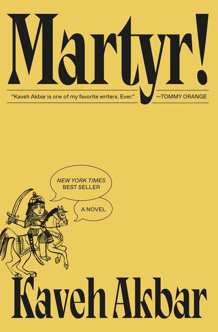
The version of the cover seen in bookstores today.
Martyr! quickly became a New York Times best seller – soon enough for the cover to get an extra speech balloon celebrating that fact. You can also see an improvement on the letterspacing in “Akbar”.
Once you get to the end of a book, “a note on the type” is a great way to learn about the creation of the letterforms you’ve been staring at for hours.
Back jacket flaps usually include an author bio and designer credit. This is good. Could they include a bit more?
The interior of this book, designed by Betty Lew, includes “A Note on the Type”, a lovely hundred-year-old publishing tradition which not only credits the text face (in this case, Dante), but tells a bit of its story. Why not have a typeface credit on the jacket flap, too? Sure, you’re reading a lot more Dante than Zangezi when you read this book, but it’s the cover that often sells the book. Also, the type used on book covers is more likely to be something newer that the interior text, and thus more likely to be made by living designers. Isn’t it time we give them a nod?


")


")


")


")


