Fenella illustrated children books by David Gentleman
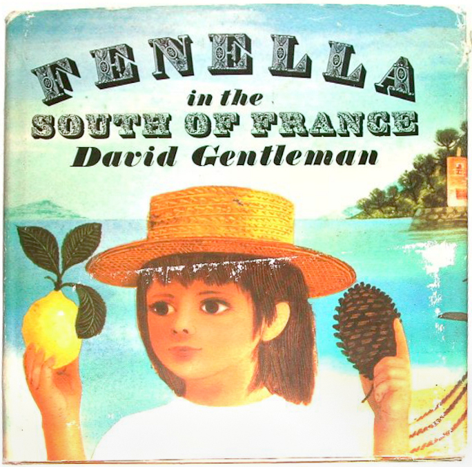
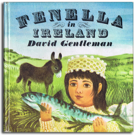
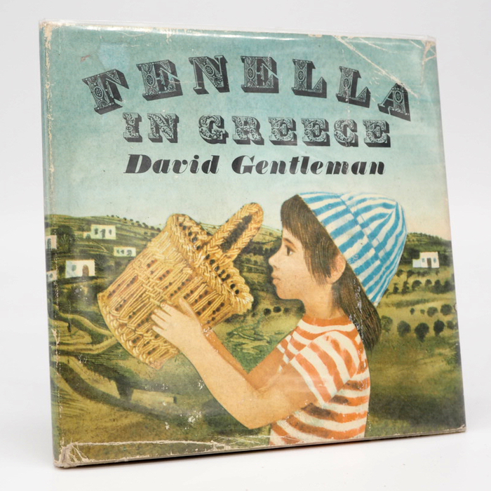
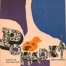
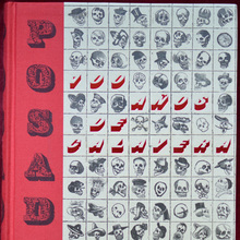
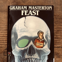
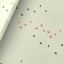
In 1966, David Gentleman designed a series of four illustrated children books about a little girl on holiday. In addition to Greece and Ireland, Fenella also travelled to Spain and the south of France. The books were released in 1967 by Jonathan Cape Ltd., London.
The type for the titles is a combination of two heavily decorated and shaded display typefaces. The first one is an ornamented fat face known in the mid-20th century as Macdonald. It has been revived digitally as Bodoni Ornamental by Michael Hagemann of Font Mesa. The second one goes back to a typeface from c. 1820 by the Paris-based foundry of Joseph Gillé. It was adopted by Deberny & Peignot, where it went under the name of Lettres Ombrées Ornées. Dieter Steffmann made a freely available (but unsatisfactory and limited) digitization of the same name in 2002. José Jiménez’ commercial version, Parisian Ornamentals (2010), is even worse and maybe derived from the freebie. If you happen to know more about the origin of the historic typeface designs, I’d be grateful for any pointers [see comments]. The italic fat face is Thorowgood.
You can see two interior pages from Fenella in the South of France on the website of Picturebook Museum.

Formats
- Books (5422)
- Art/Illustration (455)
Topics
- Kids (660)
Designers/Agencies
- David Gentleman (3)
Tagged with
- book covers (4794)
- children’s books (184)
- illustration (1267)
- travel (115)
- holidays (69)
- type on a curve (866)
- ornamental (10)
- book series (428)
- 1960s (622)
- Jonathan Cape (8)
- title pages (834)
Artwork location
- United Kingdom (2760)
- London (1521)




















2 Comments on “Fenella illustrated children books by David Gentleman”
Some great use of these lovely alphabets. I can tell you where Macdonald came from–it’s discussed in James Mosley and Julia Horsfall’s magisterial introduction to the Imprimit edition of the Pouchée alphabets, although it’s a bit of a sad story. “Shortly after the Second World War, Mr. William Webb, a typographic designer, was working at a printing office in Maryport, Cumberland, which possessed a set of ornamental capitals engraved on wood, one inch and three-quarters or just over ten lines of pica in height. Mr. Webb’s proofs of this alphabet, which he named 'Macdonald’ after its owner, were published on a reduced scale in 1952,[citation: ”Paul Arthur, 'Macdonald’, Graphis, vol. 8, no. 40 (1952), pp 178–9. It was used by Robert Harling for the cover of Alphabet and Image, no. 5 (1947).”] but the original blocks were probably destroyed." But I didn’t know it had got to Lettera (which I really should read sometime!) and they don’t mention it either (they got the reproduction rights from Graphis). The article is well worth reading. One point made in the introduction is that these letters may only have been popular for a very short time: “it is possible to conclude that most of the large English decorated types were produced during a period of hardly more than a dozen years.” And that they may sometimes have been made by smaller concerns, outside the mainstream, large-scale type-founding industry-notably, the Macdonald design and another one they mention that had been found in a London antiques shop don’t appear in any contemporary specimen.
Oh, that’s smashing! Thank you for sharing this info, Blythwood. I have updated the typeface page.
Regarding Lettera: It’s certainly a fascinating, beautiful, and influential book series. There isn’t much to read, though. Apart from the trilingual preface, it’s “just” a collection of alphabets and lettering samples. I add this to avoid disappointment.
Macdonald was also adopted for dry-transfer lettering by American manufacturer Formatt. Lettera strikes me as a more likely source for these book covers. In addition to Macdonald, Lettres Ombrées Ornées and Thorowgood Italic are reproduced in the first volume of Lettera as well.