
Korzo Theater visual identity

From Het Echte Werk:
It started in an old cinema building, with a group of creative squatters who made a place for progressive dance and music in The Hague. Korzo has since grown into the largest dance production house in the Netherlands. In addition to dance, they assume an exemplary ambition with an integral vision of music and theater. This professionalizing vision called for a new identity.
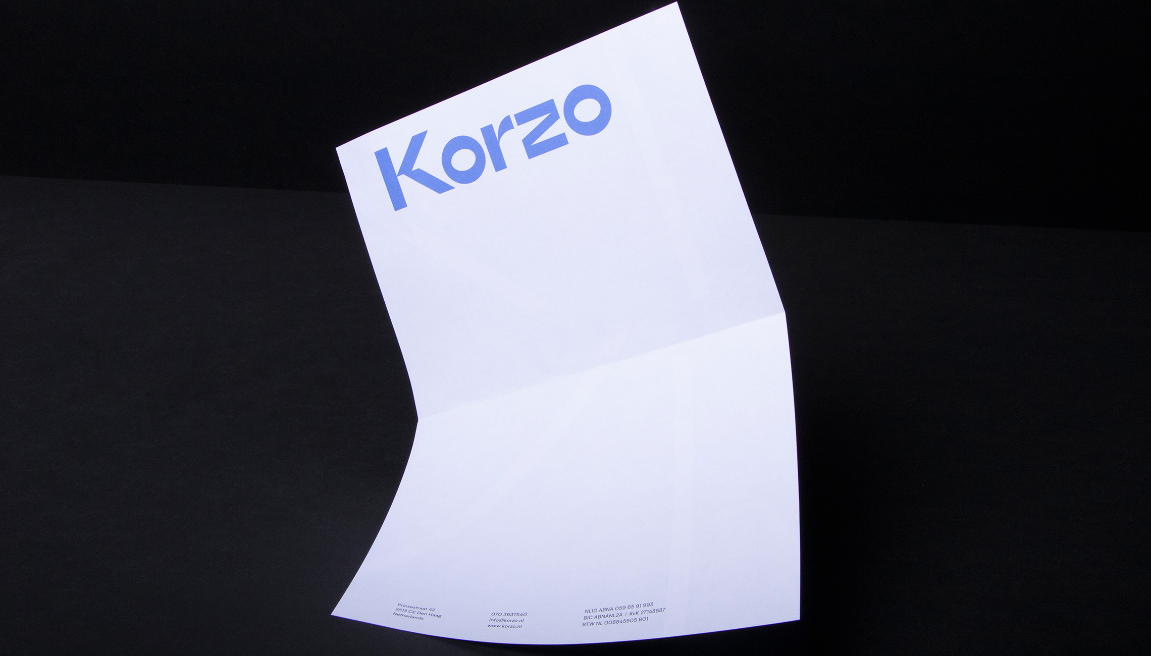
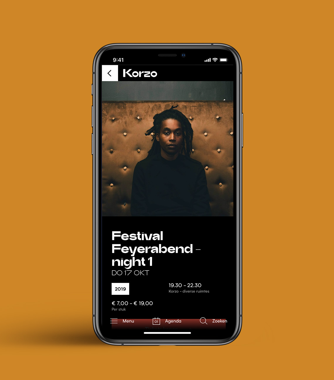
(…) A flexible and distinct identity that is sophisticated and daring at the same time. Korzo can give space to their makers as well as express themselves strongly under their own name. The “dynamic K” represents the intersection of the various disciplines with a view to new talent. The design language has a playful link to tape and the self-made origin of Korzo himself. This is complemented by a powerful word mark that catches the eye, a bold color palette, contemporary and classic typography, and a flexible grid system that allows Korzo to integrate his identity with diverse photography and content.
The typography pairs Trash from Bruta Types with Para from Ultra Kuhl.


")


")


