Fire Sale opening titles
Contributed by Florian Hardwig on Oct 9th, 2023. Artwork published in
.
Source: archive.org License: All Rights Reserved.
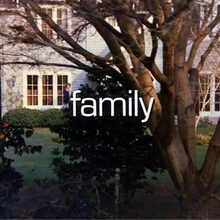
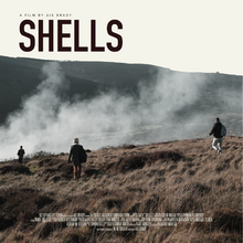
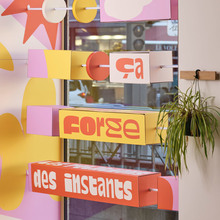
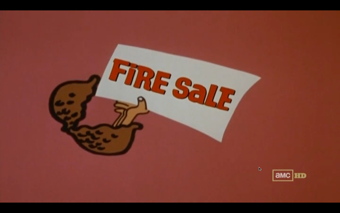
Fire Sale is a 1977 screwball comedy film based on a novel by Robert Klane (1941–2023) and directed by Alan Arkin (1934–2023). I haven’t watched it, and judging from the scathing reviews quoted on Wikipedia, it looks like I didn’t miss out. I’m posting it here because the opening titles use Filmotype Newton. I haven’t seen a full glyph set for this early 1960s phototype design yet, and the titles feature a whole lot more text than other uses. Apart from a few biform alternates for a e i, Newton didn’t include lowercase characters. The text in lowercase is added in the stylistically related Ad Lib.
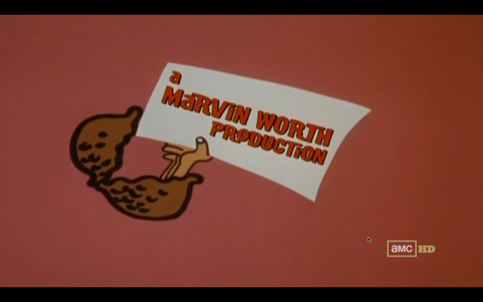
Source: archive.org License: All Rights Reserved.
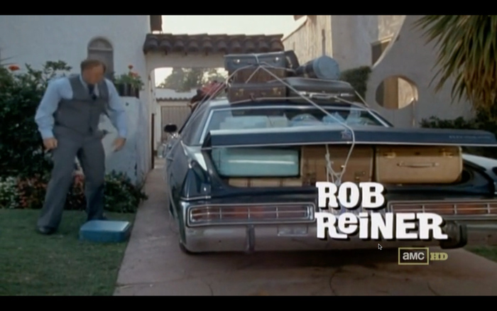
Source: archive.org License: All Rights Reserved.
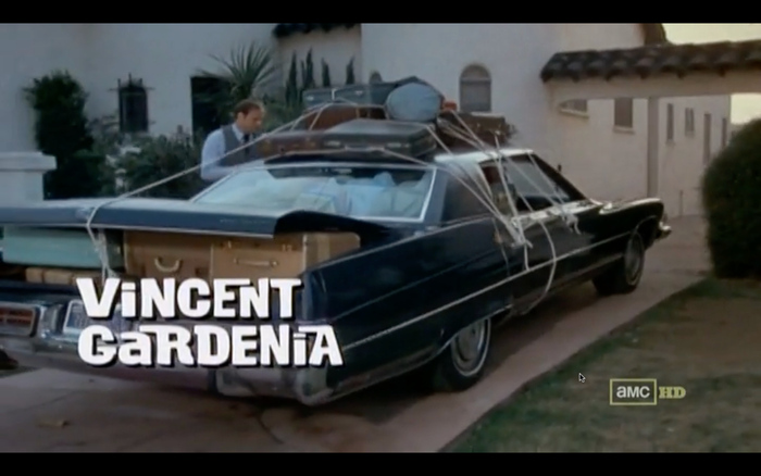
Source: archive.org License: All Rights Reserved.
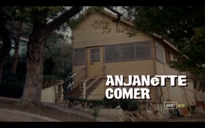
Source: archive.org License: All Rights Reserved.

Source: archive.org License: All Rights Reserved.
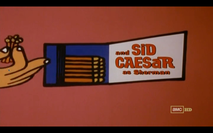
Source: archive.org License: All Rights Reserved.

Source: archive.org License: All Rights Reserved.
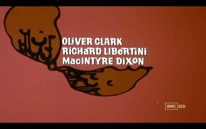
Source: archive.org License: All Rights Reserved.
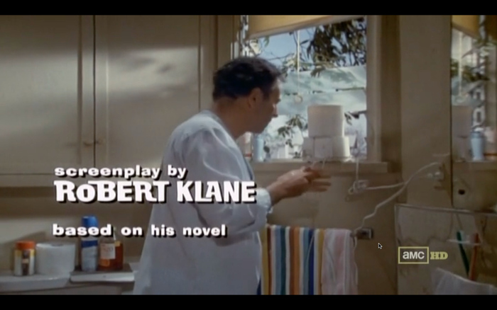
Source: archive.org License: All Rights Reserved.
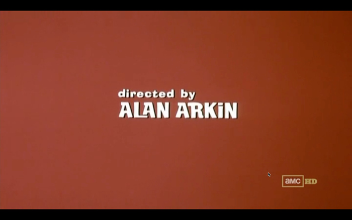
Source: archive.org License: All Rights Reserved.
Formats
- Film/Video (989)
Topics
- Entertainment (1454)
- Film/TV (1902)
Designers/Agencies
- Phill Norman (1)
- Pacific Title (10)
Tagged with
- title sequences (351)
- biform/unicase (257)
- alternate glyphs (1336)
- interlocking letterforms (78)
- type integrated with image (414)
- nuts (11)
- animation (339)
- comedy (189)
- reversed type (3168)
- Robert Klane (2)
- Alan Arkin (1)
- Twentieth Century Fox (17)
- film (186)
- 1970s (1475)
Artwork location
- United States (9325)
- Los Angeles (535)
26 Comments on “Fire Sale opening titles”
I want the Filmotype Newton font to be digitized.
I second that sentiment! You should direct your request at Stuart Sandler of Font Diner, who holds the rights to the Filmotype assets.
I haven’t seen the glyphs of the Filmotype Newton font.
As chance would have it, I came across a full glyph set recently. I can make a scan in January and share it here, if you’re interested. In the meantime, here’s a one-line sample.
It’s January 1st. So, you can make a scan and share it here?
LOL, no. I didn’t spend New Year’s Day in the studio. But now I can share the scan here.
I misremembered: it’s not a glyph set for Newton, but rather for Mason. The two typefaces are basically identical in design apart from the width: you can come fairly close to Newton by stretching Mason to around 135% of its width.
You would revive the Filmotype Mason font.
Does anyone know what are the fonts that are being used in this 1966 movie “The Big T.N.T. Show”?
Also for the opening credits I think they used Filmotype Madison and Ad Lib
Here’s the picture for the movie poster
I don’t know off the top of my head, sorry. The bold sans with vertical contrast is similar to Matterhorn and the other sans on the sticks of dynamite is in the ballpark of Catalina. Not sure if the outlined and shaded “TNT” is lettering or type – Forum II is a typeface with similar features. “The All-Time Greats” is in bold condensed Venus.
Fonts In Use isn’t meant to be a type ID board. Also, this poster isn’t really related to the Fire Sale opening titles. Why don’t you post your question to the fontid.co forum? And once you know (some of the) typeface names, you can submit a post to Fonts In Use.
I know this is not related to Fire Sale, but in that movie from 1966, they used Ad Lin in the opening and ending credits
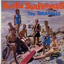
This album looks like it’s using Filmotype Newton
In the 1971 film Play Misty For Me, Filmotype Mason was used in the opening credits of the movie (Filmotype Newton’s wide companion).
I will request Stuart Sandler to digitize the Filmotype Newton font.
Cool
I really want to use the Filmotype Newton font.
Florian, you should digitize the Filmotype Newton font.
Sorry, that won’t happen, for several reasons. Most importantly, I don’t hold the rights to this design. And, also crucial, I don’t consider myself a type designer.
If you really want to use this typeface design, why don’t you have a go at it yourself? As long as you’re digitizing it for your personal use, you are good to go. Alternatively, you could hire a type designer. Take note, however, that for a commercial release, you’d better get clearance from the rights holder. Did you hear back from Font Diner; do they consider a revival?
If you don’t mind the added drip effect, you may want to look into Children shouldn’t play with dead things, a digitization based on the poster of the 1972 horror movie of the same title.
Also is there a VGC 1969 catalog of a full glyph set of Filmotype Newton?
No, only for Mason. Newton is the same design, just wider. It’s equivalent to Mason stretched to around 135% of the width.
Florian, I can contact Filmotype to digitize the Filmotype Newton font.
Yes, please do, and report back if they’re up to the idea!
Having a full-featured font of professional quality produced is a considerable investmest, especially for an interlocking design like Newton that requires lots of alternates and clever OpenType code to make it really shine. I can imagine that Filmotype/Font Diner might consider the design too gimmicky and doesn’t see sufficient market potential. But who knows? They commissioned Charles Gibbons with making a digital version of Maxwell before.
Florian, you should make a scan of the Filmotype Mason font and share it here.
Aline, I don’t know you. Please don’t tell me what I should do. :)
I did make a scan of Filmotype Mason’s glyph set a year ago – following your request – and posted it here, see my comment from January 5th, 2024.
I make scans of type specimens all the time, and the people who request them usually tell me why they need them, and offer something in return for my time and effort. Some send me scans of material that I don’t have, others share the digital fonts they created using the scans, and yet again others prefer to wire a few bucks so that I can buy me a coffee (BTW, Letterform Archive’s digitization services start at $20 per order).
The least I expect is an expression of gratitude. For the Mason scan, there hasn’t been a “thank you”, neither here or over on Flickr. Just more requests by you (for making a digital font) and by Javi (for making more scans). To which I say: no, thanks! I’ll rather do something else with my time. :)
Florian, I should contact the Letterform Archive to digitize fonts.