King’s Crown organic tea packaging
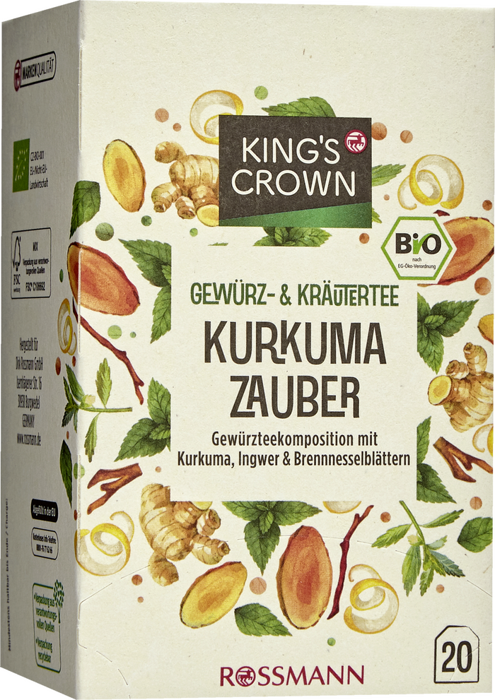
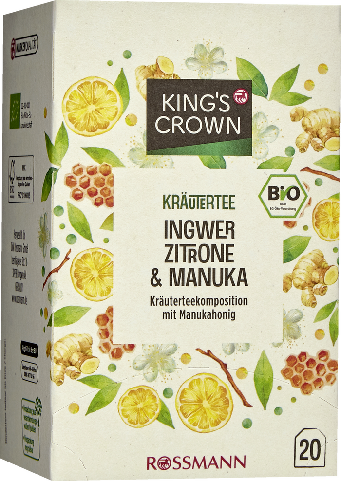
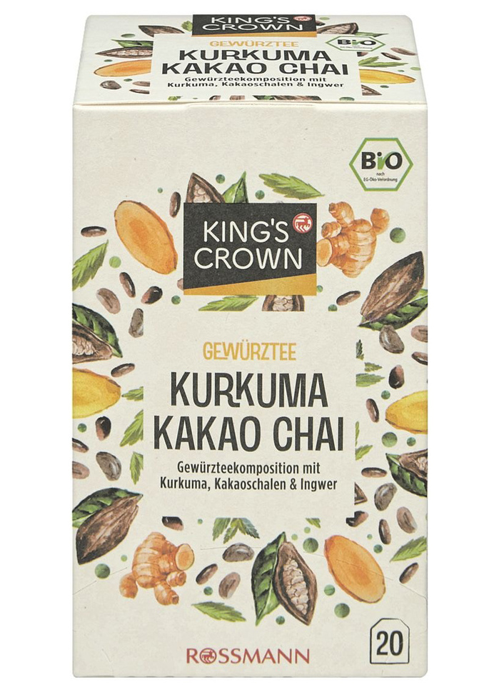
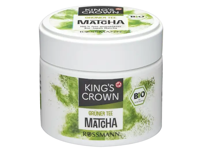
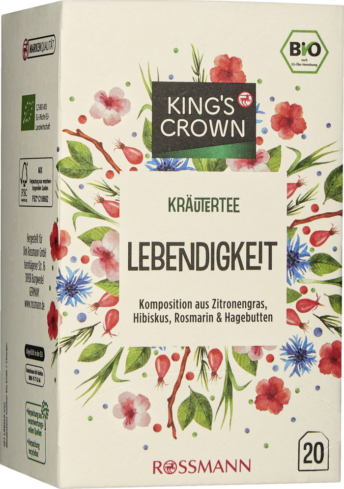
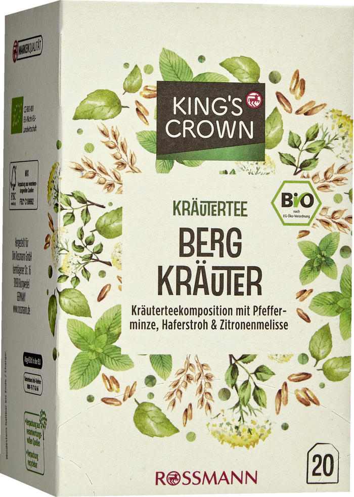
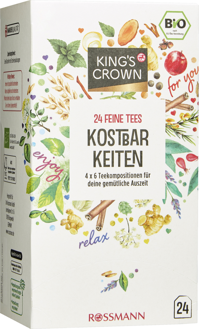
Interlocking letters are a 1960s thing and nowadays often pulled up for their retro appeal? Generally true, but here’s one fine exception, spotted in the supermarket aisle.
King’s Crown is a store brand of European drug store chain Rossmann. Their product line of organic spiced and herbal teas uses Sinzano Sans by Ray Larabie (Typodermic). Product and category names are set with the interlocking alternates included in the font, and yet these designs don’t strike as aiming for a vintage look. On the contrary, I find them very much contemporary, and quite successful.
Descriptions are added in Gotham Condensed. The King’s Crown logo appears to be based on the Latin glyphs in Tsukushi A MaruGothic, with a modified R. The script on the “Kostbarkeiten” variety is Shelby. The Rossmann logo in Optima was covered in a dedicated post.
Formats
- Packaging (1985)
- Branding/Identity (6679)
Topics
- Product (1594)
- Food/Beverage (2559)
Designers/Agencies
- unknown (3287)
Tagged with
- tea (48)
- organic food (87)
- private labels (15)
- series (930)
- packaging (654)
- boxes (409)
- jars (78)
- all caps (5979)
- alternate glyphs (1137)
- interlocking letterforms (73)
- Rossmann (1)
- German (language) (1958)
- illustration (1271)
- fruit (87)
- leaves (52)
- herbs (12)
- italic/script on an angle (318)
- logos (3881)
- modified typeface (1469)
- type in a box (603)
- reversed type (2921)
Artwork location
- Germany (3270)


