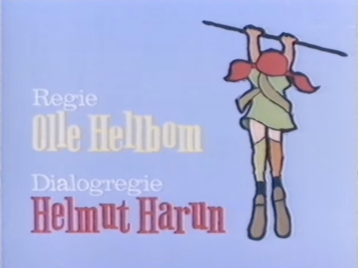
Pippi geht von Bord opening titles
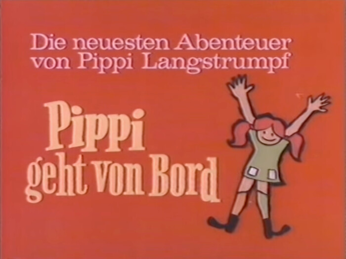
From Wikipedia:
Pippi Goes on Board (original German title: Pippi geht von Bord, Swedish title: Här kommer Pippi Långstrump) is a 1969 Swedish/West German movie, based on the eponymous children’s books by Astrid Lindgren with the cast of the 1969 TV series Pippi Longstocking. The film consisted of re-edited footage from the TV series. It was produced by Beta Film, one of the German co-producers of the TV series after the success of their first compilation movie Pippi Longstocking, using scenes and episodes not used in the first film. Despite its title, the film has little-to-nothing to do with the book of the same name in terms of story.
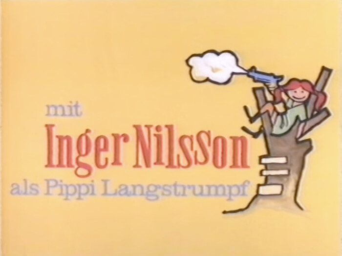
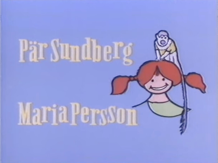
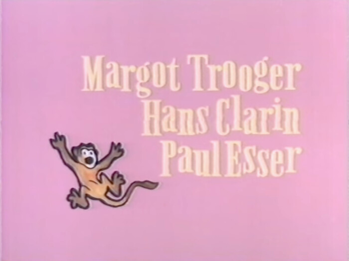
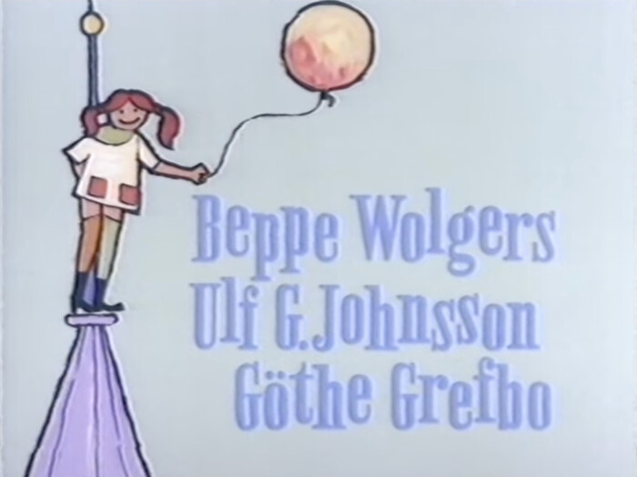
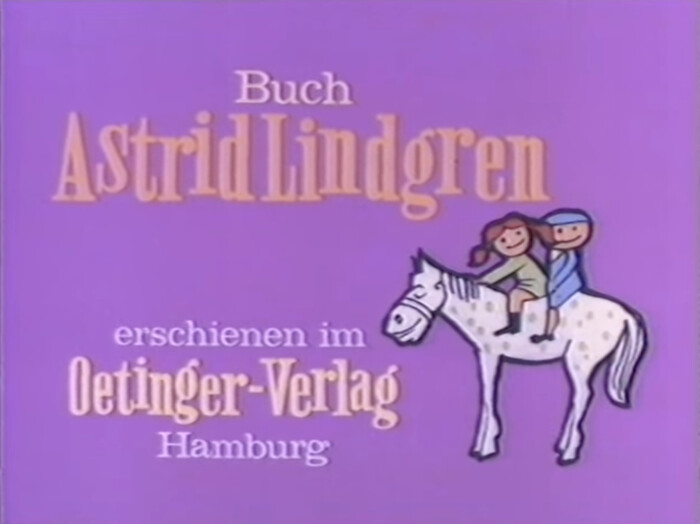
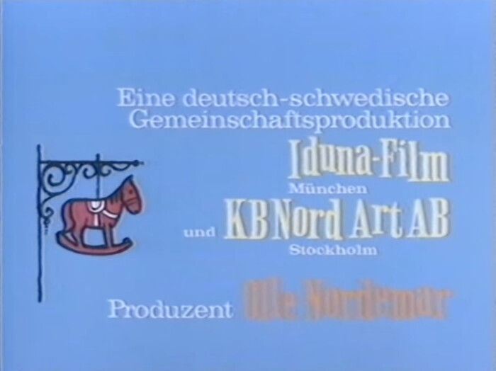
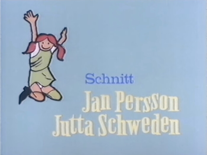
Shown here are the opening titles of the German version, which was released on October 31st, 1969, in West German cinemas. The wide Clarendon is Volta mager (Bauer, 1956). The main typeface – here with the letters arranged on a bouncing baseline – is (based on) an older condensed Egyptienne that has not been identified yet. The word “Pippi” on the title card is derived from the lettering on the book covers designed by Walter Scharnweber for German publisher Oetinger.

Formats
- Film/Video (869)
Designers/Agencies
- unknown (3292)
Tagged with
- German (language) (1959)
- Pippi Långstrump (1)
- title sequences (319)
- film (175)
- kids (244)
- Astrid Lindgren (1)
- Iduna Film (1)
- Inger Nilsson (1)
- Olle Hellbom (1)
- bouncing baseline (292)
- illustration (1272)
- title cards (61)
- lettering (540)
- mirrored glyphs (74)

















5 Comments on “Pippi geht von Bord opening titles”
For the condensed Egyptienne: it looks vaguely familiar (maybe because I watched that movie many years ago?), but I can’t put my finger on it. Chances are it’s lettering – the video quality makes it difficult to say, but there seem to be differences between repeating letters. Still, it’s possible that the letterforms were patterned after an existing typeface … something in the ballpark of Antique Condensed.
For those looking for a contemporary slab serif with such 19th-century qualities, see Wood Bonnet Antique No.7 (2012), Schmale Egyptienne No.12 FSL (2018), Job Clarendon (2020), Paraiso (2021), Mānuka Slab (2021), and the related typefaces linked on the pages for those typefaces.
I’m also reminded of the old street signs in Copenhagen.
Lettering sure would explain why the font is still unidentified. I’ve looked through loads of old slab serif fonts in the last couple of days, but no luck.
The V in “Oetinger Verlag” is particularly funky, because it’s mirrored. The same thing happens in the opening credits for Pippi Langstrumpf and Pippi in Taka-Tuka-Land. It’s even set exactly the same. They apparently re-used the same artwork here.
Unfortunately the “restored” movies and TV series currently shown on German television use a font that doesn’t even resemble the ones originally used: They use Lithos Black now – with an ugly drop shadow. It just looks wrong to me.
For Pippi geht von Bord they didn’t even bother using the correct title cards (they used the ones for the English version, which by the way used Cooper Black, just like the TV series in Sweden).
The German TV intro also uses some different footage compared to the original one. Someone should have taken a lot more care…
My favourite author Lauren Child illustrated Pippi Longstocking Goes Aboard in 2020.
Not the same font, but very similar in many deatails and also similar in style:
Frank Sinatra Sings Days of Wine and Roses, Moon River, and Other Academy Award Winners
The image didn’t come through. Here’s the relevant detail from this 1964 album cover:
True, quite similar – the bouncing baseline helps with that. The typeface is rounder and more polished.
The following should also be noted about Florian Hardwig’s link: the Job Clarendon is also included in the Adobe Creative Cloud subscription.