
The Beatles – “Come Together” / “Something” Dutch single cover

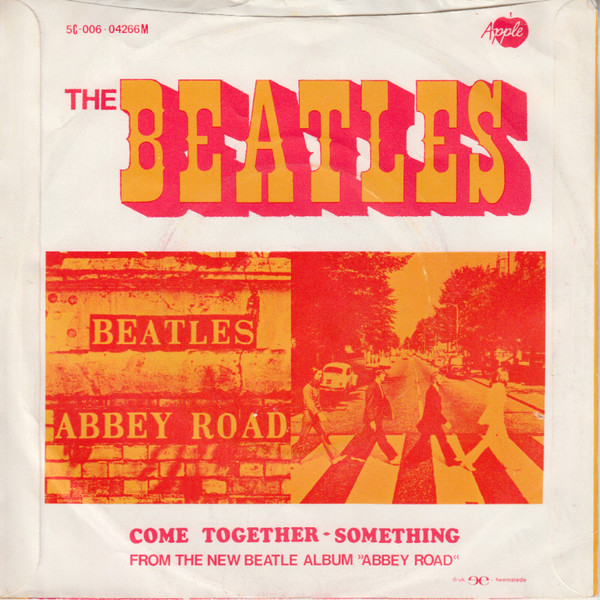
A double Lettera feature for the Dutch sleeve of the “Come Together” single by the Beatles, the opening track from their Abbey Road album released in fall 1969.
The band name on the front is rendered in tall skeletal letters with triangular terminals. They are derived from a capital alphabet drawn by Swiss designer Armin Haab. It was reproduced in the second volume of the Lettera source book series, first published in 1961. The only major deviation from the model is the letter S, which has a downward-pointing triangle at the bottom in Haab’s design. The apertures were partly filled with white areas enlivened by a spot pattern, apparently to give the spindly letterforms a bit more heft and presence. Chances are that the uncredited sleeve designer picked this style for its name: Haab baptized his creation India. One year before, in 1968, the Beatles had travelled to Rishikesh in northern India, a visit that received widespread media attention.
On the back, “Beatles” is shown in shaded Tuscan caps with mid-height spurs. This case is less clear: Judging from the proportions, counters, and placement of spurs, I believe this started out with Juanita, a capital alphabet drawn by Alex Stocker for the first volume of Lettera from 1954. If that’s true, its bifurcated serifs were closed in this application, and the original thin split shade dropped in favor of a long close shade.


")


