U-Roy – Dread In A Babylon album art
Contributed by Florian Hardwig on Feb 21st, 2021. Artwork published in
.
Epic in use for Dread in a Babylon by U-Roy. Released by Virgin Records in 1975, this album was a success in England, and laid the foundation for the international popularity of the Jamaican artist born as Ewart Beckford. Hailed as “The Originator”, U-Roy “was the prime innovator of toasting over versions of popular songs, remixed by dub music pioneers such as King Tubby. This vocal style was a major influence on early rap (Disco / Electro / Break Beat) and the later American hip-hop movement.” [Discogs] The “Godfather of Rap” died this week in Kingston at the age of 78.
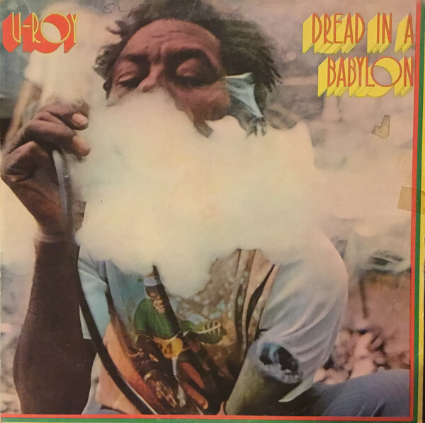
Source: www.discogs.com License: All Rights Reserved.
Front cover of TR International’s release, Jamaica, 1975.
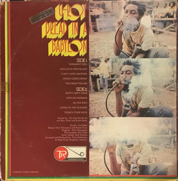
Source: www.discogs.com License: All Rights Reserved.
Back cover of TR International’s release, Jamaica, 1975.
Formats
- Album Art (3445)
Topics
- Music (5203)
Designers/Agencies
- Ken Dolman (1)
Tagged with
- U-Roy (1)
- reggae (44)
- album records (2188)
- vinyl records (2760)
- 1970s albums (286)
- Virgin Records (19)
- smoking (34)
- marijuana/cannabis (44)
- red gold and green (18)
- shadow effects (980)
- chromatic (616)
- red and yellow (142)
- all caps (5986)
- back covers (1673)
- track listings (946)
- right-aligned text (226)
- reversed type (2921)
- TR International (1)
Artwork location
- United Kingdom (2766)
- London (1525)



















2 Comments on “U-Roy – Dread In A Babylon album art”
I think the early version of Epic was from Elongated Thin Antique by M. Moullet from a 1946 Alphabets Publicitaires book according to Daylight Fonts:
It’s definitely related in style! The key difference (to me) is in the format: Elongated Thin Antique is not a typeface, i.e. it wasn’t produced as a font of metal (or wood) type, and hence couldn’t be (easily) used to set words and lines. It’s rather a piece of lettering: a model alphabet meant to provide inspiration for people who had to draw letterforms themselves in their line of work. Keep in mind that in the first half of the 20th century, a lot of text wasn’t typeset, but still drawn or written by hand.
Some of the alphabets shown in Moullet’s work were turned into digital fonts – a process that would make them typable and, along the way, define metrics (how wide is the space to the left and right of each letter?) and add semantics (is the round-top A assigned to the lowercase, or is provided as stylistic alternate?) – but as far as I can tell, this one is not among them.
This kind of playful mix of wide and narrow letterforms (as well as rounded and pointed forms) was a popular theme in Art Deco. One design from that era that was produced as a proper typeface is Maximilien Vox’s Banjo (1930). Shown below is a specimen by Deberny & Peignot. The copy reads “Avez-vous toujours un bon dessinateur sous la main? Sinon, le charactère qu’il vous faut c’est Banjo” – which translates to “Do you always have a good draftsman on hand? If not, the typeface you need is Banjo”. This refers to the advantages of the format: a draftsperson could draw such letters, either by referring to a model like Moullet’s, or by virtue of their own imagination. With a typeface, publishers became independent of the drawing skills of their staff.