Luiz Bonfá – Jacarandá album art
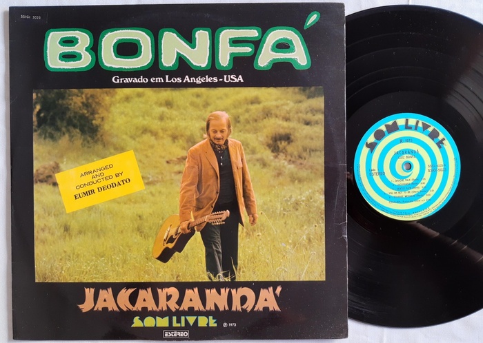
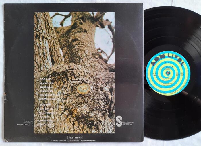
Jacarandá is an album by prolific Brazilian guitarist and composer Luiz Floriano Bonfá (1922–2001). It was released in 1973, with two different cover designs. Ranwood’s version features a photograph showing a peculiar detail of a tree (a Jacarandá?), taken by Bonfá himself. Domestic label Som Livre apparently didn’t trust the commercial appeal of this find. They relegated the bark to the back, and rather went with a photograph of the artist and his guitar for the front cover. This picture was taken by his wife, singer and songwriter Maria Toledo (1937–2010).
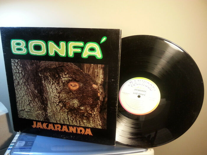
Front cover of the Ranwood Records pressing.
The typography of both versions features two rare and spectacular typefaces. Bonfá’s name is set in Aztec. This wide all-caps sans with rounded corners was shown by Californian phototype service Lettergraphics in their 1968 catalog. Its unknown designer aimed for a 3-dimensional look by adding a gradient of dots. The letterforms hence resemble worked stones as found in meso-American monuments. On the album cover, the gradient isn’t smooth: the inner parts are printed in a light green, the edges in a dark green, separated by a jagged inline in white. The acute accent on the A probably wasn’t included in the font, and added ad hoc.
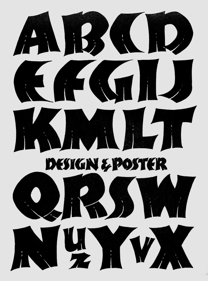
“Design & Poster” – alphabet by Ross F. George as shown in the 13th edition of his Speedball Text Book (1938).
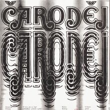
The typeface used for the title is an interesting one, too. It’s shown by Lettergraphics as Split Ends in their 1976 catalog (but not yet in one from 1969). The same face is reproduced under the name Split Caps in Castcraft’s Enyclopedia of Phototype Styles (1978) as well as in Special Effects and Topical Alphabets, a source book compiled by by Dan X. Solo and published by Dover in 1978. The design goes back to an (incomplete) alphabet by lettering artist Ross F. George, presented on a page labeled “Design & Poster” in the 13th edition of his Speedball Text Book from 1938, with less detailing than the phototype adaptation(s). There are various digital interpretations.
The Brazilian pressing additionally has a line in Windsor, proudly announcing that the record was “gravado em Los Angeles–USA”. The Som Livre logo is in Riverside Drive (ca. 1970), and “Estereo” in Stop (1971). The yellow sticker-like addition combines a wide sans and a serif, both in all-caps. These could be Trade Gothic Extended and Bodoni Bold.
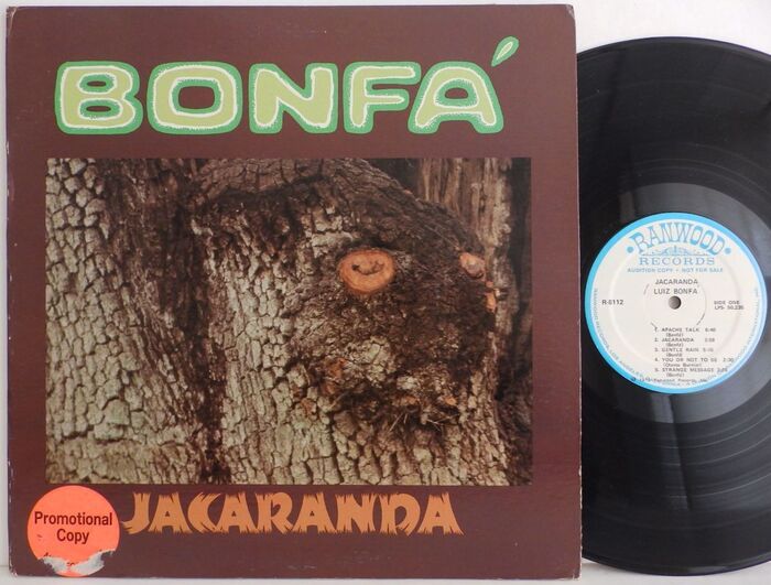
Front cover of a promotional copy of the Ranwood Records pressing.
Formats
- Album Art (3439)
Topics
- Music (5197)
Designers/Agencies
- unknown (3288)
Tagged with
- Luiz Bonfá (1)
- Ranwood Records (5)
- Som Livre (2)
- Música Popular Brasileira (MPB) (17)
- Latin jazz (26)
- jazz (403)
- album records (2182)
- vinyl records (2754)
- trees (79)
- guitars (138)
- 1970s (1355)
- 1970s albums (285)
- type on an angle (1068)
- diacritics (137)
- Portuguese (language) (415)
- back covers (1671)
- track listings (943)
Artwork location
- Brazil (451)



















4 Comments on “Luiz Bonfá – Jacarandá album art”
Here’s a better view of Aztec’s speckle pattern, extracted from a showing in Lettergraphics’s 1976 catalog.
Do you have any more info about this specific catalogue? And do you know if there a full specimen of Aztec in it? Searching 'Lettergraphics’s 1976' isn’t giving me much love in return.
The 1976 catalog is titled The Complete Lettergraphics Library. It is of a very tall format with a brown cover and a plastic comb binding. And no, it doesn’t have a full specimen of Aztec in it, just a one-line sample and the enlarged glyph shown above.
If you go to the Aztec typeface page, you will find a link to my scan of a different specimen from 1969 – which is also included in this post, see above. It has a full glyph set including numerals (assuming that the zero is identical with the letter O) and basic punctuation – but some glyphs are shown at a small size only, and the whole reproduction is rather coarse. I’m not aware of a complete showing of better quality.
Thanks for the info Florian.