
Kingdom Come: Deliverance

Kingdom Come: Deliverance is an action role-playing video game developed by Warhorse Studios and published by Deep Silver for Microsoft Windows, PlayStation 4 and Xbox One. It is set in the medieval Kingdom of Bohemia, an Imperial State of the Holy Roman Empire, with a focus on historically accurate content. It was released worldwide on 13 February 2018. — Wikipedia
The logo is in Rudolf Koch’s Maximilian. The blackletter face is accompanied by 1529 Champ Fleury, a crude roman digitized by Gilles Le Corre.


Web graphic presenting a map, books and other fan merchandise.

In-game graphics with stats and menu in 1529 Champ Fleury.
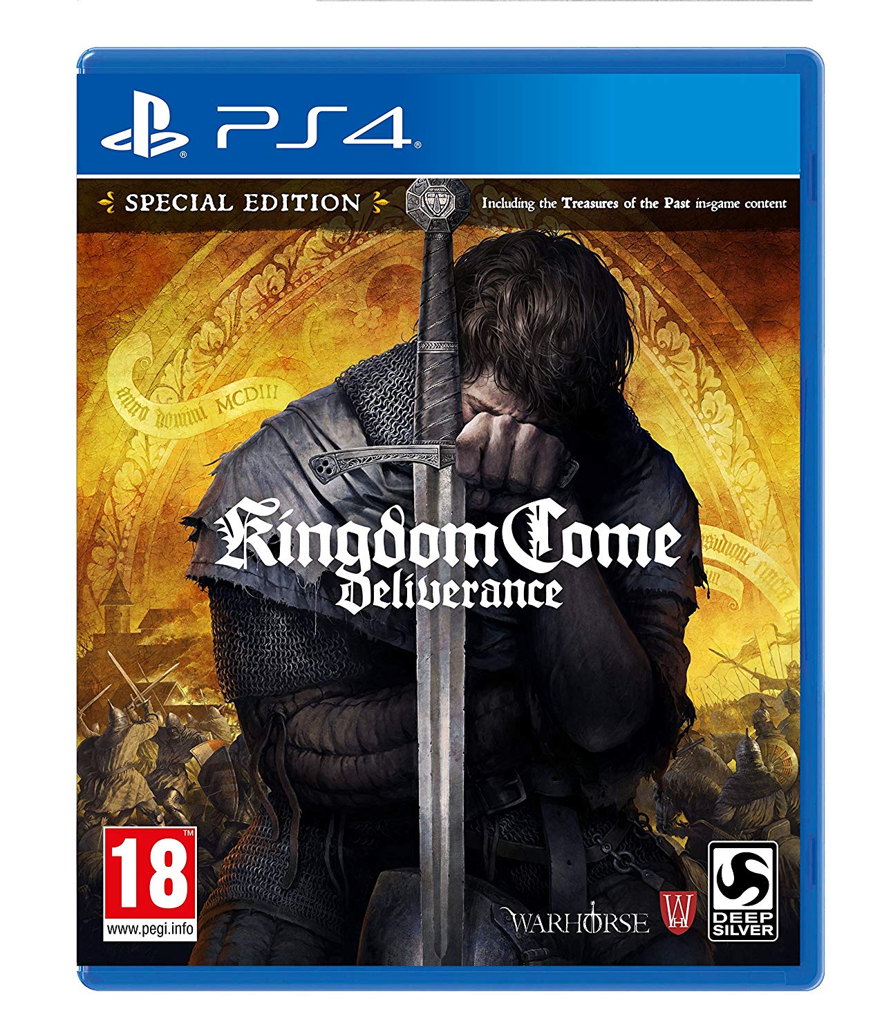
Packaging of the Special Edition for PlayStation 4.

For the Russian website, 1529 Champ Fleury was replaced with Mikadan, see comments.


")


4 Comments on “Kingdom Come: Deliverance”
It seems weird to me to have the grungy text with the crisp blackletter
Agreed, although the blackletter isn’t exactly crisp either. It’s a pity that designers of historical games often overdo the amount of faux patina.
They have put quite some effort into tweaking Maximilian, and used its decorated initials for the logo. Not sure which of the many digital versions they started with. The rounded i dot suggests it might have been Dieter Steffmann’s crude freebie version. In any case, it’s heavily customized: a got a less ambiguous double-storey form, v was opened up. “Artbook” introduces a new A, and k looks homemade and more like a tz ligature (related: a knockoff of Wilhelm-Klingspor-Gotisch has the tz glyph included as k), and the H in “Hans” was romanized, too. “Soundtrack” features Maximilian’s single-storey a, but here d is a mirrored b, and the counters of S were opened up.
I’m amazed that Gilles Le Corre went to such lengths to equip his 1529 Champ Fleury with language support for Baltic, Central European and Turkish. Then again, in the book the facsimile font is based on, the Champfleury from 1529, Geoffroy Tory “put forward the idea of accents, the apostrophe, the cedilla, and simple punctuation marks” [Britannica], so it’s only logical to give it an appropriate character set. The diacritics may be just as rough and unpolished as the rest of the typeface, but at least technically, this made the font suitable to be used for the Czech and Polish versions of the Kingdom Come website, too. The font doesn’t cover Cyrillics, that’s why the designers switched to Mikadan for the Russian website. I’ve added an image of it to the post.
Here’s how the logo would look like when set in Dieter Steffmann’s digitization of Maximilian (top), compared to the actual logo (bottom). Spacing adjusted. K and C are from the Zier style, in a bigger size and lowered.