
The Barbarian Nurseries
Contributed by Stephen Coles on Jan 28th, 2019. Artwork published in
September 2011
.
Source: rodrigocorral.com License: All Rights Reserved.
Design: Elena Giavaldi, Rodrigo Corral Studio. Art direction: Rodrigo Corral. Art direction at Farrar, Straus and Giroux: Susan Mitchell.

Source: www.amazon.com License: All Rights Reserved.
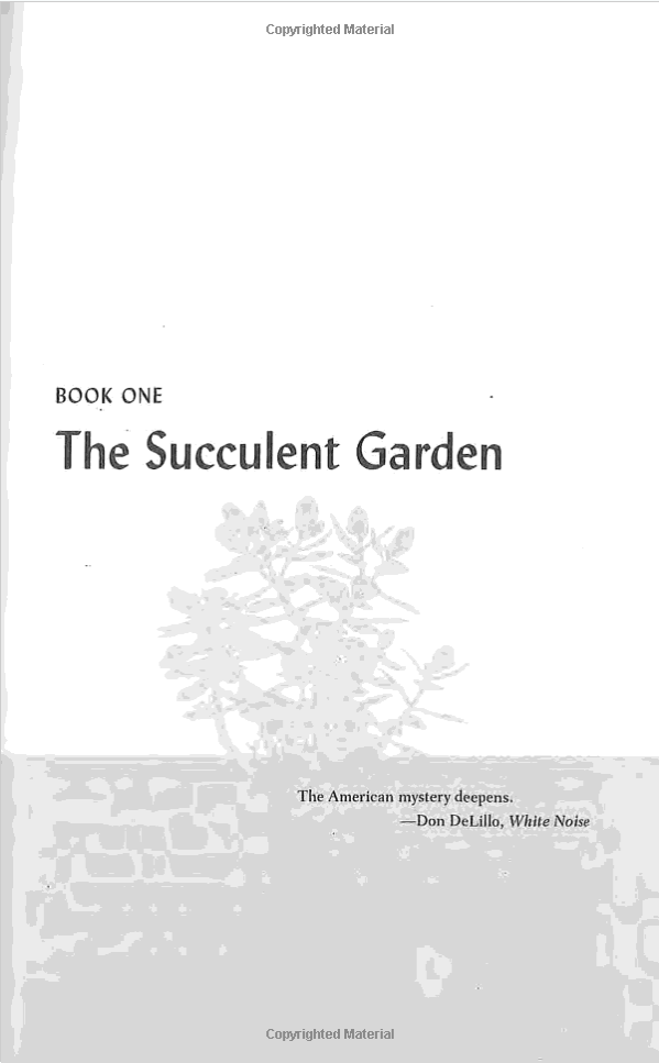
The interior of the paperback edition (Picador, 2012) was designed by Jonathan D. Lippincott. It also uses Lydian, for the title page, chapter openings, running titles, page numbers, and initials.

Source: www.amazon.com License: All Rights Reserved.
Source: www.amazon.com License: All Rights Reserved.

Source: www.amazon.com License: All Rights Reserved.

Source: www.amazon.com License: All Rights Reserved.


")

")


</span>")


")


")


")

")


9 Comments on “The Barbarian Nurseries”
I note here for posterity the trend of Lydian on new books nowadays.
The collection of Lydian on Fonts In Use shows the same pattern, when sorting Lydian on artwork date: uses from the 1940s–1960s followed by a void; Friends (1993); and a series of book covers from the 2010s on.
Thanks for posting the link to Kaitlyn Tiffany’s article! I’ve been meaning to add it myself, you beat me to it. I’m pretty sure Stephen’s recent posts featuring uses of Lydian were motivated by her synopsis. Tiffany writes that Lydian –
This is not entirely accurate. Lydian was used for the 2011 reissue of Woolgathering by New Directions. The original edition of Patti Smith’s book from 1992 was published in the Hanuman Books series and used different typefaces, namely Kompakt and Brush Script. I’ve added a post about it.
It’s true that Lydian recently has seen a major revival that started about a decade ago. Rodrigo Corral was among those who fueled it, as documented by Stephen. One of the earliest re-adopters was Bureau Mirko Borsche with their rebranding of the Thalia Theater in 2009. This iconic and controversial use is included in the article, but hasn’t been documented on Fonts In Use yet.
Tiffany mentions Lydia, released by Colophon in 2013, and describes it as follows:
It’s worth pointing out that Lydia is a pretty direct revival of Lydian Bold Condensed and Bold Condensed Italic, designed by Warren Chappell in 1946 and marketed by ATF from 1949 on [McGrew]. As such, it’s part of the original family. Here are two in-use examples from 1955 and 1965.
These minor inaccuracies aside, it’s great to see general-interest media channels like Vox’s The Goods discuss typeface trends! We’re honored that Fonts In Use could serve as a resource for this.
Here’s what Cynthia Hollandsworth had to say about Lydian. Her take might be extreme, but I’d argue it’s nevertheless representative for Lydian’s perception in the 1980s, 1990s, and early 2000s. This might help to explain the void mentioned by Matthijs:
From: Types Best Remembered/Types Best Forgotten. Edited by Robert Norton. © 1993 Parsimony Press. Yes, this is a book worth reading! You can get it from Oak Knoll Books.
As Tiffany implies in her piece, I think Lydian’s recent popularity has a lot to do with a nostalgic impulse — not only for retro book covers, but hand lettering in general, which the typeface strongly resembles.
There is a second factor at play. Nostalgia or – more generally and less judgmentally – the analog and handmade (real or faux), can be signified in many different ways.
Lydian occupies a special niche. It’s for those who don’t want to use scripts and other informal, animated, non-standard typefaces (let alone actual hand lettering), but still want to communicate “organic” somehow. The best shortcut to do so is via stroke contrast. Nothing says “calligraphic” faster than the implied broad-nib pen. With Lydian, one can achieve this goal without having to leave the comfort zone of the plain sans serif, which is the standard letter of today (to a much wider extent than it used to be in 1938). Lydian is a dressed skeleton: It brings in lots of the tool, but very little of the hand – that’s what I read into Hollandsworth’s rant about “its simplistic shape”. Lydian is back in fashion because it combines the simplicity of the modern sans with the aura of the handmade.
It’s not by coincidence that in virtually all the contemporary examples, Lydian is used exclusively in caps. Its lowercase would tell a different, less sterile story, with the more complex forms for a and especially g which are not found back in the ordinary sans serifs, or the diamond-shaped dots which are just a tad too explicit. Likewise, it’s not by coincidence that Robinson (2016), a recent addition to the genre, has a single-storey g and round dots, for a wider usability.
I didn’t even notice my comment got published! I waited for a while and figured it must have simply been a stupid comment, so I contented myself with making a set about this. I just noticed this conversation by accident while browsing Twitter. Cool comments, Florian!
Harbour is a more modern face that combines basic roman forms with stroke contrast, but with more contrast. It is also used most often in caps. If we consider Harbour as the modern Lydian, then the concept of Lydian never really went away. I really liked when they were combined here.
Hi Thiago, in your user account settings, you can choose to get notified when someone comments on a Use upon which you have previously commented.
Harbour is indeed another interesting design that has been popular over a long time, and especially in recent years. It was released in 1998, but almost all of the 100+ Uses documented on Fonts In Use so far stem from the past decade, and the vast majority from the past five years. In parts, this probably has to do with the fact that it’s not that easy to find images from 20 years ago, but to some extent, Harbour also might have been a little ahead of its time – it’s a slow burner!