“Mundus ante nos est.” Class of ’84 graduation card
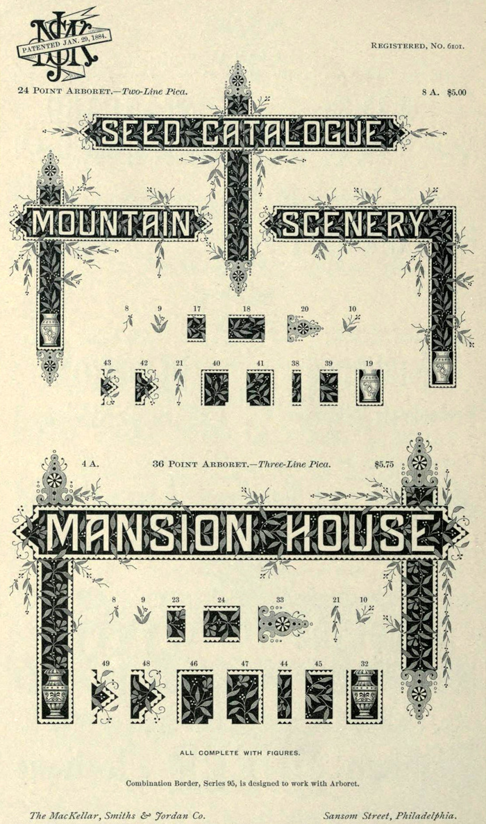
Mackellar, Smiths & Jordan specimen, 1892.
In January 1884 Herman Ihlenburg patented Arboret, a complex typeface made of decorative gothic letters reversed out of a black, bordered band and ornamented with leaves and berries (or olives). Like Ihlenberg’s later Arboret No. 2 and Stipple, the type’s background pattern is continuous, disguising the separate metal pieces and binding lines of letters together in a seamless way.
This card, found by ephemera collector Alan Mays, celebrates the “Class of ’84” from an unknown institution. If it was printed in that same year it would be one of the earliest uses of Arboret. It could well have been printed later than 1884, however.
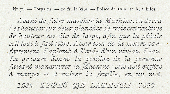
The charming and curious italic at the top of the card matches a face called Fantaisie Italique by French foundry Berthier & Cie, and Skelett-Kursiv by German foundry Klinkhardt. Its origin is unknown and it was probably available from other companies (including American foundries) under different names.
The italic names are set in one of the many generically named Modern or Scotch typefaces of the Victorian period.
Formats
- Ephemera (1035)
Topics
- Education/Academia (1807)
Designers/Agencies
- unknown (3291)
Tagged with
- graduation cards (1)
- business cards (1243)
- staircase lines (61)
- 1880s (26)
- early uses (1740)
- only type (1106)
- ornaments (118)
- Latin (language) (33)
- mottos (17)
Artwork location
- United States (8320)
In Sets
- Antique (John Randall) (11)
- 1800s (Arin Ringwald) (26)
- _st (GareyAdey) (75)

![“Mundus ante nos est.” [The world is before us.]](https://assets.fontsinuse.com/use-media/73205/upto-700xauto/5bda9814/1/jpeg/8476352578_ffd1299761_b.jpeg)

















2 Comments on ““Mundus ante nos est.” Class of ’84 graduation card”
Beautiful card, and I love the look of Fantaisie in particular—it’s both elegant and playful. It reminds me of Aldine cursive, the type W. A. Dwiggins developed for Underwood in the early 1930s (which I recently encountered for the first time in Bruce Kennett’s great WAD book.)
Yes, some of the forms and ball terminals in Fantaisie do bring to mind typewriter italics like Dwiggins’. See also Light Italic, Glovis, Vulf Mono, Lacrima, and Pitch Italic. Though these all have much less stroke contrast than Fantaisie.