
WAR IS OVER! (If You Want It)
50 years after its original launch, John Lennon & Yoko Ono’s simple anti-war campaign is just as effective as ever.
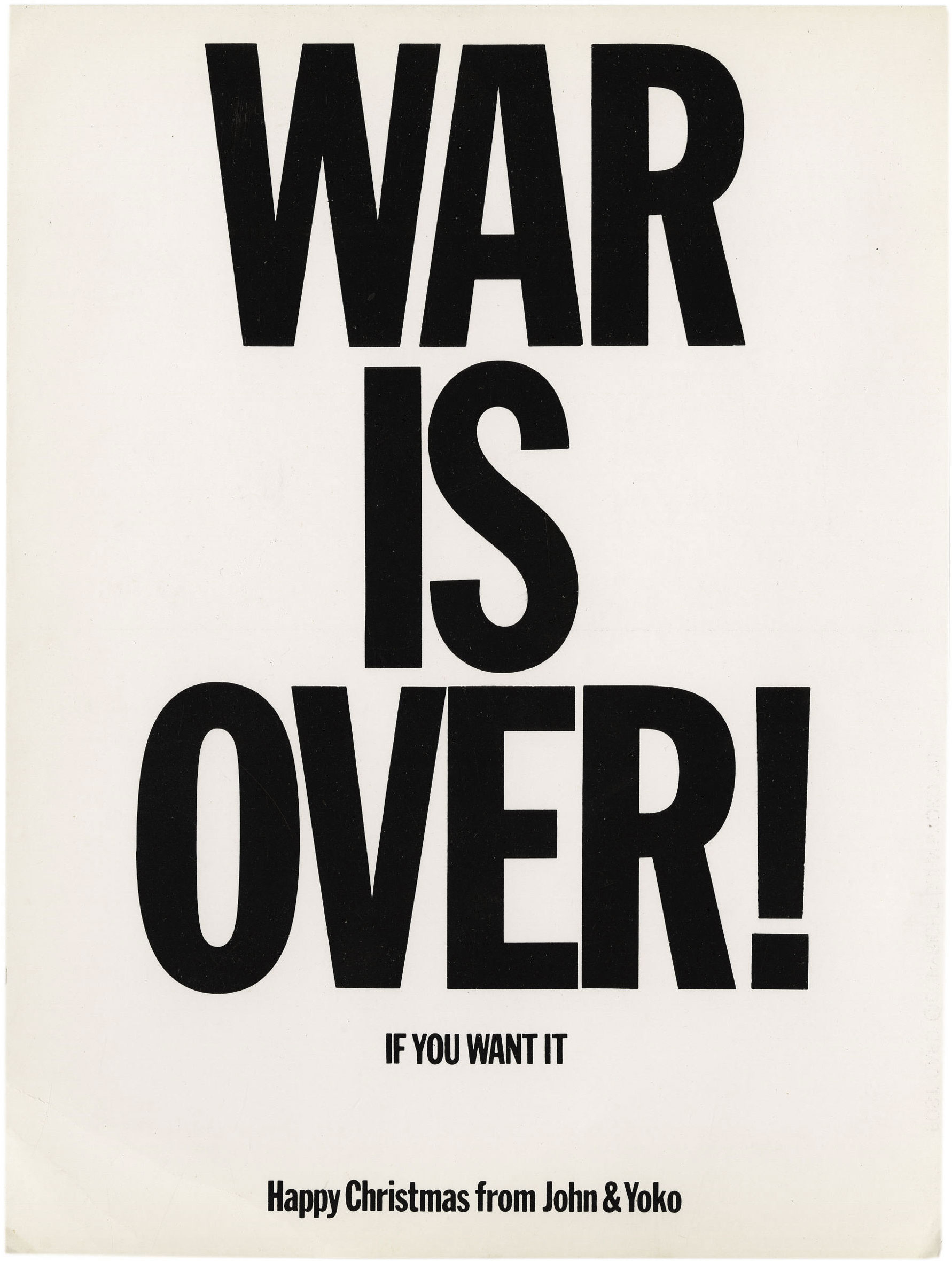
Original WAR IS OVER! postcard.
The War Is Over! campaign for peace was launched 50 years ago this week by Yoko Ono & John Lennon. On December 15, 1969, a series of billboards, leaflets, posters, newspaper ads, and radio announcements were released in 11 cities worldwide with a simple and immediate message: WAR IS OVER! IF YOU WANT IT.
At the end is usually a signature line, stating either “Happy Christmas from John & Yoko” or something more secular like “Love and Peace from John & Yoko” or, simply, “Love, John & Yoko”.
Yoko Ono conceived the basic idea for the poster, which was expanded into an international campaign, co-opting the techniques of advertising and political propaganda to promote peace. In a short video about the campaign, Lennon explains:
We decided to work for world peace. We do it by the advertising method. We believe that [in] today’s society advertising is the thing politicians use and commercial companies use, the Beatles used it, John & Yoko should use it. Our product is peace.
We’re selling it like soap, you know. And you’ve got to sell and sell until the housewife thinks “Oh, well there’s peace or war, that’s the two products.”
We specifically did the poster event around the world for Christmas to try and get at least one plug in for peace on earth at Christmas.
The design for the campaign is starkly simple. “WAR IS OVER!” is declared in bold, all-caps, sans-serif text, functioning as the attention-grabbing “second coming” headline bait. The smaller “IF YOU WANT IT” line then switches the focus back on the reader, employing Ono’s concept for empowering the viewer to finish the work.

John & Yoko at the Apple Records offices in Savile Row, December 1969. Note the French and German versions in the background.
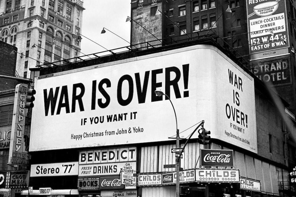
Times Square, New York City, December 1969. The text on this billboard is not set with type, but uses non-typographic lettering that was presumably more practical to apply at such a large scale.


1912 type specimen of Franklin Gothic Extra Condensed from the American Type Founders Company.
Most implementations of the design are typeset with tightly-spaced, center-aligned Franklin Gothic Extra Condensed – a common typeface for newspapers throughout the 20th century that, along with the capitalization and exclamation point, gives “WAR IS OVER!” the intended feeling of a breaking news headline.
Many of the posters and billboards don’t use Franklin Gothic but employ other typefaces or even hand lettering that may have been more practical for larger formats while still roughly approximating the style. Deviations from Franklin Gothic are especially visible in the signature line at the bottom of some of the original posters, where the text seems to be rendered with hand-cut lettering.

Original WAR IS OVER! poster with letterforms that are similar but noticeably different from Franklin Gothic.

Detail of idiosyncratic lettering – presumably cut by hand – from an original WAR IS OVER! poster.
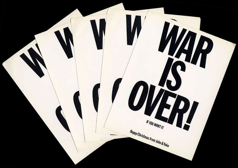
Original WAR IS OVER! postcards.
In an interview with Marshall McLuhan, Lennon mentions a shop in New York that perhaps did the original typesetting and/or chose Franklin Gothic, though it’s unclear how much detailed typographic direction was given by Ono & Lennon:
And it started up, there’s a place in New York, where you can have your own newspaper headline, you know. There’s a little shop somewhere in Times Square. And we were wondering how to, sort of like, get it in the newspapers as if it had happened, you know. And it developed from that.
To launch the campaign, a “Peace for Christmas” concert was held at London’s Lyceum Ballroom to benefit UNICEF, with a giant WAR IS OVER! banner hung across the stage and small handbills passed out to audience members.

The Peace for Christmas concert in London.


Times Square, New York, December 1978.
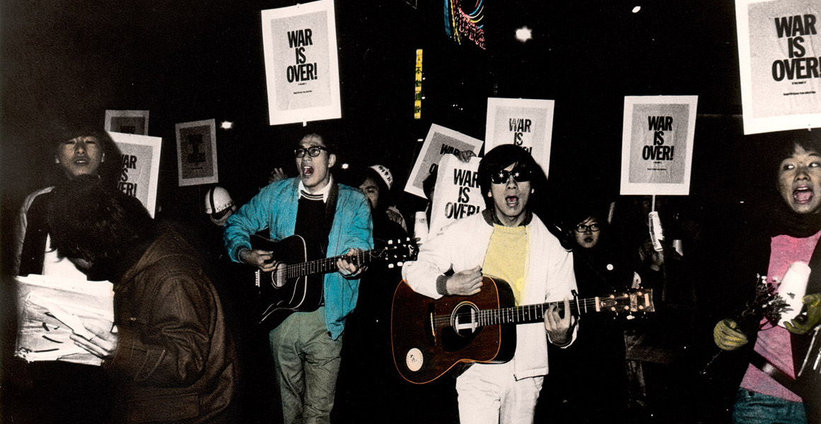
The campaign has carried on long beyond its original launch. In 1971 John & Yoko and the Plastic Ono Band released “Happy Xmas (War Is Over)” which adapts the motto into a Christmas-themed peace anthem. Billboards and posters for the campaign continue to be posted, and the design has been translated to dozens of other languages (though not always in Franklin Gothic, especially for languages that don’t use the Latin script). A website for the cause offers graphics for people to print on their own, and promotes the #WARISOVER hashtag on Twitter and Instagram.

Translations of the WAR IS OVER! design.
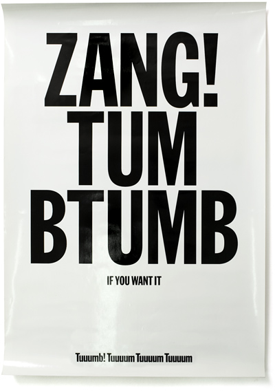


The simple but effective typographic format has inspired many similar designs – from Experimental Jetset’s Zang! Tumb Tumb and Lost & Found, to Malcolm Garrett’s “BREXIT IS OVER” cover for The New European (which they offer to download for DIY prints), to Homocats’ TRUMP IS OVER apparel.
It’s safe to say the WAR IS OVER! format has taken on a life of its own as a design meme, inspiring others to spread their own ideas to the world with simple, bold typography. ✌️

Yoko Ono & John Lennon holding an original WAR IS OVER! poster.


")


")


5 Comments on “WAR IS OVER! (If You Want It)”
There are a couple cool photos on Yoko Ono’s Flickr account of John & Yoko posing with Shoshana Ginzburg (who is unidentified in the caption) and Ralph Ginzburg in December, 1969, at the home of Ronnie Hawkins.
Ralph Ginzburg collaborated closely with Herb Lubalin on several projects, including Avant Garde magazine, and Shoshana was the Promotion Director for Avant Garde. So they had a strong connection to the world of typography and design.
In one of the photos, shown above, there is a proud display of typographic anti-war design: John & Yoko are holding War Is Over leaflets, Shoshana is holding the “No More War” call for entries, and Ralph is holding the “Fuck War” poster as it appeared in Avant Garde with the winners from that contest. An unidentified person in the background is holding up a full-size War Is Over poster. Several issues of Avant Garde are also sitting on the table in the foreground.
A series of Lennon’s erotic prints were published in the January, 1970, issue of Avant Garde (perhaps to reconcile for some earlier mix-ups), so it’s likely they were meeting to work on that. With their ties to the world of typography, it’s conceivable the Ginzburgs could have helped John & Yoko find a typesetting shop for the War Is Over campaign, but there’s no evidence to support that.
[Thanks to Sasha Tochilovsky from the Lubalin Center for offering additional background on the photo.]
Over on Twitter, Norman Hathaway commented:
To which I replied:
While the selection of Franklin Gothic could have come from such a shop or from a dedicated typesetting agency (maybe even with a connection to Ralph Ginzburg, as mentioned in the previous comment), I still haven’t been able to uncover any solid credits for the details of the typographic composition either way. I’m still following up on some leads, but any tips are welcome!
My timely parody/homage.