
Foreign Language by Flight Facilities music video
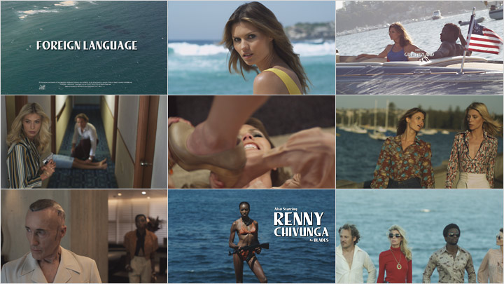
I think Lee is an objectively hideous typeface, but I can’t argue its appropriateness for this pitch-perfect ode to 1970s TV nostalgia.
“Now this is Retro with a capital 'R’. Done with an immaculate sense of styling, tongue-in-cheek, and oozing with Fun, Foreign Language is a music video by Dimitri Basil that emulates the title sequences of all our favorite vintage action films and TV shows. You name it; Bond, Baywatch, Starsky & Hutch, Charlie’s Angels.
The choice of font is really important for this video. What font did you use, and why did you select it?
Dimitri Basil: ‘I tried multiple fonts, everything that was designed before 1978. Most of the appropriate fonts created in the ’60s and early ’70s look too modern, so at the end I decided to go with Lee Bold.’
Lee was used as the titling font on the TV series Charlie’s Angels and for the original VHS mark.” — Remco Vlaanderen, Watch the Titles

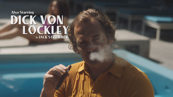
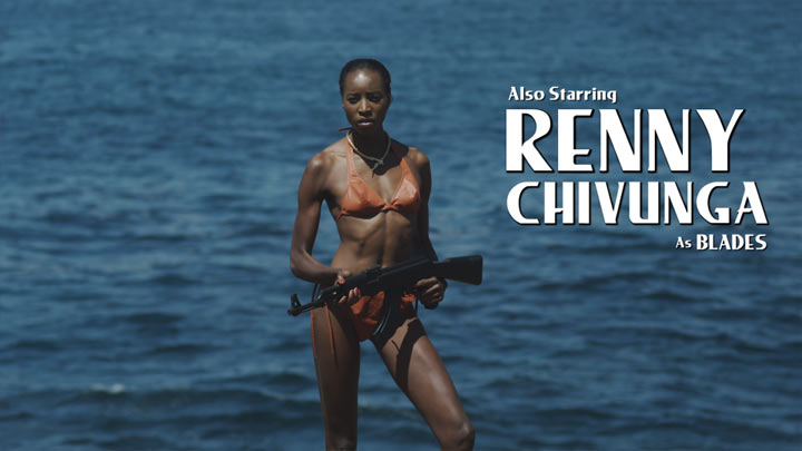
Obviously the font used lacked sufficient kerning. It is most likely “Lester Bold”, the version offered by Solotype with their Moderne Display Fonts book.


 Main Titles")


2 Comments on “Foreign Language by Flight Facilities music video”
I wonder what font he actually used since there is apparently no digitalized version. Or if he digitalized the letters himself for this purpose…
Hi Miro, please see our typeface page: There’s a digitization by Dan X. Solo, named Lester Bold. Unfortunately, it’s not really well made. Judging from the spacing/kerning problems in “HILTON” or HOSTILE”, Basil used this version.