
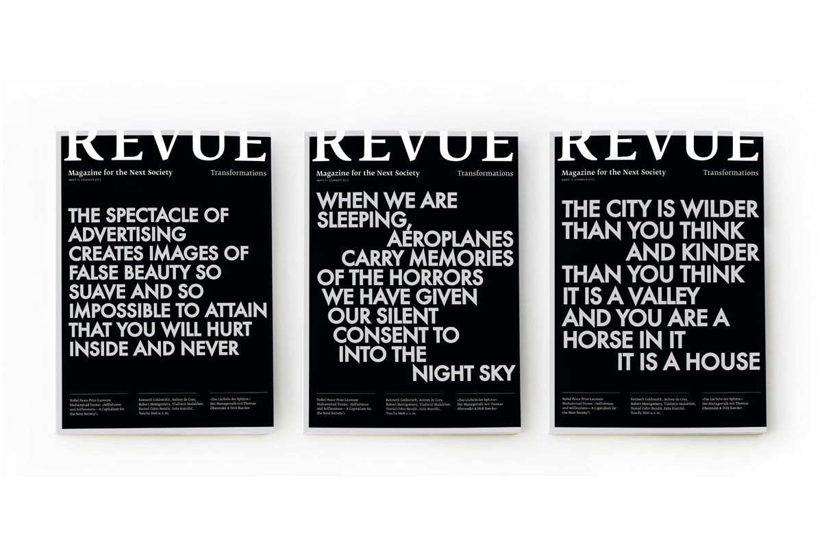
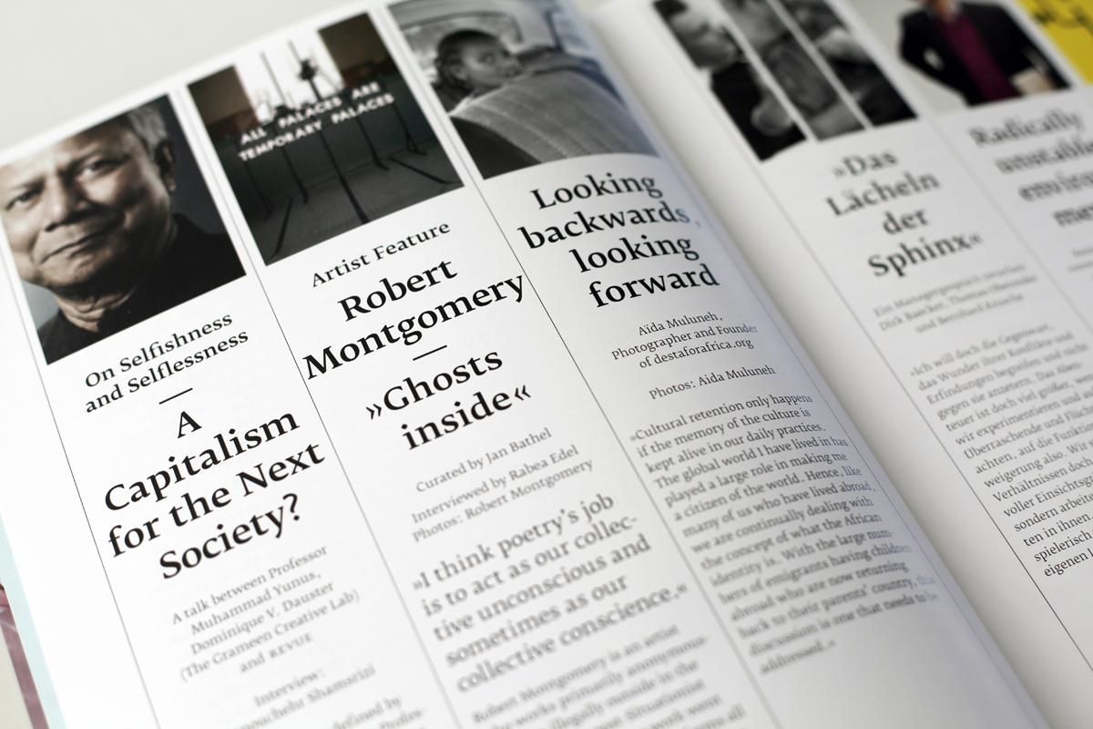
Revue #13: Transformations
Contributed by Lange Sommer on Apr 6th, 2014. Artwork published in
.


Topics▼ |
Formats▼ |
Typefaces▼ |


 album art")


2 Comments on “Revue #13: Transformations”
I think it’s not Futura, but Neutraface.
No, see ‘C’, ‘M’ or ‘G’ in Neutraface. This is Futura. The reason why it looks so weird and spikey is the fact that apparently a stroke has been added, which amplifies the overshoots.