
The Journal by Bang & Olufsen Play
Contributed by TypeTogether on Mar 15th, 2014. Artwork published in
.
Source: www.type-together.com License: All Rights Reserved.
B&O Play is part of the Danish brand Bang & Olufsen. It focuses on attractive and high quality audio / video portable products, aimed at a new generation.
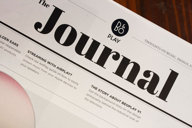
The Journal is a space where the B&O Play team share their thoughts on music, design, fashion and products. From time to time they also feature some behind-the-scenes stories from their daily lives. The Journal started as a blog, and has only recently launched the first printed edition, a high quality newspaper.
The Journal uses TypeTogether’s Abril in headlines and text throughout its three media versions: print, mobile and web, acompanied by a sans serif face.
For the magazine title the design team has chosen Abril Fatface.

Source: www.type-together.com License: All Rights Reserved.

Source: www.type-together.com License: All Rights Reserved.

Source: www.type-together.com License: All Rights Reserved.

Source: www.type-together.com License: All Rights Reserved.


 by Markus Kutter")


4 Comments on “The Journal by Bang & Olufsen Play”
This looks like another example of Gotham for print, Proxima Nova for the web.
Why is that done—Gotham for print and Proxima Nova for web?
Hoefler & Frere-Jones were not among the early adopters of webfonts, and launched their webfont service Cloud.typography only in August 2013. Before that, you simply couldn’t use Gotham on the web legally (unless you wanted to tinker with text graphics), so many designers looked for substitutes. Proxima Nova (and its predecessor Proxima Sans) has a similar look, and was hence often chosen as a replacement by publications and brands who used Gotham in print. I don’t have an exact date for Proxima’s availability as webfont, but MyFonts announced their initial webfont library of around 28,000 fonts in January 2011. I’m pretty sure that Proxima Nova – then already a bestseller – was among them.
Proxima Nova was also available as a web font via Typekit back in 2009, even when that service was still in its early invite-only phase.