
Ausdauer Muziektheater

Ausdauer, German for “perseverance”, is the name of a musical theater founded in 2011 in Rotterdam, the Netherlands. The group consists of experienced composers, musicians, actors and playwrights who firmly believe that music and acting should fuse on equal terms, and not one art serve the other. Accordingly, they exclusively develop new dramas with original, contemporary compositions, even when they deal with historic matter or reference their precursors.
Matthijs Sluiter’s Studio Het Mes from The Hague is responsible for the visual appearance of Ausdauer Muziektheater, that is, the house style and the promotional material for each year’s production. While the design of the posters varies a lot according to the piece, cohesion in the visual language is largely achieved by means of the chosen typefaces.
Since 2018, Kai Bernau’s Neutral (Typotheque) is systematically used for all reading texts, always with its alternate monocular a. The headline level displays an intriguing play with Mars, a small typeface family designed by Alaric Garnier, inspired by Venus. Interestingly, the first two members were the extreme widths, the Condensed and the Extended, released by Production Type in 2018. Studio Het Mes jumped on Mars straight away and used it for the poster for Roan / De Eeuw van Ariane. The moderate “Standard” cut of medium weight followed in 2021.

Website: overview of all performances

Poster for Die Mauer. Photo by Jeff Zimberlin.

Website: About page

Website: main menu

Website: newsletter sign-up

Postcards for De Eeuw van Ariane and Die Mauer
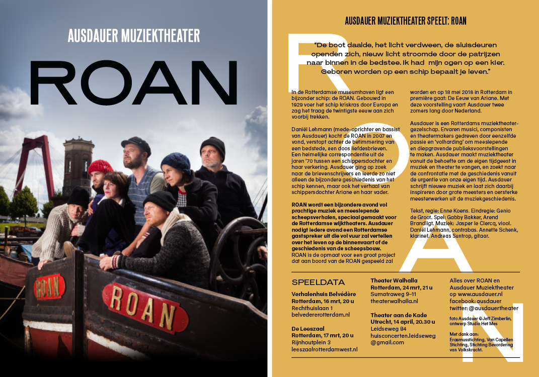
Flyer for Roan (a precursor of the groups’s play De Eeuw van Ariane). Photo by Jeff Zimberlin.
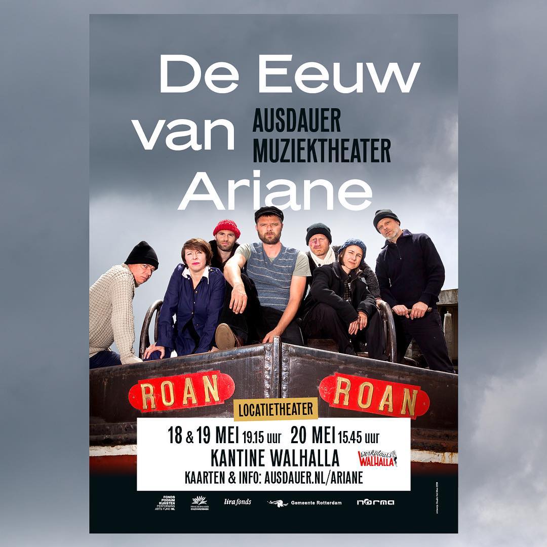
Poster for De Eeuw van Ariane. Photo by Jeff Zimberlin.
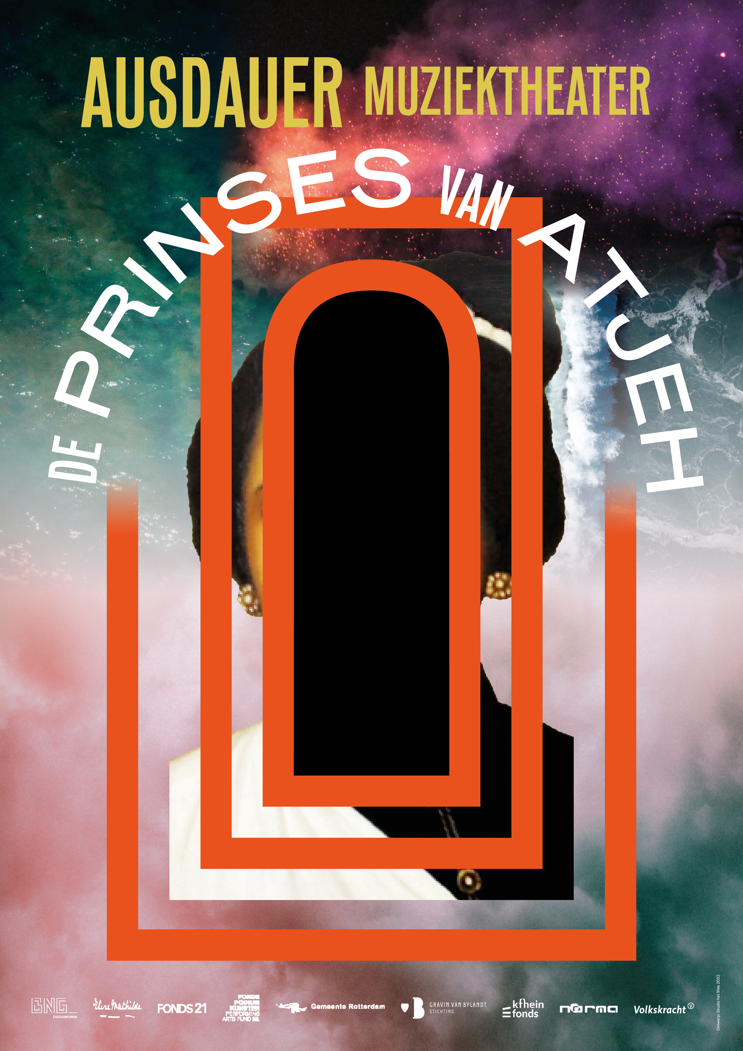
Poster for De Prinses van Atjeh, 2022, featuring the Condensed and Extended weights of Mars, the latter with the alternate R


1 Comment on “Ausdauer Muziektheater”
See also the post about the poster for L’Histoire du Diable, a play produced by Ausdauer in 2013: