
Pillar Visuals
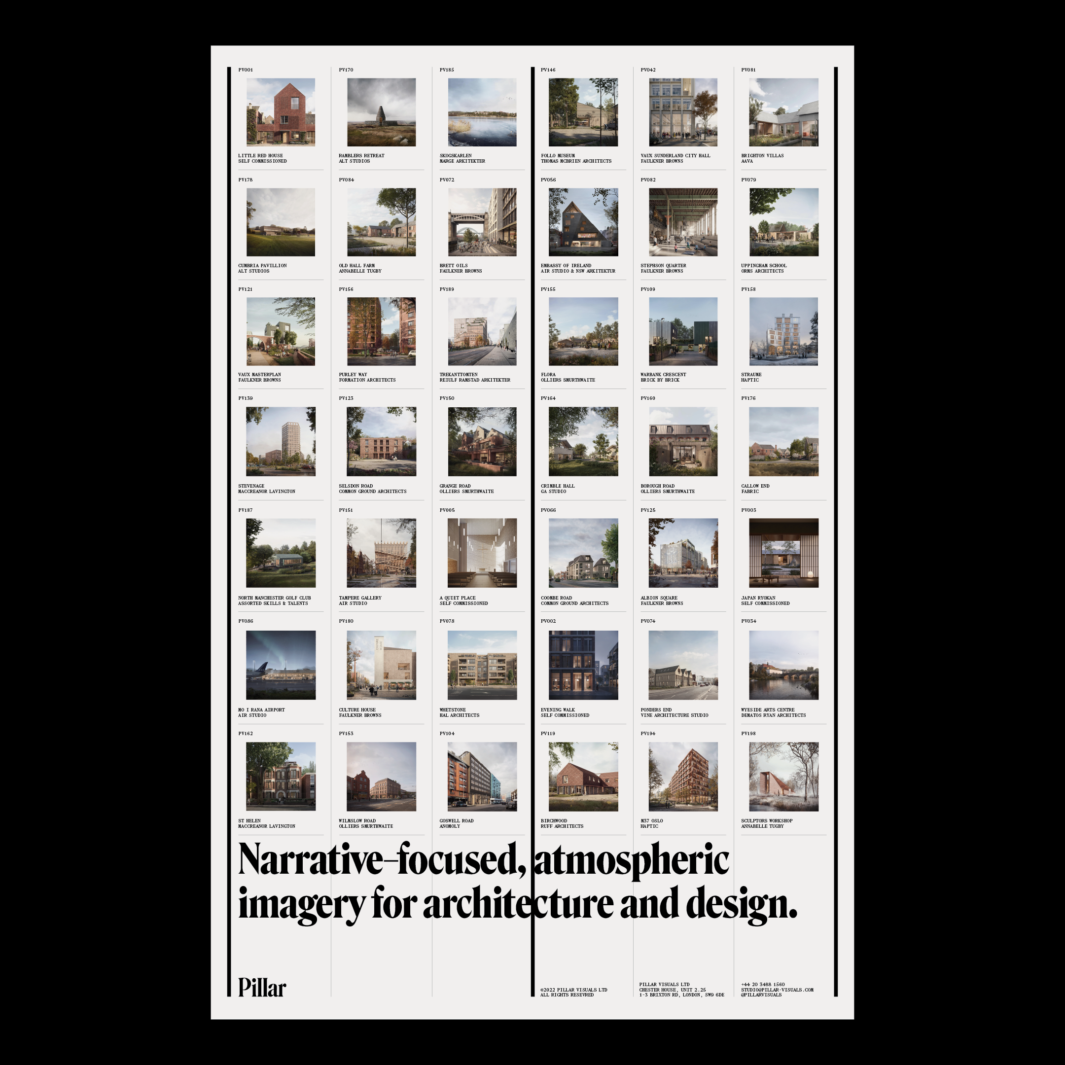
Established in 2018, Pillar Visuals is a London–based architectural visualisation studio specialising in the creation of narrative–focused and atmospheric, computer generated imagery. M. Giesser took on the strategy, communication, and design for the brand, with web development by Sam Morgan.
They use Roslindale Display Condensed for their logo (with a clever substitution! see below), Roslindale Deck in large text, and Mercure by Charles Mazé is used for small text and metadata.
In the words of the designer, M. Giesser:
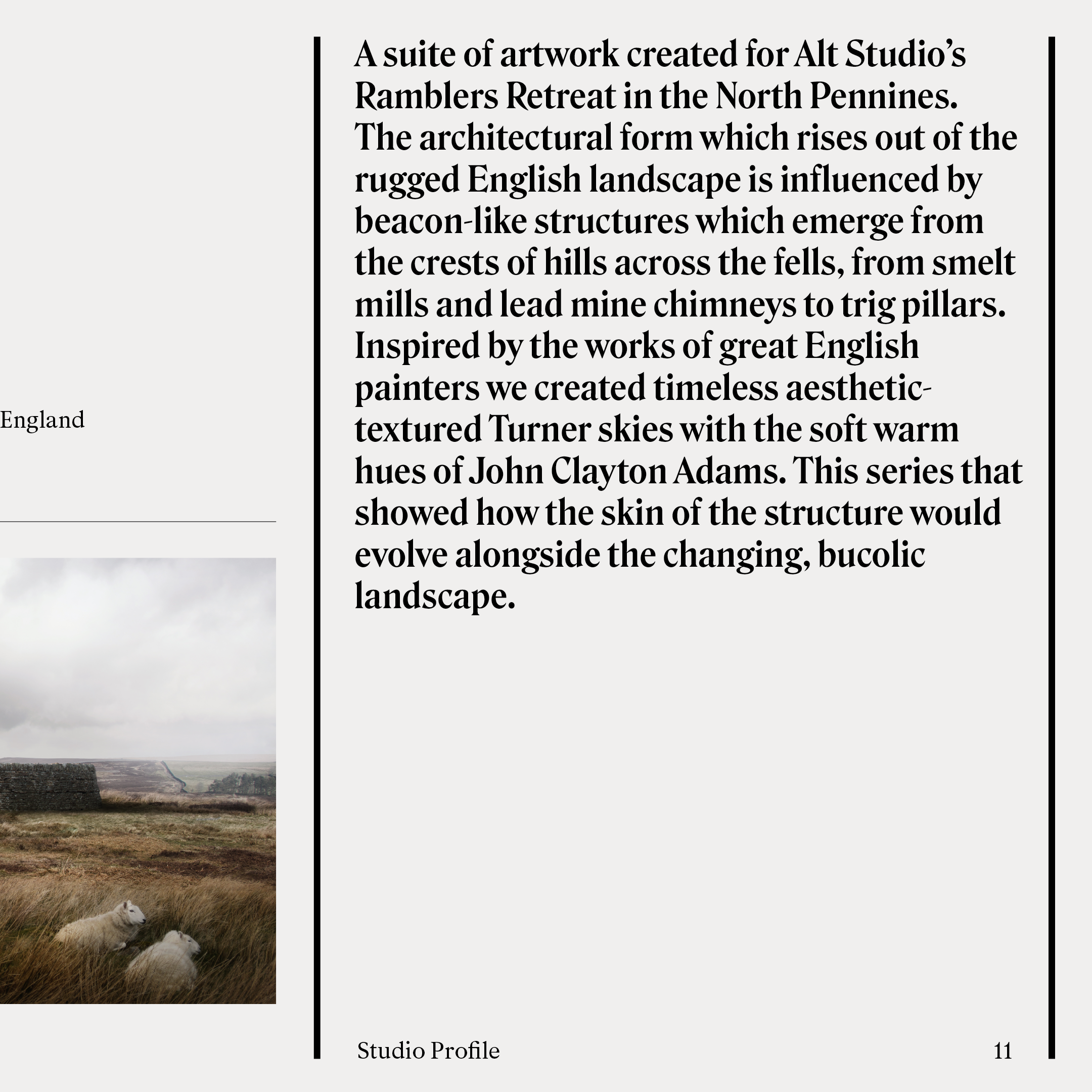
With the visual identity I wanted to ensure that the client’s inspiration (the great British landscape painters of the 19th century) felt more represented than creating something more aligned to modern architecture (clean, neutral, sans-serif). In the initial workshops, they used words like “romance”, “nostalgia” and “timeless elegance” so it was clear that I needed to develop a response that could sit comfortably in this space, while also feeling contemporary and not too “ye olde”.
The role Pillar plays is a supportive one (which is literally where their name came from) whereby their background as architects enables them to take a loose brief from their clients and be able to run with it. Often filling in any blanks / gaps as they go, which is an invaluable service. So this idea of support became integral to the identity system and is conveyed by the three heavy rules used across all communications. The rules are both ornamental and highly functional, helping to organise information. A further nod to this idea is found within the logo where I swapped Roslindale’s l’s for uppercase I’s, to create, well, pillars. It’s a bit obvious and possibly a bit cheesy but I felt it was still subtle enough for people to not even notice. The intention here was to also create something that spoke to the fact that there are two directors and while the studio may expand over time, it will always be led by these two.
The resulting identity stands apart from all the others in their competitive landscape while avoiding something that could’ve been a nostalgic nightmare / pastiche. There’s an intentional contrast between the whimsical romance of yesteryear and the strength in straightforward simplicity.


")


")


 brand identity")


