The Exorcist movie titles
The classic horror film carried over an iconic typographic style from the novel it was based on, but later editions diverged curiously.
The Exorcist is a 1973 horror film directed by William Friedkin based on William Peter Blatty’s 1971 novel of the same name. The story focuses on the demonic possession of a young girl and the efforts of her mother and a pair of Catholic priests to rescue her. Regularly named as one of the greatest horror films of all time, The Exorcist was the first horror film to be nominated to receive an Academy Award for Best Picture. In 2010, the Library of Congress recognized it as being “culturally, historically, or aesthetically significant”, and selected it for preservation in the National Film Registry.
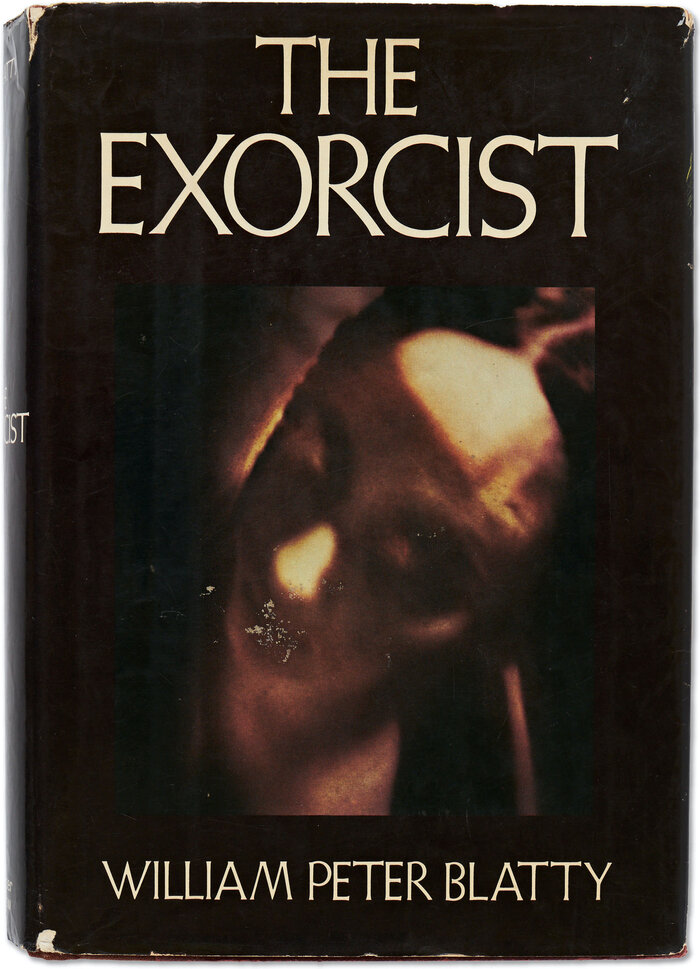
The Exorcist in its original book form served as the basis for the story and typography of the film.
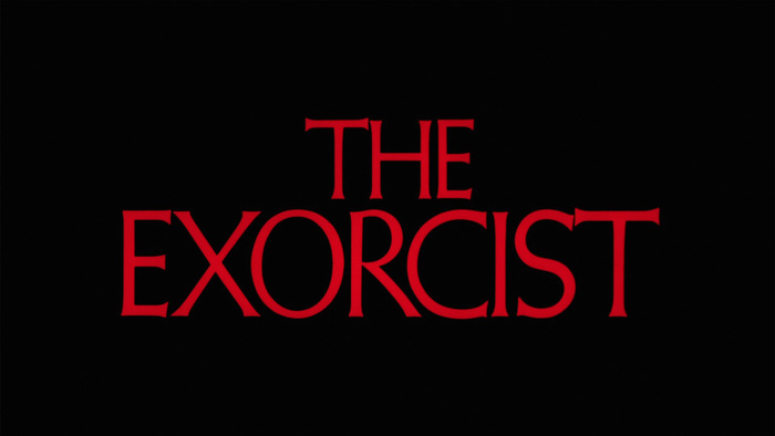
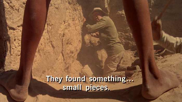
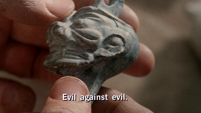
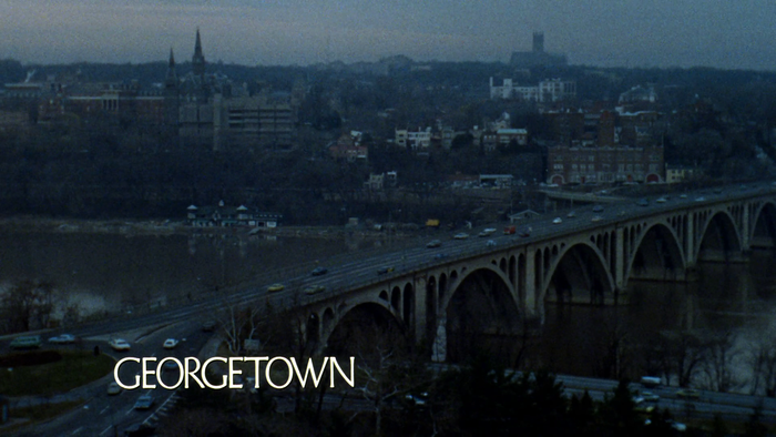
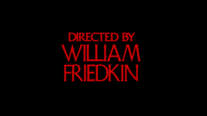
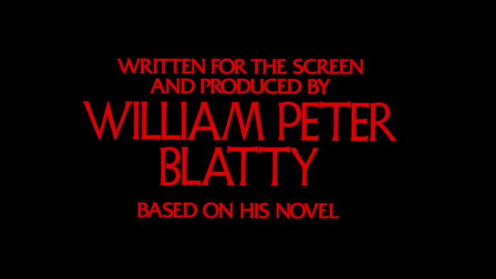
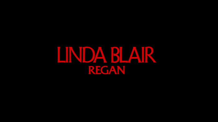
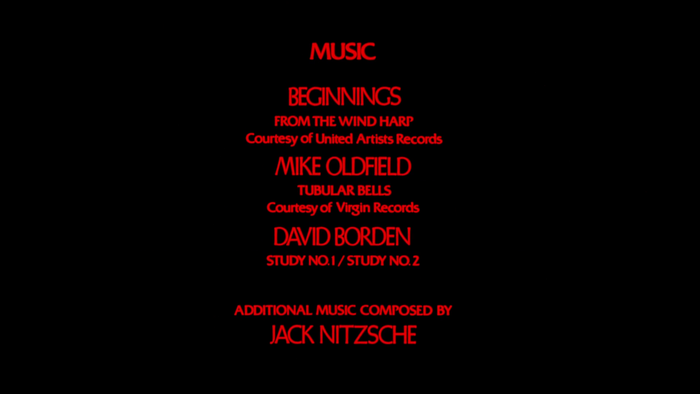
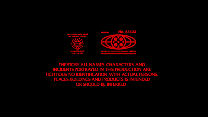
The film’s titling, by Dan Perri, takes design cues from the typography of the book’s first-edition dust jacket, designed by Frederick Cantor. Specifically, it adopts the use of Weiss Initials No. 2 for the primary title, name credits, and location intertitles. In the credits at the end of the film, Friz Quadrata is also used as a secondary typeface for role credits and other smaller type. Subtitles in the opening scenes are set in News Gothic.
Gemini is another typeface often associated with The Exorcist , due to its use on the book’s paperback edition and, subsequently, on the iconic posters for the movie. But that typeface makes no appearance in the titles of the film itself.
The Exorcist’s titles are fairly minimal, composed with static red type on a black background, but there were still technical, artistic, political, and even legal considerations behind the minute typographic decisions. An interview with Perri at The Art of the Title goes into many details about the production considerations.
For example, Perri talks about how each decision is more sensitive when there are fewer elements involved:
“The simplicity of the titles is in the delicate handling of all the elements. On screen, the fewer the elements, the more important each becomes. So we’re dealing with two elements: a screen that’s black and type, the name of the film. How those two words interact, the size relationship, the size on the screen, the placement, how it enters the screen, all those things have impact and those are all part of my process.”
The interview also touches on how the relationship between the author and director influenced details of sizing and line-breaking:
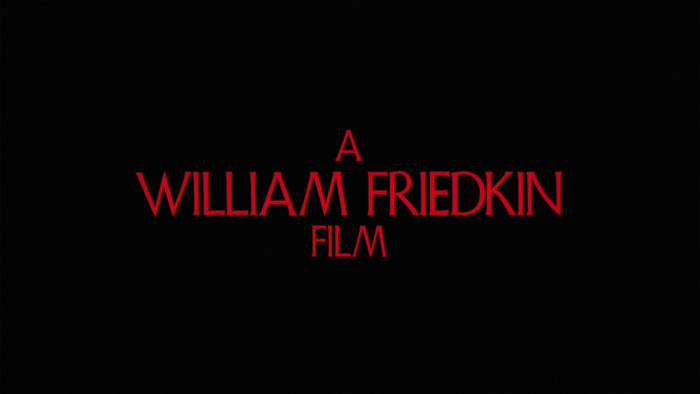
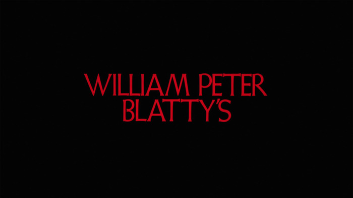
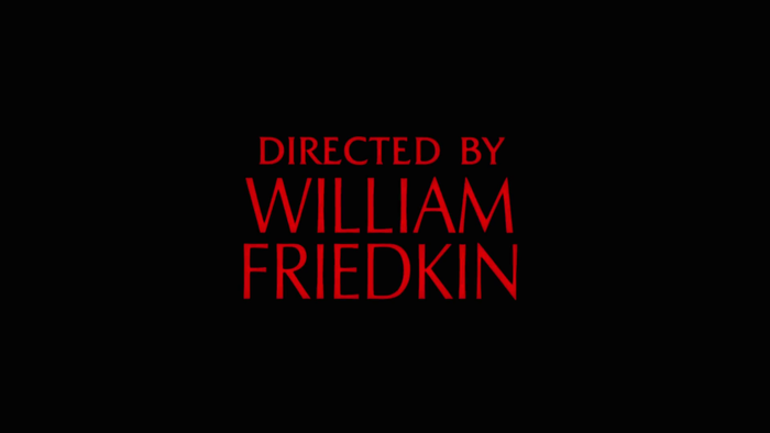
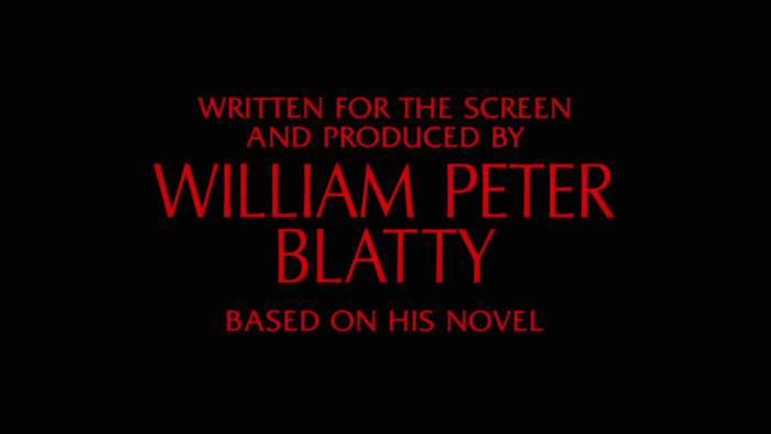
It was a well-known fact that Friedkin and Blatty were not getting along during filming, and the design of the titles reflected that tension as well as certain legal obligations. “The two credits that precede the main title have to announce the director because it’s his film, and then the writer’s connection to the film,” explains Perri.
“It’s ‘William Peter Blatty’s The Exorcist’, it’s his possessory, but then it’s ‘A William Friedkin Film.’ There are legal guidelines as well; their names had to be the same size but where Bill Blatty has three names, of course they had to be the same size. … If you look at the Friedkin title next to the Blatty title, the Blatty title looks bigger because it’s three names and two lines, whereas Billy’s name is ‘William Friedkin’ in one line. I could have stacked ‘William’ over ‘Friedkin’ the way I stacked ‘William Peter’ over ‘Blatty’. When I showed these to Billy I probably showed him a version where both their names were stacked similarly and the version we wound up using, which gave him distinction as being arranged differently than Blatty’s name.”
Perri also explains how the format of film impacted considerations for color and exposure of on-screen typography:
“Relative to putting it on the screen we all felt it had to be red. But dealing with red at all on film is always difficult because it’s so intense, the colour is so raw. When it’s exposed against black it tends to, what’s called, bloom. It swells, it glows, it’s very hard to control. I had to do a lot of exposure tests just to get the right red that wouldn’t bloom. Then the typography could do its job and convey its subtleties in the letters.”
Perri’s work on The Exorcist helped further his career in movie title design. He continued on to design the titles for other iconic films like Star Wars, Taxi Driver, A Nightmare on Elm Street, The Warriors, Raging Bull, and many more.
Changes for the 2000 extended cut
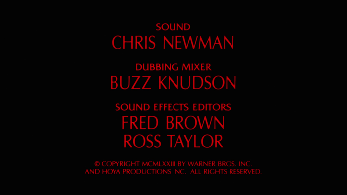
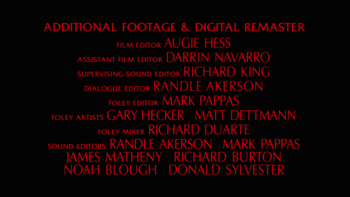
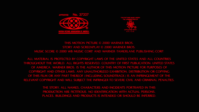
An extended “director’s cut” of The Exorcist was released in 2000 with a handful of new scenes not included in the original theatrical release. That newer version of the film retains the use of Weiss Initials for the introductory titling as well as the intertitles, but for some reason the main title and other credits at the end of the film replace Weiss Initials with Optima. It’s a curious replacement, especially because the layouts seem to be nearly identical to corresponding credit screens in the original.
The replacement may have been related to practical availability though. Since the new edition of the film required additional screens of credits for digital remastering etc, those screens would have required new typesetting. But in 2000 there doesn’t seem to have been a properly authorized and/or high-quality version of Weiss Initials that was easily available for digital typesetting. So it’s possible that instead of having mis-matched type for the old and new credits, or having the new credits typeset with letterpress type, everything was reset for consistency using the digital fonts that were available. (One of the new credits of the extended cut for “additional visual effects” is given to Pacific Title, a producer of film title sequences that may have handled the new typesetting.)
For more info on the typography of The Exorcist, check out The Art of the Title’s interview with Dan Perri, and the other posts here at Fonts In Use about the iconic movie posters as well as the book’s first hardcover and paperback editions.
Formats
- Film/Video (869)
Topics
- Entertainment (1298)
- Religion/Spirituality (334)
- Film/TV (1670)
Designers/Agencies
- Dan Perri (5)
Tagged with
- The Exorcist (6)
- film (175)
- title sequences (319)
- intertitles (19)
- reversed type (2921)
- red and black (1002)
- center-aligned text (1567)
- subtitles (13)
- horror (179)
- devils (17)
- tight letterspacing (736)
- supernatural (26)
- all caps (5981)
- Warner Bros. (32)
- occult (35)
- William Peter Blatty (4)
- William Friedkin (3)
- various editions (77)
- end credits (111)
- title cards (61)
- alternate versions (32)
- tight-not-touching (251)
- equal billing (4)
Artwork location
- United States (8320)
In Sets
- cool (Luke Brickett) (32)



























2 Comments on “The Exorcist movie titles”
Incidentally, many pieces of the marketing for 1974’s demon-possession film Beyond the Door – which was widely panned as a cheap knock-off of The Exorcist – featured Optima (and its sibling, Palatino).