
Rencontres d’Arles 2021

The Rencontres d’Arles is a photography festival taking place each summer in the city of Arles, in the south of France. Since 1970, the year of its creation, the Rencontres d’Arles has become an institution and a springboard for emerging photographers and creative talents: the festival is now considered as a major influence in the dissemination of world photography. During three months, the city lives with the exhibitions disseminated in various historical buildings (Arles still bears the legacy of the Roman Empire) and different events that punctuate the festival.
For its 2021 edition, the Rencontres d’Arles gave the responsibility of its identity to ABM Studio, specialized in graphic design for cultural institutions. After two years of Covid crisis that restricted the access to culture, this year’s identity had to be strong to mark the return to museums and galleries. ABM Studio chose to play with a bold capital A as main marker for the festival, whose anchoring in Arles is known to anyone interested in arts in France. The main poster for the festival is therefore only composed of a capital A from Media Sans by Production Type, shown next to a photograph of a dazzled figure coming into light.
Media Sans is used throughout all the identity and gives the festival the assertive and bold voice it needed. It’s used in a range of weights and widths, most often in all caps, and is supported by Kepler from Adobe for longer texts in the catalog and on the website. As much at ease in the small sizes of the program leaflet as on the gigantic panels of the festival’s exhibitions, Media Sans works as the identity’s coordinator, immediately identifiable and visible in a glimpse, as the visitors wander into the city.

Poster.
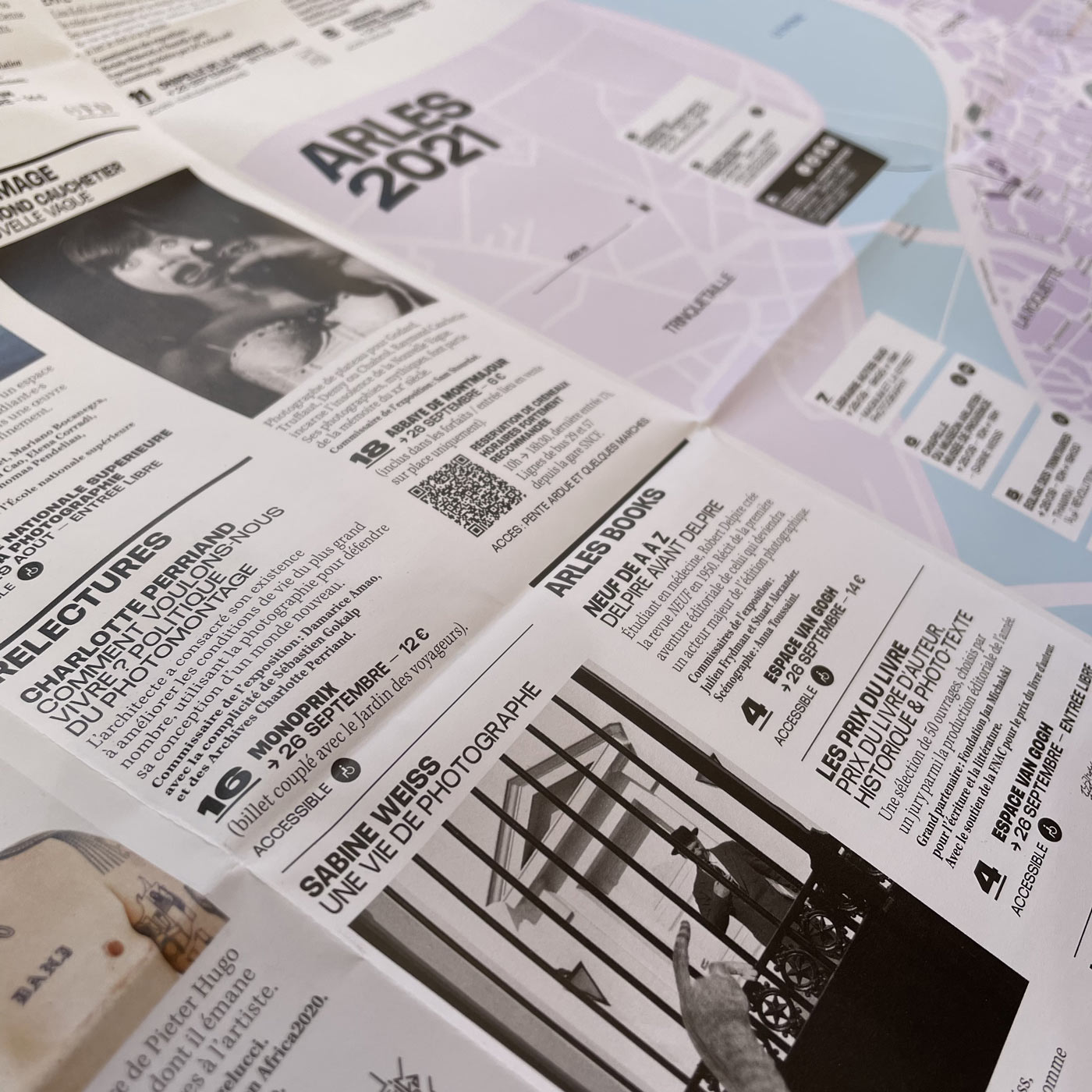
Program newspaper.
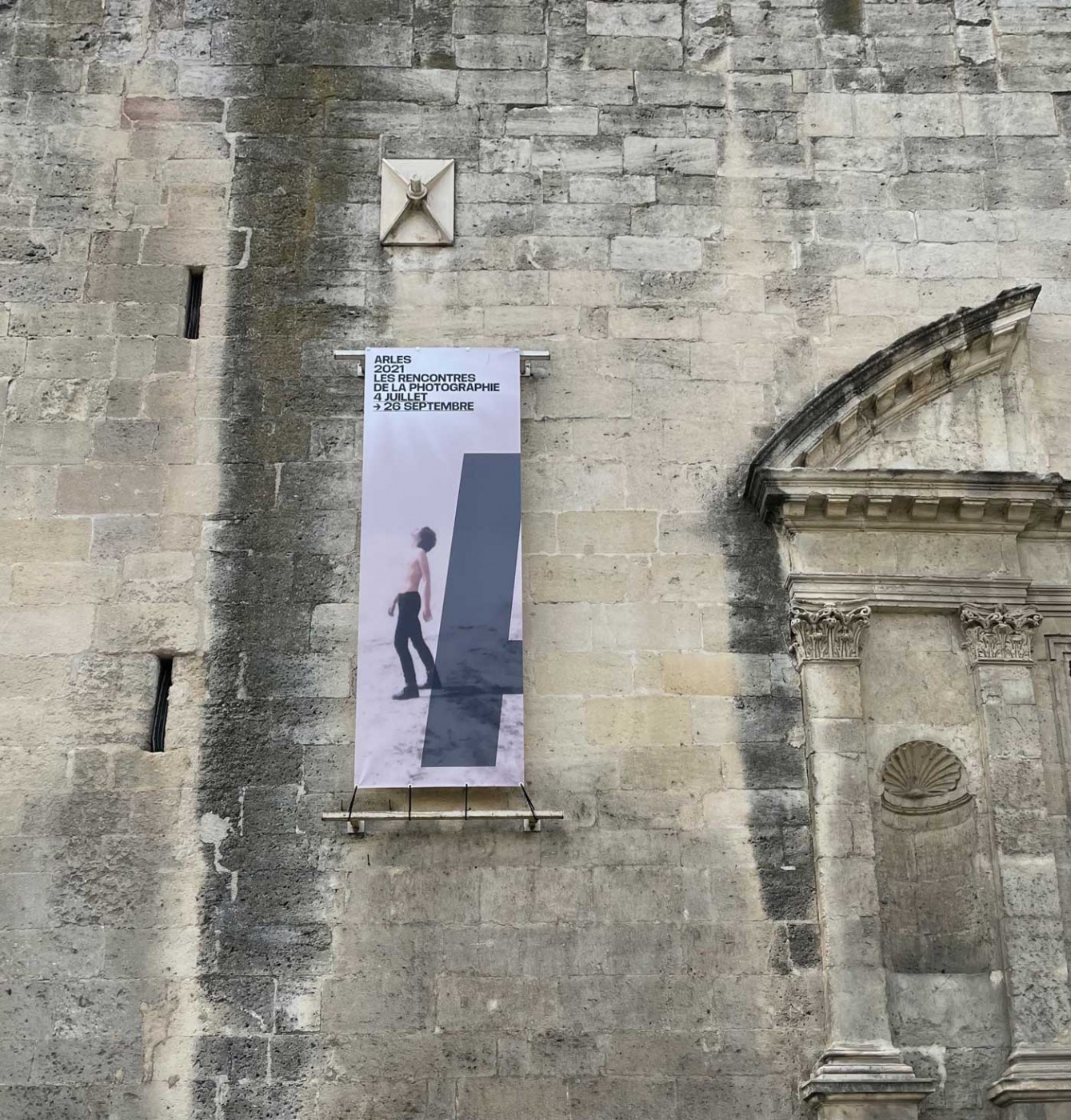
Banner.

Exhibition design.
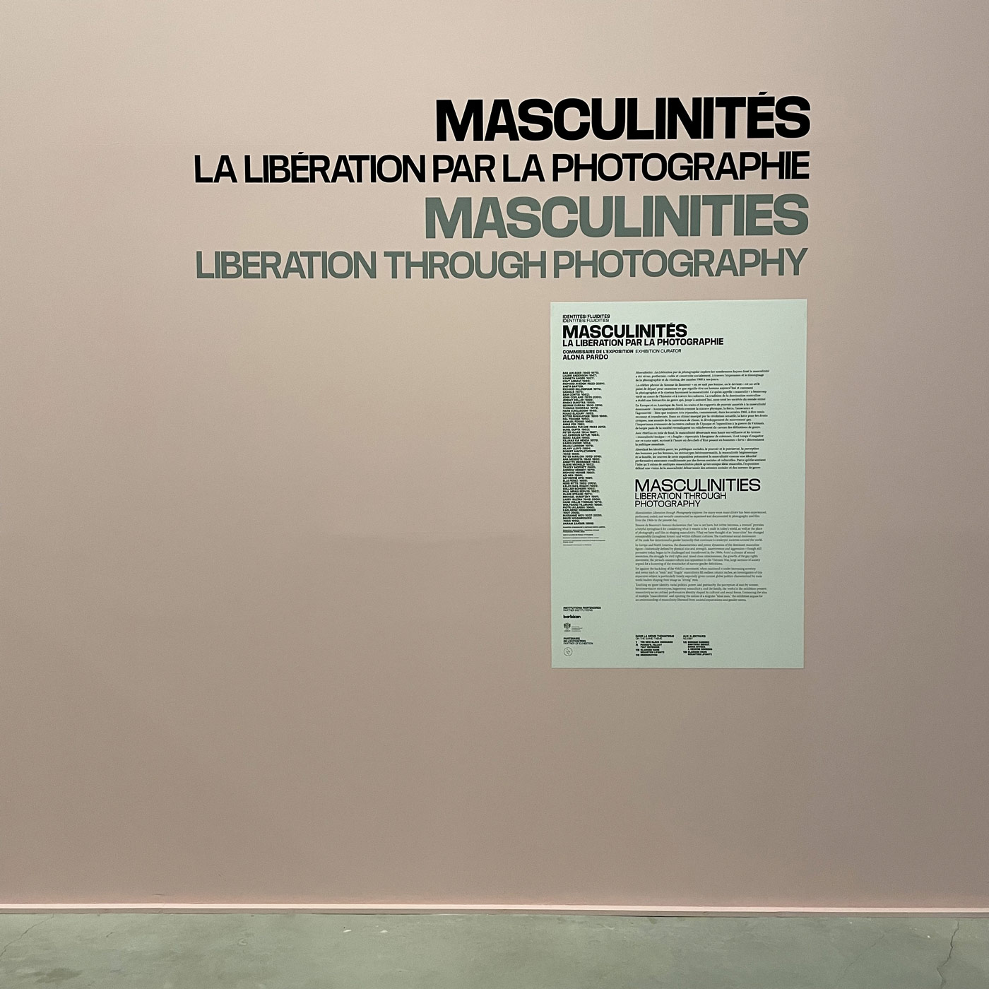
Exhibition design.


Homepage.

Map with venues.

Website detail.

Website detail with exhibition overview.

Website detail with exhibition details.

Website detail.
.png)
Catalog spread.


")


")


