Arthur C. Clarke paperback series (Signet, 1981–1983)
![The Wind from the Sun, 1982. Cover art by Paul Alexander. [ISFDB]](https://assets.fontsinuse.com/static/use-media-items/121/120896/upto-700xauto/5f58b71f/arthur-c-clarke-the-wind-from-the-sun-signet.jpeg)
The Wind from the Sun, 1982. Cover art by Paul Alexander. [ISFDB]
The Wind from the Sun is a collection of science fiction short stories by British writer Arthur C. Clarke. Some of the stories originally appeared in a number of different publications, and the collection was first published in 1972 by Harcourt Brace Jovanovich.
This volume contains all the stories I wrote in the decade of the 60s, which was one of the most dramatic periods in the entire history of science and technology. Those years embraced the laser, the genetic code, the first robot probes of Mars and Venus, the discovery of pulsars — and the landing on the Moon. Many of these events, either in anticipation or after achievement, are reflected in these tales; for that reason, I have placed them in chronological order. — Arthur C. Clarke
The image shown at the top is Signet’s 7th printing which, according to the Internet Speculative Fiction Database (ISFDB), was published in 1982.
The photocompositor typeface used for the author and title is Roc Mitchell’s 1971 design, Corporate. To be more precise, it is probably Limited, a Corporate copy from Solotype which has minor variations such as 90-degree corners on the bottom of the ‘A’ counter. In designing Corporate, Mitchell is said to have been inspired by Eurostile, another squared, futuristic face which happens to be used here for the text above Clarke’s name.
The same typographic setup has been used for the whole series of Arthur C. Clarke novels published by Signet between 1981 and 1983. Fonts In Use contributor Alex Rosario had previously submitted a post about this series (thank you, Alex!), which has been merged into this post. In 2017, Alex made a digital revival and expansion of Corporate, named Corporatus.
![The Other Side Of The Sky, 1981. Cover art by Vincent Di Fate, 1981. [ISFDB]](https://assets.fontsinuse.com/static/use-media-items/122/121082/upto-700xauto/5f58b7a9/The-Other-Side.jpeg)
The Other Side Of The Sky, 1981. Cover art by Vincent Di Fate, 1981. [ISFDB]
![The Sands of Mars, ca. 1983. Cover art by Vincent Di Fate, 1981. [ISFDB]](https://assets.fontsinuse.com/static/use-media-items/122/121080/upto-700xauto/5f58b7a9/8652442370_657bedbeac_o_d.jpeg)
The Sands of Mars, ca. 1983. Cover art by Vincent Di Fate, 1981. [ISFDB]
![Glide Path, 1982. Cover art by John Berkey. [ISFDB]](https://assets.fontsinuse.com/static/use-media-items/122/121087/upto-700xauto/5f58b91c/Glide-Path.jpeg)
Glide Path, 1982. Cover art by John Berkey. [ISFDB]
![Islands in the Sun, 1981. Cover art by Vincent Di Fate, 1981. [ISFDB]](https://assets.fontsinuse.com/static/use-media-items/122/121081/upto-700xauto/5f58b726/Islands-in-the-Sky.jpeg)
Islands in the Sun, 1981. Cover art by Vincent Di Fate, 1981. [ISFDB]
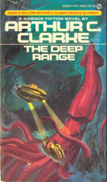
The Deep Range, 1981. Cover artist unknown.
![Report on Planet Three, 1982. [ISFDB] Cover artist unknown.](https://assets.fontsinuse.com/static/use-media-items/122/121086/upto-700xauto/5f58b8e7/RPRTNPLNTT1982.jpeg)
Report on Planet Three, 1982. [ISFDB] Cover artist unknown.
![Tales of Ten Worlds, 1981. Cover art by Paul Alexander. [ISFDB]](https://assets.fontsinuse.com/static/use-media-items/122/121088/upto-700xauto/5f58b9e9/Tales-of-Ten-Worlds.jpeg)
Tales of Ten Worlds, 1981. Cover art by Paul Alexander. [ISFDB]
Formats
- Books (5438)
Topics
- Literature (2514)
- Technology (1218)
- Science/Nature (909)
Designers/Agencies
- Vincent Di Fate (6)
- Paul Alexander (4)
- John Berkey (2)
Tagged with
- Signet Books (23)
- paperbacks/softcovers (1494)
- science fiction (407)
- Arthur C. Clarke (7)
- center-aligned text (1567)
- short stories (102)
- borders and rules (918)
- orange and red (24)
- book covers (4806)
- all caps (5981)
- type in a cartouche (157)
- book series (428)
- 1980s (596)
Artwork location
- United States (8321)




















12 Comments on “Arthur C. Clarke paperback series (Signet, 1981–1983)”
This post initially focused on The Wind from the Sun only. Thanks to the input of Alex Rosario, it has been extended to show the whole series of Arthur C. Clarke paperbacks featuring the Corporate typeface. The date was corrected, too: While many sources give 1973 as the date for this edition, the series with this cover typography was published between 1981 and 1983. I’ve added verified info about dates and cover artists from ISFDB. In some of the covers, you can see the signature “V. Di Fate ’81”. The 1973 date apparently refers to Signet’s first paperback series with novels by Clarke, but wasn’t updated in later printings. The 1970s series uses Alpha (Schaedler) Midnight. We might add a dedicated post about it later.
Groovy stuff, peeps!
Thank you for expanding this, Florian and Alex!
What a lovely set!
The Castcraft sample of Limited is possibly a copy of Quad Typographers, Inc.'s Limited and Limited View listed in its 1974 catalog – in name, at least. I’ve no idea if it was modified in the same manner as Castcraft’s 1978 version.
Lista Faccia Nova:
luc.devroye.org/fonts-93366…
It’s also possible Roc Mitchell licensed Corporate to other typesetting houses but changed the name. This might also explain why Phil Martin went on to develop another typeface named Corporate, later digitized as URW Corporate.
Martin’s/URW’s Corporate doesn’t seem to have been designed as early as 1971, even though MyFonts lists it as such. It doesn’t make an appearance in either the A.I. Index Vols. 1–10 from 1976, or the TypeSpectra Collection from 1979. Curiously, however, several books under The Times Mirror Company banner (e.g. New English Library, World Publishing, Fuller & Dees) published from 1975 onward feature logotypes/wordmarks very similar to Martin’s/URW’s Corporate. An early use, or an inspiration?
1975 Times Mirror Company logotype:
imgur.com/J3EeuGe
Nokia’s old corporate logotype also seems to borrow elements of Mitchell’s Corporate aka Limited too. Plus, I’ve seen too many unusual hodgepodge combinations of Microgramma, Eurostile, Corporate, Limited, URW Corporate and Earth. I imagine it’s because not all type houses stocked the required typefaces but were able to substitute in something similar, particularly if it was only an extra word, letter or number on the end of an existing logo.
For example, looks like the K-that’s-almost-a-H was just too funky for the Estes 1977 Model Rocketry Catalog – so they made a new one to feature throughout!
andeverythingelsetoo.blogsp…
And as for Corporate being based upon Microgramma / Eurostile – this should show how with some rescaling and cutting the elements could be transformed into a new form.
From Microgramma to Corporate:
imgur.com/OQNVzp6
I like that Microgramma-to-Corporate image, to me shows a pretty clear resemblance between the two in a groovy way.
I’m not a fan of that custom 'K’ on that model rocketry catalog, however. It looks a little too close to other terrible attempts at a 'K’ from other fonts that have tried to simulate Corporate, Earth, or even China/Changeling! Not planning to add it to the alternates of Corporatus anytime soon if ever.
Patrick:
Corporate and Corporate Image do appear in Alphabet Innovations’ Vol. 4 catalog of 1971. See my scans above and the index.
Does anyone have a Quad Typographers catalogue? With Limited in it.
Stephen Coles:
Sorry, I’m referring to the “other” Corporate, sometimes also known as Corporate Gothic in certain catalogs, which is attributed to Phil Martin and has been digitized by URW.
fontsinuse.com/typefaces/16…
It currently has a release date of 1985 listed – but this is wrong as it was used for the opening titles of Star Trek II: The Wrath of Khan in 1982. MyFonts once listed a release date of 1971, as seen in this banner graphic: allfonts.co/wp-content/uplo…
I have not seen Corporate Gothic listed in any Alphabet Innovations or TypeSpectra catalogs, though the Times Mirror samples suggest that it may have been released around 10 years earlier, in 1975.
Ahh, I see. Here’s a snapshot of the Star Trek titles for our future reference.
I just want to point that im fed up reading the blurred lines between corporate and limited.
Corporate and how it was designed has different features that if you look closely are not same as Limited. When you actually look at it is 100 % different from Limited. Neither where the names where swapped. They are not the same. Or anything that anyone can come up with. I bought a catalog last year in it is LIMITED SET. Limited and View.
They are NOT they versions that appear in the CASTCRAFT CATALOG. Yes there are 2 versions of the Limited SET. That appear in 2 separate catalogs. And yes there where 1 set of Limited from CASTCRAFT. And the other from “Encyclopedia of Phototype Styles”. As I traced both alphabets and digitised them they are totally different. But look the same.
The CASTCRAFT versions and in the Encyclopedia of Phototype Styles don’t match the book covers. The version I have does.
The set in the catalog I have is the original. Version used on the books. Mentioned I own some of them.
John
John, I have difficulties understanding what you are trying to tell us.
Yes, Corporate and Limited are not identical. Stewf posted a comparison, with source info. I don’t know about “100 % different”, but they are different. Do you argue that Limited should have its own typeface entry on Fonts In Use? That’s thinkable, but it’s not like we have tons of in-use examples that would warrant the fragmentation of two such closely related releases.
How are they different? The Encyclopedia of Phototype Styles is a catalog by Castcraft. If you refer to another Castcraft showing, which one?
Is it the “scan from a specimen leaflet published by Type Films of Chicago, a.k.a., Castcraft” that you posted to Flickr? How is that version different from the one shown in the Encyclopedia?
And why does the showing have “Copyright by Fürst” written over it? Fürst was a German chain of typesetting studios. Is the leaflet by Castcraft or by Fürst?
What’s the title of that catalog? Who published it, and when? Can you share a scan?