
Martin-Pouret
Contributed by Maxime Francout on Aug 24th, 2020. Artwork published in
April 2020
.
Source: martin-pouret.com License: All Rights Reserved.
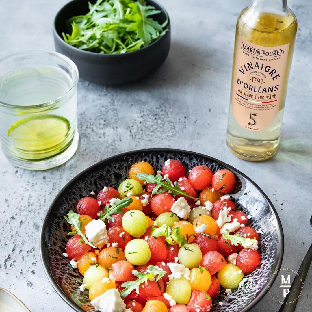
Martin-Pouret is a French business specializing in gourmet food including fine vinegars, high-end mustards, and pickles. Established in 1797, the family-owned company was sold to Compagnie des Gourmets in 2019. Sid Lee created the new branding, using Form as the primary typeface. The typeface by Bizarre Bizarre is used for the logo and the packaging. Form also appears for headings on the website, where it is paired with Akzidenz-Grotesk Condensed and Lydian.

Source: www.instagram.com License: All Rights Reserved.

Source: www.instagram.com License: All Rights Reserved.

Source: www.instagram.com License: All Rights Reserved.

License: All Rights Reserved.

Source: www.instagram.com License: All Rights Reserved.

License: All Rights Reserved.
License: All Rights Reserved.

Source: martin-pouret.com License: All Rights Reserved.
Website.

Source: martin-pouret.com License: All Rights Reserved.

Source: martin-pouret.com License: All Rights Reserved.

Source: martin-pouret.com License: All Rights Reserved.
")


")


1 Comment on “Martin-Pouret”
I like the labels. The previous logo used Windsor, and (some of) the labels showed ITC Zapf Chancery Italic, partly in all caps with underline. The latter looked downright amateurish.
The designers of the new website realized that Form is a display typeface and not suitable for smaller text. It’s baffling that they went with Lydian instead. While it’s a good match for Form, Lydian is not suitable for web text either. It’s way too fidgety for that. And justifying narrow columns of text doesn’t help either.