
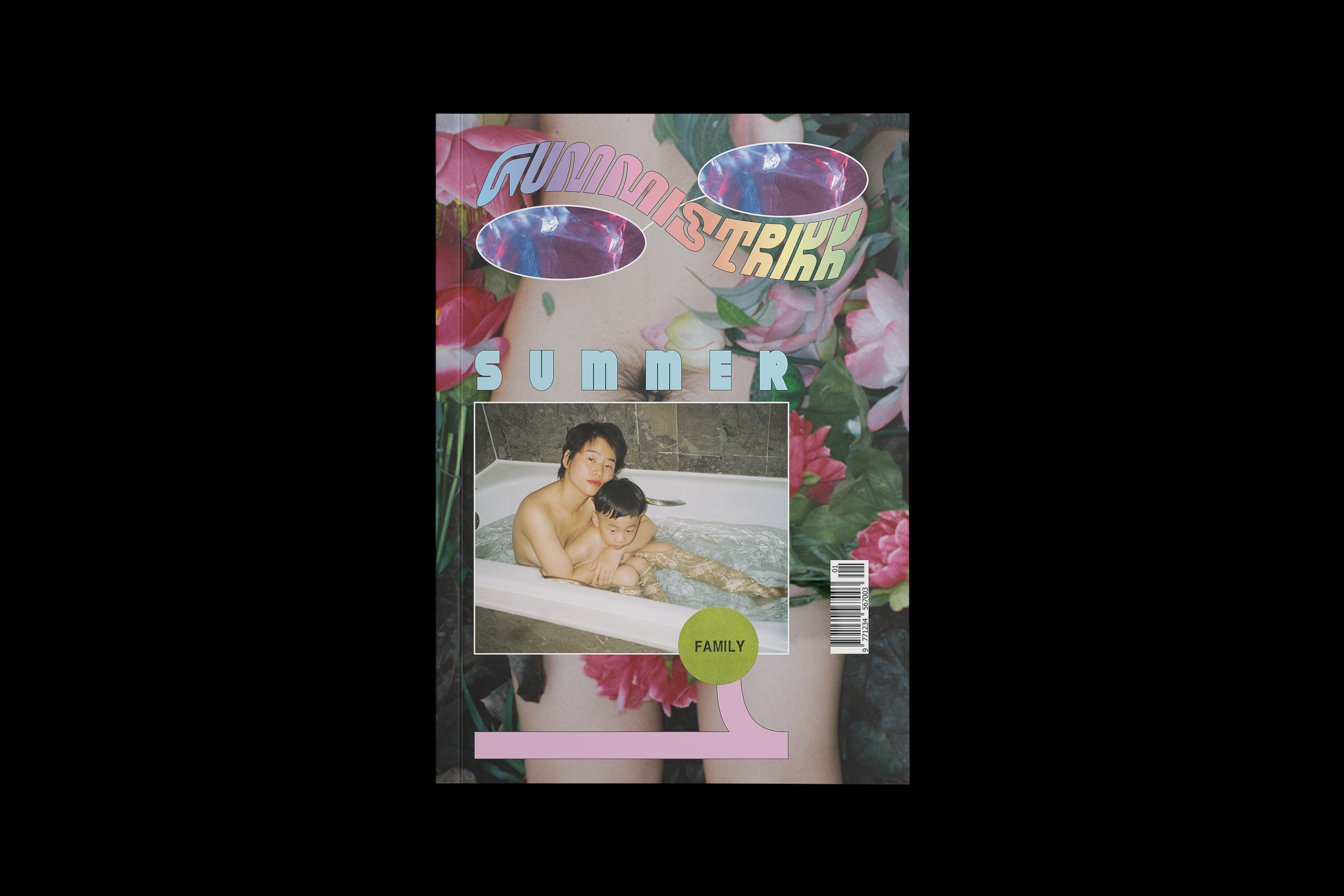
Gummistrikk magazine, “Family”, summer 2020
Contributed by Cristiano Cola on Jun 16th, 2020. Artwork published in
June 2020
.
Luo yang. License: All Rights Reserved.
Designed to bring a new breath to the heart of independent magazines, Gummistrikk is made in the spirit of magazines from the early 1990s. It was born in Milan as a reaction against the superficial glamour, and as a part of the global counterculture movement.
Working with undiscovered, unknown artists, Gummistrikk manages to capture a fashionable world in a way that pushes away superficiality and replaces it with personal expression and quality.
The magazine logo uses Pickle-Standard, with the theme set in Fat Porn. The magazine interior pairs Roobert with two similar-looking serif typefaces: Arachne and Silk Serif.
Gummistrikk magazine is a personal design project and has not been published. See more images on Behance.

Luo Yang. License: All Rights Reserved.

Luo Yang. License: All Rights Reserved.
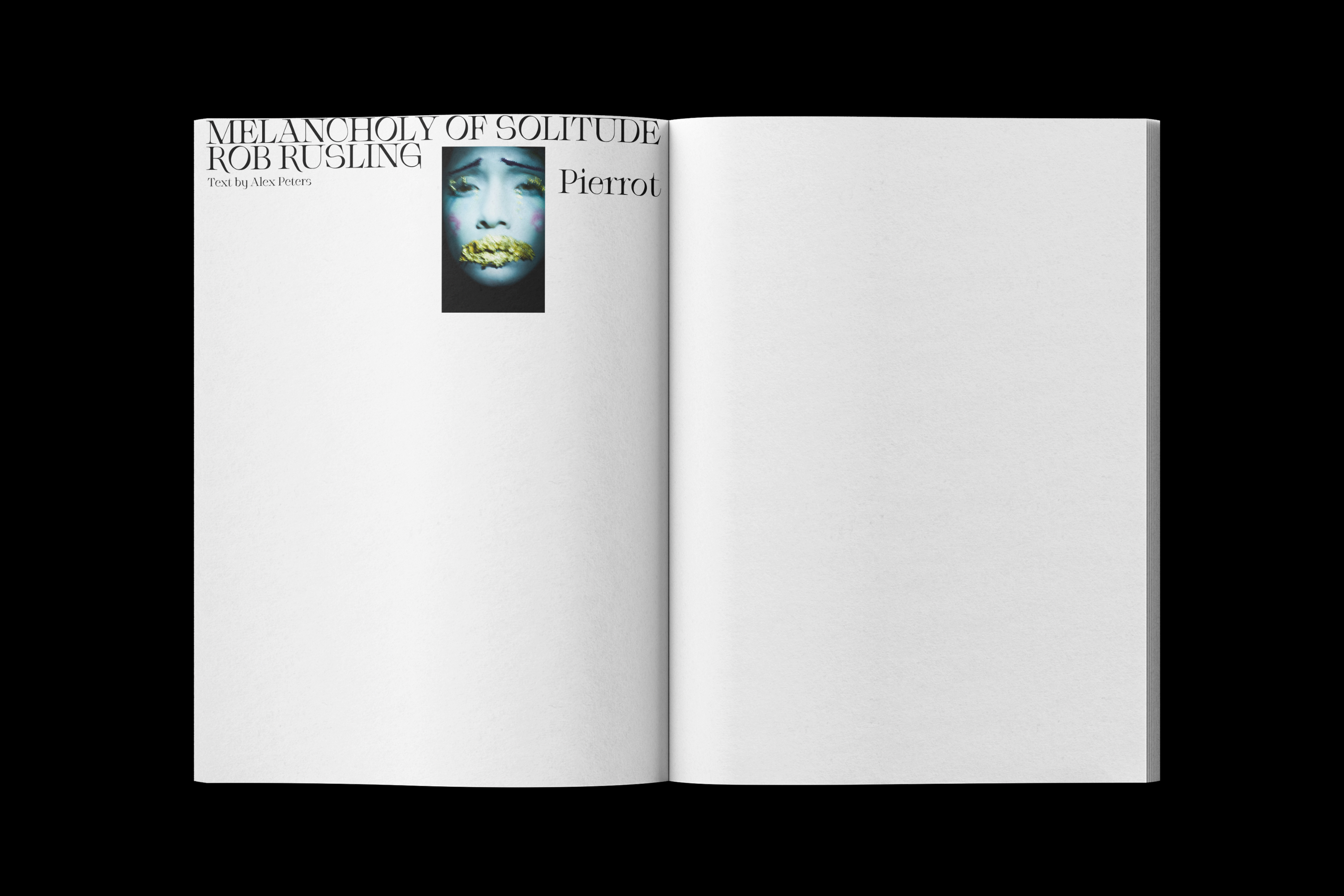
Rob Rusling. License: All Rights Reserved.
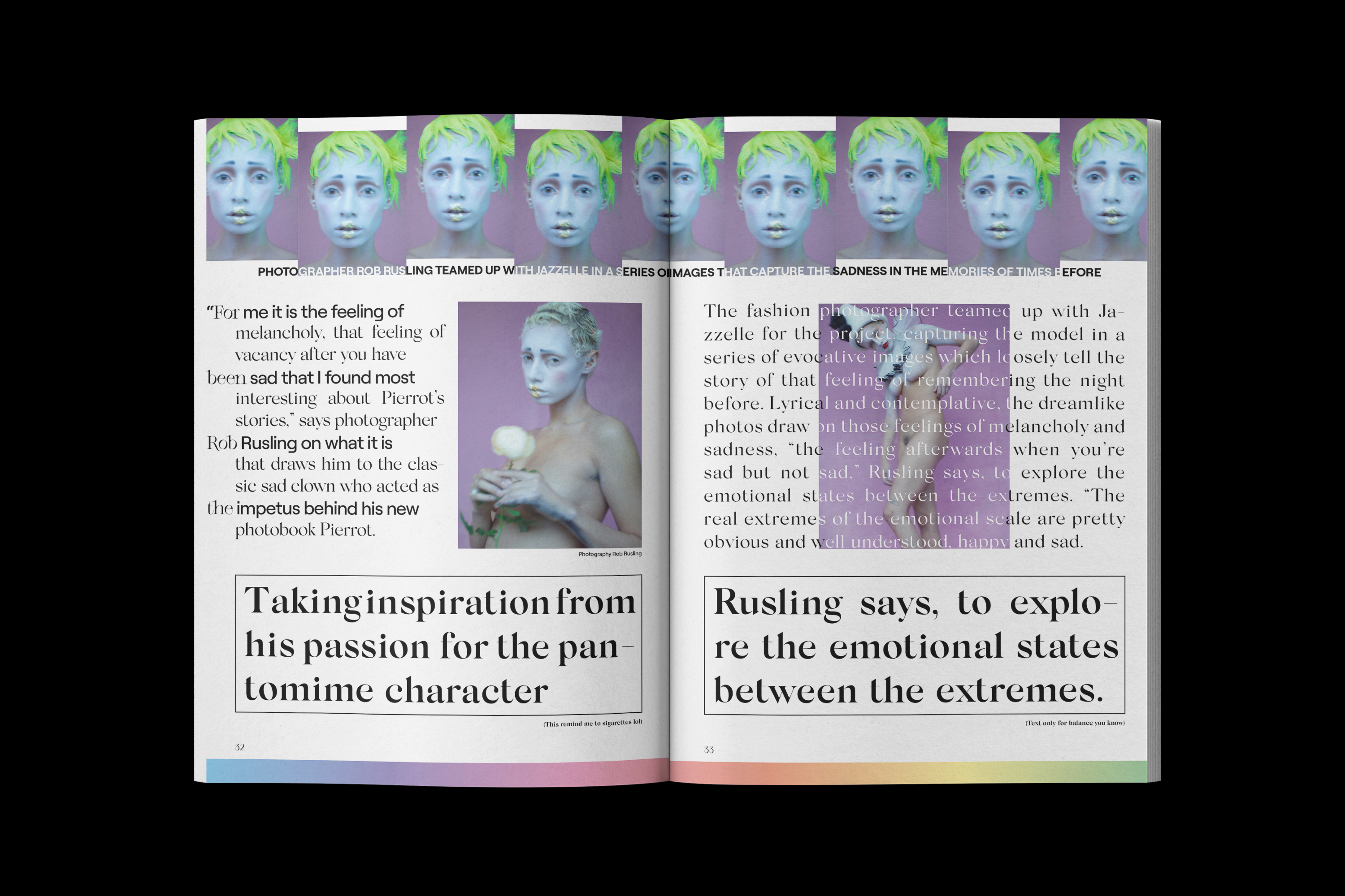
Rob Rusling. License: All Rights Reserved.
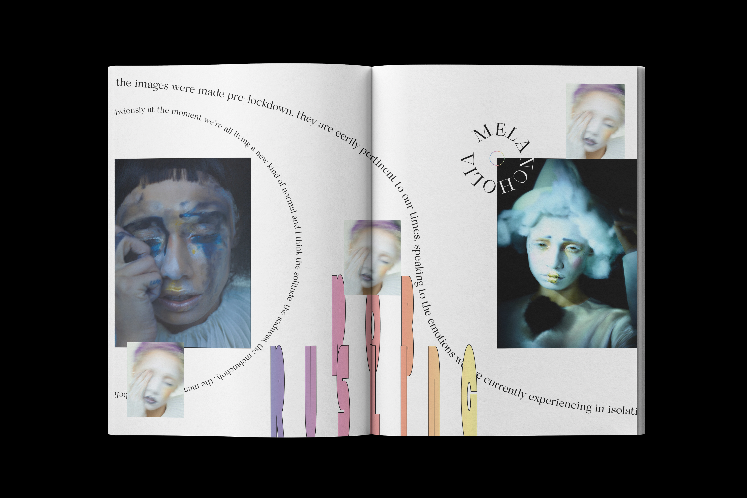
Rob Rusling. License: All Rights Reserved.


")


