
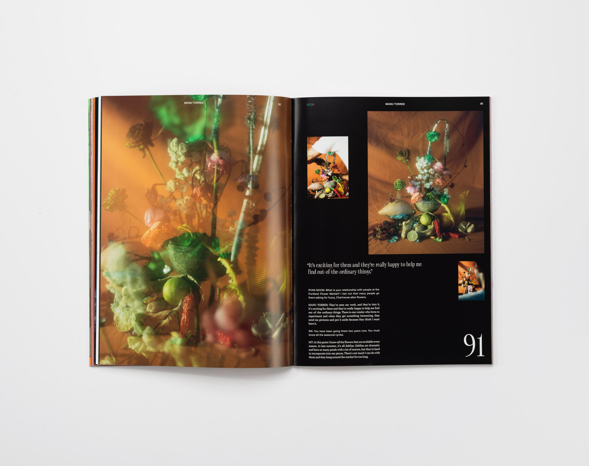
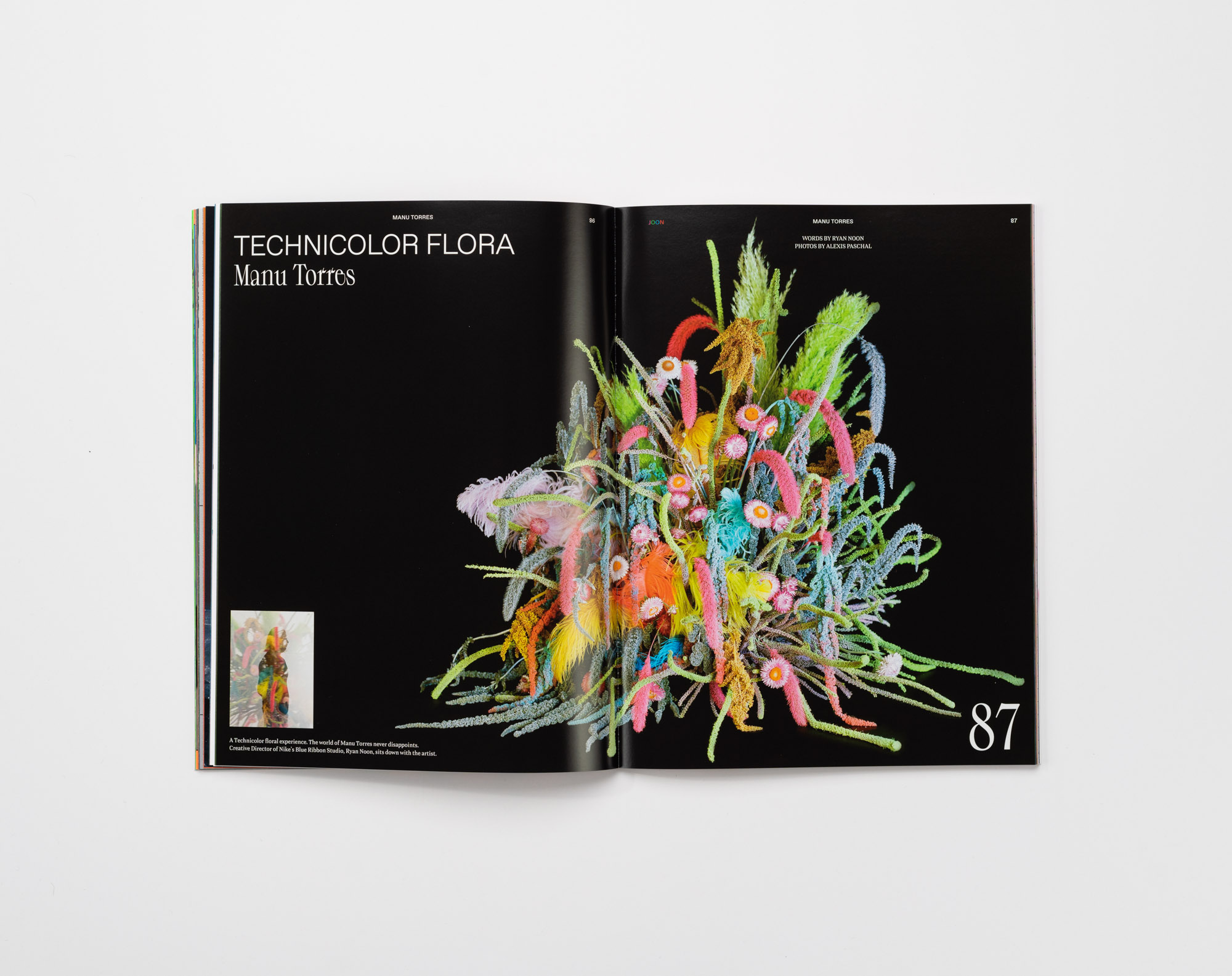
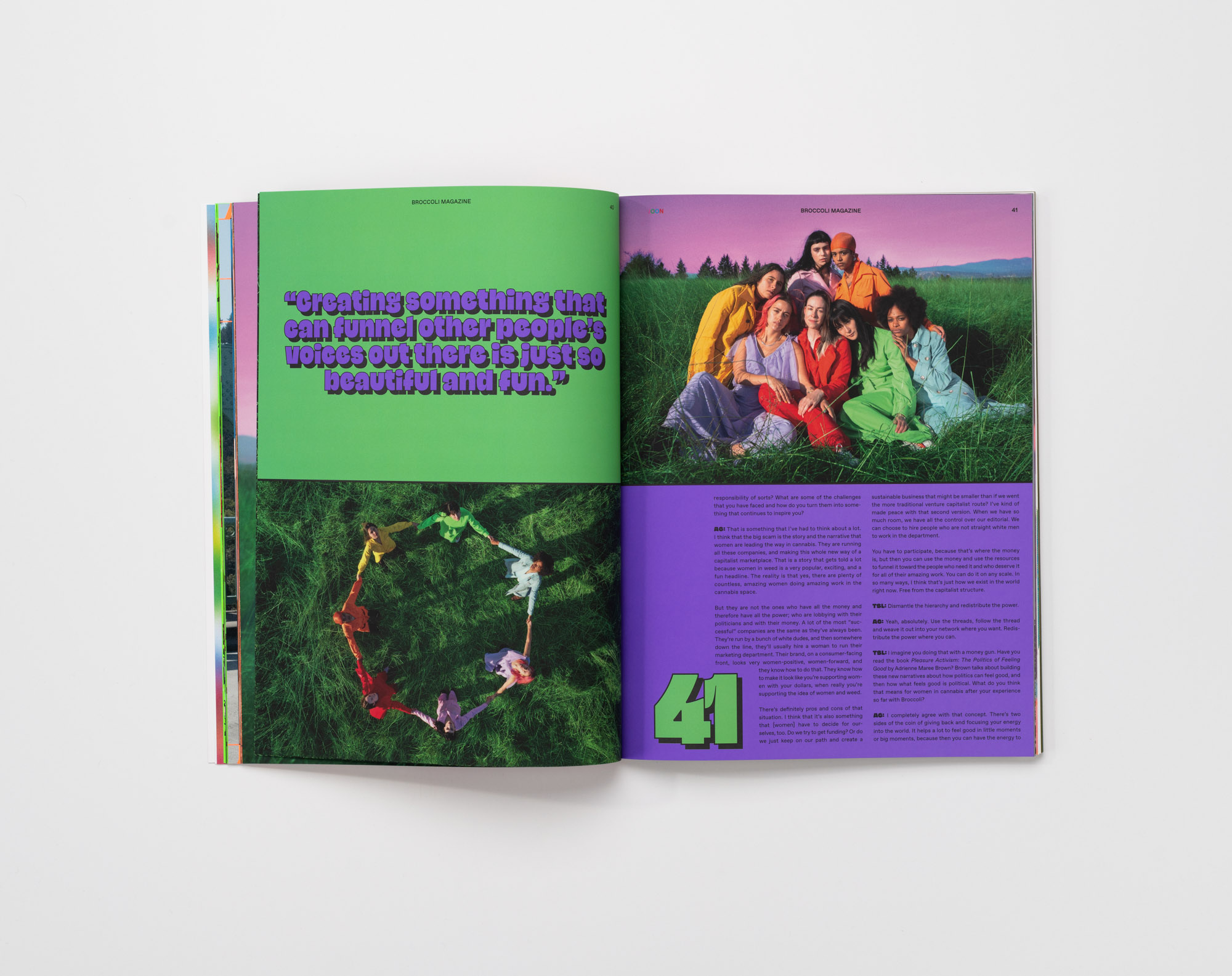
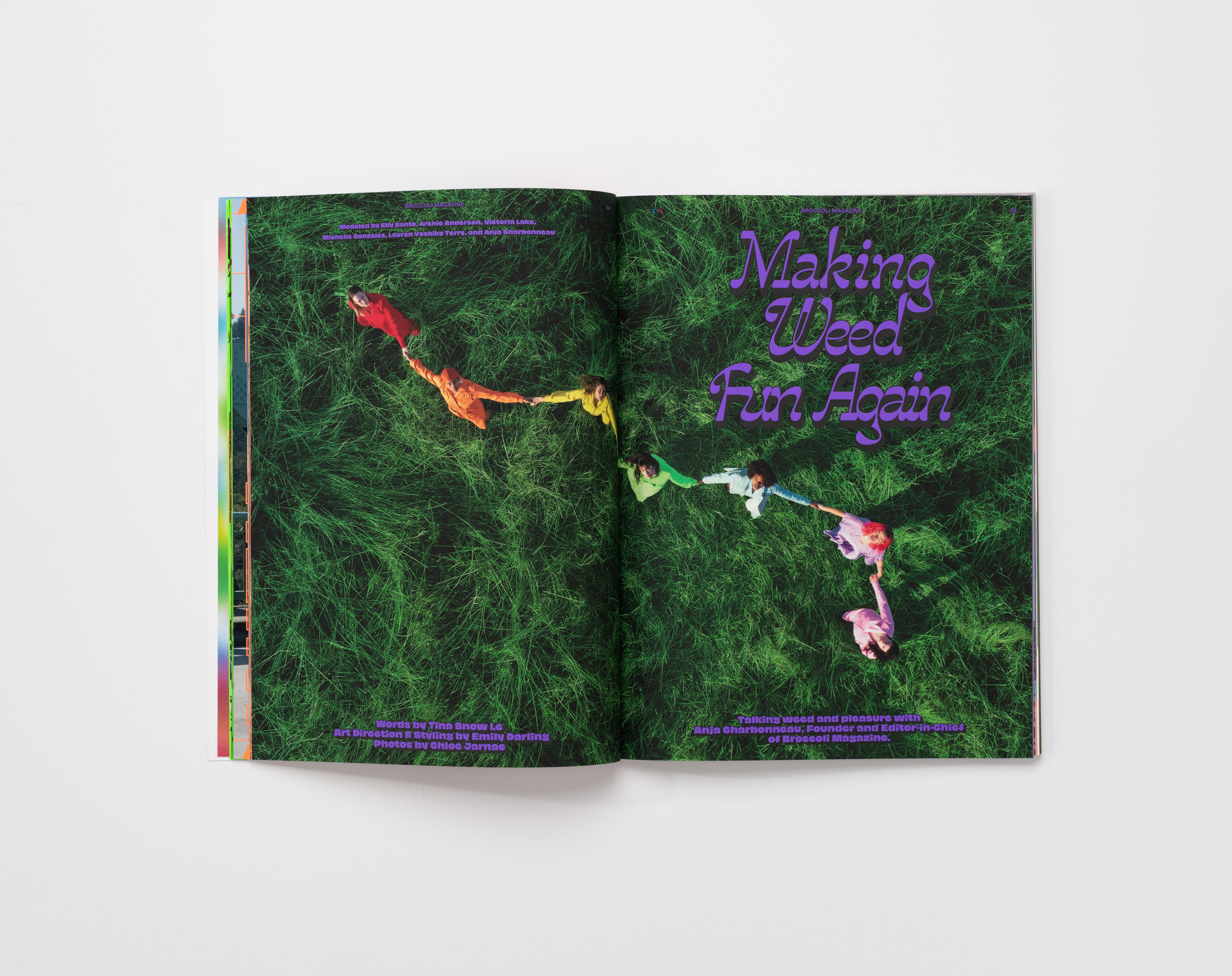
JOON magazine, Issue 01

Designed by FISK in Portland, OR, JOON magazine is a celebration of design and culture, with vibrant layouts and expressive typography. Between the pages of JOON you’ll find compelling stories, insightful interviews, and inspiring works of art by a diverse group of humans based in Portland and beyond.
The typefaces featured within these pages are Banto (Teo Tuominen), CoFo Peshka (Contrast Foundry), Gooper (Very Cool Studio), Jaune Grande (Studio Triple), Relaate (Alex Slobzheninov), and Spindle (Gor Jihanian), all available on Future Fonts.
In Farsi, the word JOON translates to life, and is often used as a term of endearment. It carries a positive connotation of closeness and affection, bestowed upon loved ones.
JOON is also a partnership between FISK and Brown Printing that was initiated to help shed light on the exciting arts scene in Portland and to showcase the possibilities and impact of design and print. Photographs by Mario Gallucci.


Spread featuring Relaate

Spread featuring CoFo Peshka
Spread featuring Relaate

Spread featuring Pilowlava and various styles of the GlyphWorld font series. The text typeface is ABC Favorit Mono.
Spread featuring Jaune Grande
Spread featuring Spindle and Jaune Graunde


")

 catalog")


11 Comments on “JOON magazine, Issue 01”
I could see Favorit in this magazine. And also Leah Maldonado’s Glyphworld and Velvetyne’s Pilowlava.
The logo JOON is set in David Chathas’ W.I.P. typeface Softman.
Hi Jay, as always, thanks for your keen eye! I’ve added Favorit (+ Mono), Pilowlava, and GlyphWorld.
Do you know for a fact that the logo is in Softman? It’s entirely possible, but with just three different (generic) letterforms, there’s not much to verify the ID. It could also be something else, or custom drawn.
Hi Florian and Jay,
The masthead is indeed Softman by David Chathas!
Are we able to credit the photographer of the magazine as well? Mario Gallucci.
Thank you!
Best,
Bijan
According to David's Mods/Redraws PDF, it says it is a redraw of what he had saved on his computer as debussy.ttf or culturally referred to the “Dunkin” typeface in the US midwest. It was designed in 2018 and currently work in progress.
Jérémy Landes also designed Le Murmure (Velvetyne, 2018) for the French design agency of the same name, which used in pages 6–7 and 8–18.
On pages 19–33, a condensed part of the Kreuz (Production Type, 2018) type family is being used with Radim Pesko’s Agipo in Bold Condensed and again on pages 86–144.
The cyberpunk typeface entitled Art Dystopia (2015) is used on pages 132 to 139.
Hi Bijan, thanks for chiming in and confirming the ID! Much appreciated. In the Designer/Agency field, we generally credit those who worked on the typography. I’m happy to add Mario’s name with a link to the description.
Jay, thanks for the extra info! Debussy is a ripoff of VAG Rounded (1979), with limited character set and poor outlines, made by the shady Fantazia Fonts and Sounds outfit in the 1990s. As with most stuff on Dafont, it should be avoided. David, if you’re reading this: Congrats, you reinvented a forty-year old typeface! 😂 Might be interesting to compare the diacritics you came up with to those in the existing versions.
The typeface used for the Dunkin’ Donuts logo is Bob Newman’s Frankfurter (1970). See Nick’s post about the Dunkin’ Donuts logo. Frankfurter is similar to VAG Rounded, but at least its original (heavy) weight doesn’t have a lowercase.
Thanks for identifying additional fonts, Jay! I won’t add them to the post, as we only credit those fonts that are (clearly) visible in the included images. It’s still welcome.
Hello Everyone.
Thanks for the dialogue around this.
Part 1
When I made that it was from ignorance and self discovery. Being from the midwest we just call it the Dunkin Donuts font but never bothered to properly ID. When I started it I had “debussy”. I did some research but didn’t really find what I wanted. I had always known about frankfurter highlights and quickly sort of moved on from it when I didn’t find the right weight in lowercase I was looking for. I had always known about VAG Rounded because I used it at this place I used to work but the heaviest version didn’t line up to the weird copy I had. I had been playing with this other one from dafont as well (www.dafont.com/overmuch.font) that I wasn’t able to identify but I loved the shapes. I sought out to redrawn them both to improve and adapt for what I wanted. During that I had been teaching myself glyphs and wanted to see what I could learn doing “rounded fonts” but I did it manually instead of using the script. I also had never done diacritics, so I wanted to learn how the combining marks work because I had never done them before. I figure this font was simple enough to apply. In my self teaching i took visual inventory of how other people had been drawing the lighter weights of similar things. Very basic shapes so it was pretty easy to recreate in the weight I wanted.
Somewhere along the line I found some other bad copy that had a lowercase of the current iteration of my version “softman” that was similar to what i was doing, but it was still autotracey which made me think it came from some printed thing before. I cleaned that up and modified here and there, making “minor” changes to my liking. I was really just trying to clean up this shitty version I had, to make it usable and fill in the gaps.
Part 2
Going back to diacritics. The ones I made are more horizontal. I didn’t like how tall they were on Frankfurter/Debussy. I also made the umlaut closer because I didn’t like that it felt like they were drifting away. Proportionately weight wise they are probably very similar. I generally wanted them to feel cozier because I liked using it big.
Part 3
Colophon not that long ago got a commission to build out and updated the Dunkin Donuts font into some other weights and tweaks which you can see here https://www.colophon-foundry.org/custom/dunkin/ . I’m looking more closely now while writing this. It’s interesting seeing theres and comparing it to mine. The colophon one has optically more perfect circles while my lowercase has slightly more ovular. My “j” and “t” have no hook. They have a tilted “e” and much better “G”. In general the Colophon one is more geometrically refined and uniform. The way the “c” closes on theirs feel more “perfect”, while mine is sort of an “slack jawed mouth breather”. Mine is much closer carbon copy to whatever bastard source material I was using.
This was the other one I was working on at the time. I tried posting a pic in the last comment but I did it too small. If anyone has an ID for what this might be. Kind of has Dave West Photo-Lettering Inc. vibes. Original dafont source here.
Hello David, thanks for chiming in! It’s interesting to hear about your journey through the land of “sausage fonts”. Thanks for pointing out Colophon’s update of the Dunkin’ Donuts typeface. I will add a note to the post on Fonts In Use.
You are right, Debussy is bolder than the official VAG Rounded. First made in a single weight, VAG Rounded was later worked into a family of four weights. In 2018, Monotype commissioned Tom Grace to make VAG Rounded Next, which extends the family to 10 weights plus italics (and decorative Shine and Rust styles). Still, its ExtraBlack is not as heavy as Debussy.
As far as I can tell, Debussy is derived from an extension made at Brendel / Typeshop. This German company was active in the 1970s and 1980s and known for taking existing designs – not always licensed – and expanding them to a range of weights. They did this with VAG Rounded, too. Digital versions of their adaptation are still being sold, for example by SoftMaker as Volkswagen Serial, or by TypeShop Collection as TS Volkswagen. The heaviest weight of these families match Debussy. There’s another derivative made by FontBank in the early 1990s, named Valken. All these fonts are identical in many details (like the diacritics), including errors like the mirrored inverted question mark, see the comparison below.
If my presumed order is correct, then TS Volkswagen is (directly derived from) the Brendel “original”, with the erroneous pointed terminal in ? and a mirrored ¿ glyph. Volkswagen Serial fixes the latter, but not the former. Debussy attenuates the pointedness in ?, but augments the issue in the spur of q (among other glyphs). The inverted question mark is mirrored. In Valken, the terminal was rounded in ?, but not in its inverted counterpart. What a mess.
For some reason, the images you meant to include didn’t come through. I assume you intended to show your Guilt Trip (2018) compared to the freebie Overmuch (Digital Graphic Labs, 1998). Unsurprisingly, Overmuch is derived from an existing design, too, sadly without acknowledging its sources. In this case, the basis was Too Much Opaque, designed by W. Seifert for VGC in 1974. The comparison below shows the digitization by Image Club.
In 2015, Ferdinand Ulrich compiled an overview of the history of rounded typefaces for FontShop. Incidentally, part 2 includes an image of a 1980s specimen by Berlin-based phototype studio Fürst which shows Frankfurter and Too Much side by side.