
Ditto Inc. logo and packaging
Ditto Inc, founded in 1910 and later a division of Bell & Howell, Inc., manufactured duplication equipment, such as spirit duplicators. Ditto machines became so popular in American offices and schools it became a generic noun/verb — one would “ditto” something to make a copy.
This 1958 redesign of the Ditto logo, using Bulletin Typewriter almost directly, is credited in Barbara Baer Capitman’s American Trademark Designs, (Dover, 1976) to Morton Goldsholl of Morton Goldholl Associates (though this book often attributes work to firm owners rather than specific designers). The straight double-quotes ("), as seen on a typewriter and common shorthand for repetition, were used in the logo and as a pattern motif for packaging.
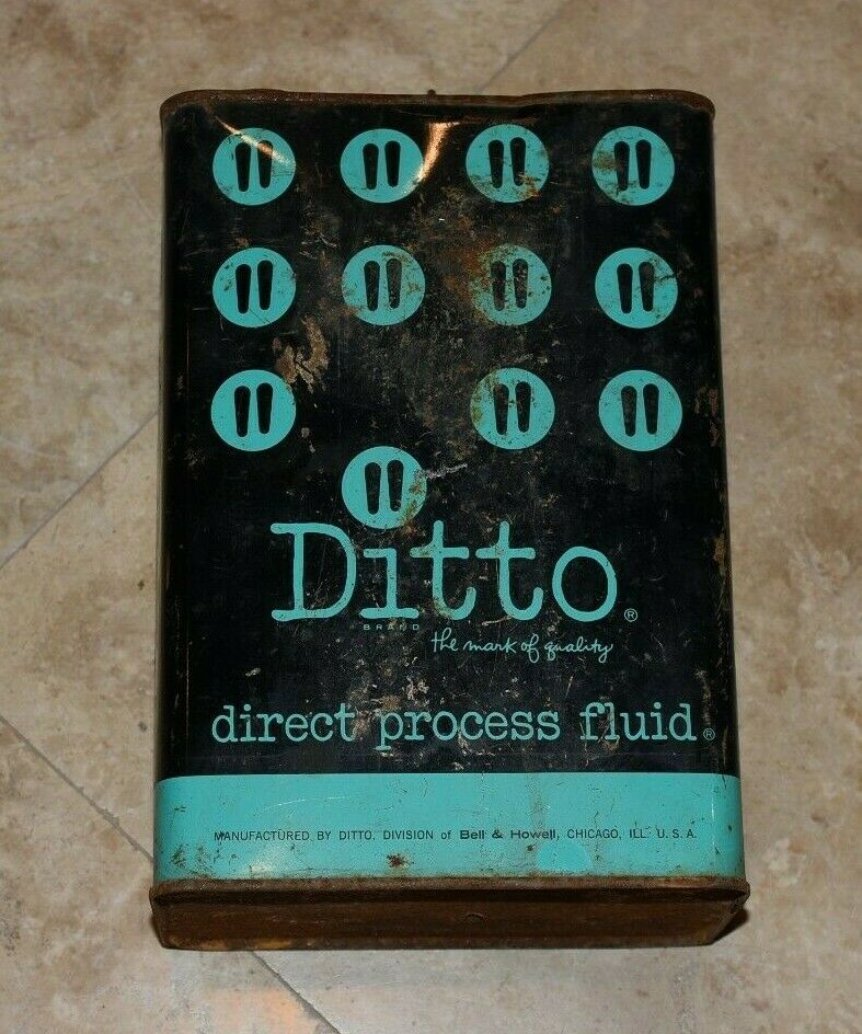
Ditto direct process fluid tin, undated.

Design for Ditto direct process fluid tin, 1961.
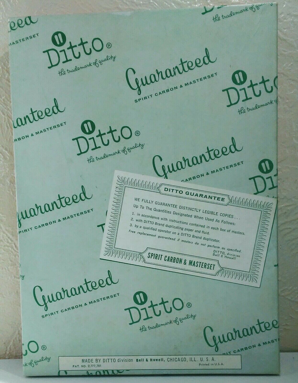
Ditto masterset packaging, undated.
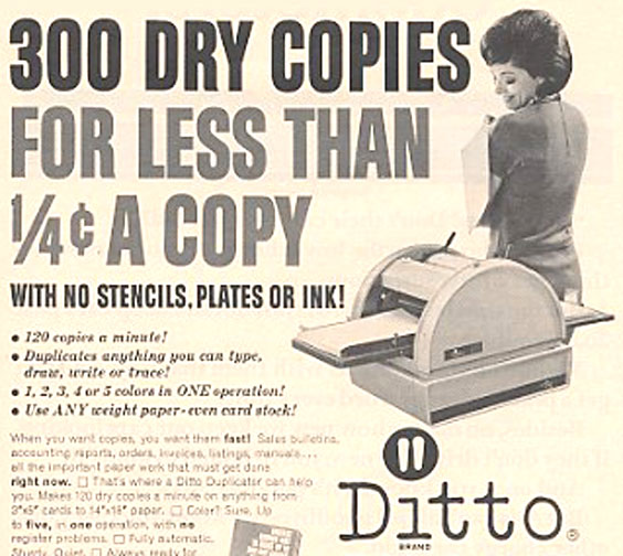
Ad for Ditto duplication machine, 1965.


")

")


4 Comments on “Ditto Inc. logo and packaging”
Interestingly, double-tick symbols were used as ditto marks long before they were used to mark quotations, going back as far as cuneiform tablets from the Iron Age.
I also just learned there is a dedicated DITTO MARK (U+03003) character in Unicode.
Interesting! Is it specifically used in Asian scripts, or is it part of the CJK SYMBOLS block for another reason?
The 'quotation mark as ditto’ came up recently in a work meeting. Thought of this wordmark. Looks like a use of Murray Hill Gothic on the last image.
My dad had a Ditto machine in his office, which was in our house, and I figured it out about 1955.
The company used the ditto mark with a circle around it as their trade mark. Of course the quote mark on a typewriter (like a Windows keyboard) is really a ditto mark. But I noticed the two lines did not align, and wondered if that was to make it more informal, or what. I recall being impressed by the new branding, which reversed the mark out of solid circle.
Unlike the mimeograph, the color was not in ink, but on the second sheet in each master set, which had a thick coating of waxy pigment. You typed on the top sheet, and a reverse image came on the back, as though you had put carbon paper in the typewriter wrong side up.
My father showed me you could *draw* on the masters, too, and change the colors of an area just by moving a different second sheet behind it. The default color was an annoying purple, but there was black, red, and blue. Everything printed a little lighter than you wanted.
Later I figured out you could Scotch-tape together different pieces of a master, which allowed you to change your mind. Simple typos were corrected by scraping the wax off the back for each master—and then retyping on fresh backing. I used my the office’s new Royal electric typewriter with a carbon ribbon, but it was hard to get the corrections to line up. And I made a lot of typos, and still do.
When ready to proof, you would clamp the top edge of the master face down on the Ditto machine cylinder, and turn it with a hand crank. A little Ditto fluid (half wood alcohol, half rubbing alcohol, plus some secret ingredient that had an intoxicating smell) wet a pad that dampened the wax on the back of the master just enough so some would rub off on a sheet of paper. You could get a 50 copies off before the color started to fade.
In the 2nd grade, I produced a letter-sized newspaper called My Fun Reader, with up to 10 pages (side-stitched). It was intended to be a more local and less boring competitor to My Weekly Reader, which was handed out at school.
It’s good to see that logo again, after 60 years. I can still remember the smell of paper printed on a ditto machine.