
Aus Natur und Geisteswelt
Source: www.flickr.com Uploaded to Flickr by altpapiersammler and tagged with “eckmann”. License: All Rights Reserved.
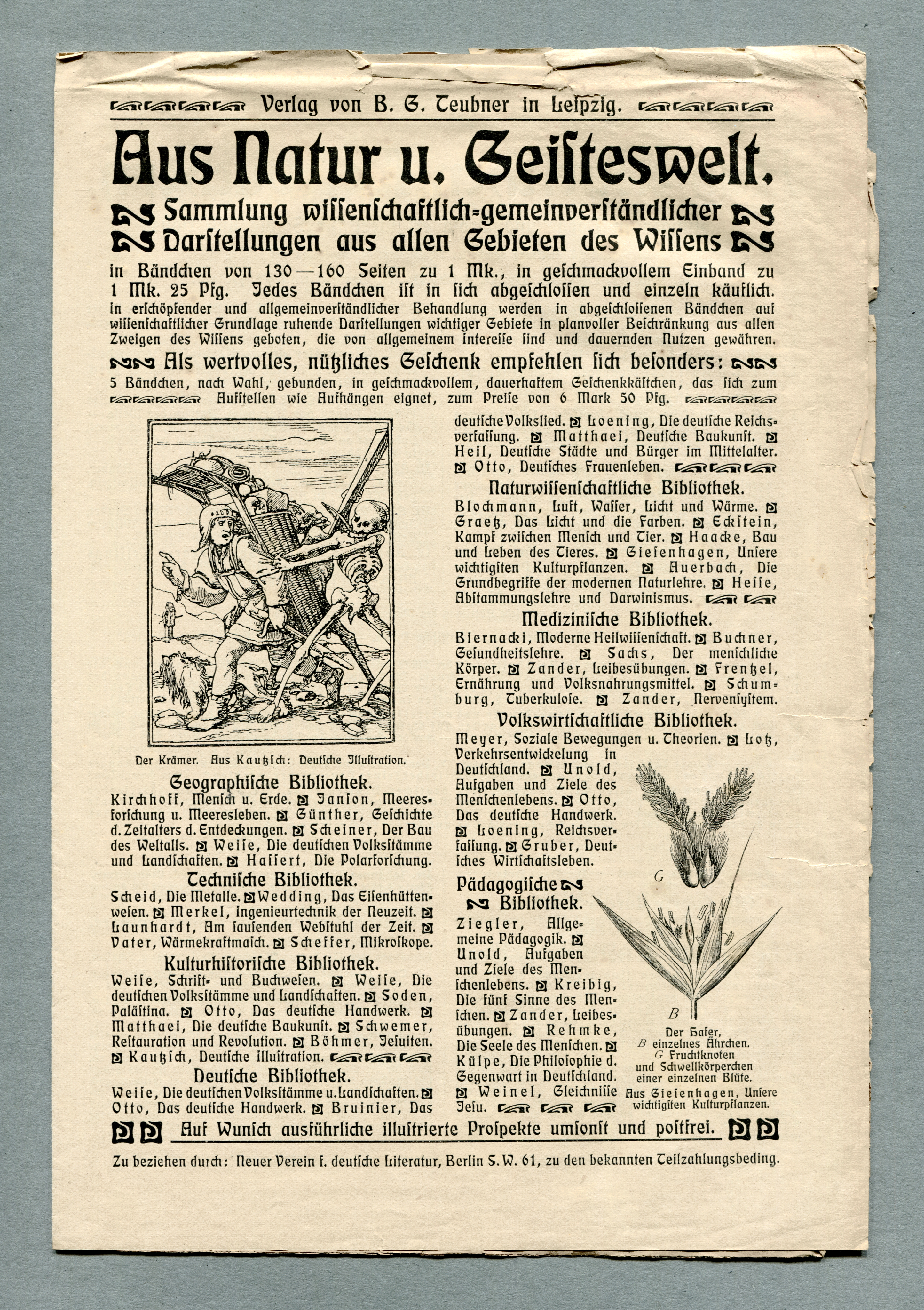
Brochure for non-fiction books from the Leipzig-based Verlag B. G. Teubner (1811–2008). “From nature and humanities. Collection of scientific and generally understandable depictions from all areas of knowledge”. Aus Natur und Geisteswelt was published from 1899 on and spanned 240 volumes. This brochure is probably from the late first decade of the twentieth century.

")
 and #16 (16 Jan 1919)")


")


2 Comments on “Aus Natur und Geisteswelt”
Eckmann here is used throughout the ad, from the heading to the image captions – it’s one big Eckmannfest! There are at least six sizes. According to Seemann’s Handbuch der Schriftarten, Eckmannschrift was available in a total of 13 sizes (6, 8, 9, 10, 12, 14, 16, 20, 24, 28, 36, 48, and 60pt). If you look closely, you can spot a number of German oddities that are common in blackletter, but were also applied in a hybrid “Neudeutsch” style like Eckmann: There’s the long s (ſ) and ligatures for tz as well as for the ch and ck digraphs (Eckmann also came with ligatures for CH, SCH, Cie, and SZ; not pictured here). Tracking is used for emphasis, in lieu of italics. Eckmann has more straightforward alternate forms for D, H, I, T. Both forms of D can be found in this ad, see “Darſtellungen” in the third line and “Deutſche” in the last subheading of the left column.
Detail of an undated specimen (c. 1900) included in “Bleisatzschriften des 20. Jahrhunderts aus Deutschland” by Hans Reichardt (ed.)
The ornaments are also part of the Eckmann series. Here’s a page from the specimen showing the smaller sizes of Eckmann-Schmuck. A small subset of these border elements and ornaments are included in the digital Rudelsberg-Schmuck, but unfortunately the outline quality is poor.
For his freewheeling interpretation Eckmannpsych, James Edmondson drew three optical sizes. I was curious to see how they compared to the original metal Eckmann. Top: G in five sizes as included in the ad, shown at the original relative size, and brought to the same height. Below: G from Eckmannpsych Small, Medium, and Large. James doesn’t specify the recommended range of point sizes for these variants, nor do I know the exact point sizes of the types used for the ad. For the sake of simplicity, I’ve aligned the three sizes of Eckmannpsych to the smallest, medium, and largest sizes of Eckmann.
In the metal types, the middle part of the letter gets more horizontal towards the smaller sizes, resulting in a larger counter. Eckmannpsych Large is much narrower than Small, and has a more pronounced contrast between thicks and thins. While these features correspond to what one would expect in terms of optical compensation, they can’t be found back in Eckmann. The metal original has an overall lower contrast than Eckmannpsych and hence doesn’t need the same amount of adjustment.
Awesome! FWIW, I was thinking of the intended sizes for Eckmannpsych Small around 12 point, Large around 72 point+, and the 36 for Medium. It seemed kind of overkill to give the optical sizes numeric names, because of the experimental vibe of both the original and my interpretation. And yes, the original is a much better “all purpose” design! Eckmannpsych Large completely falls apart at small sizes.