
“Trambanen vrijhouden” poster
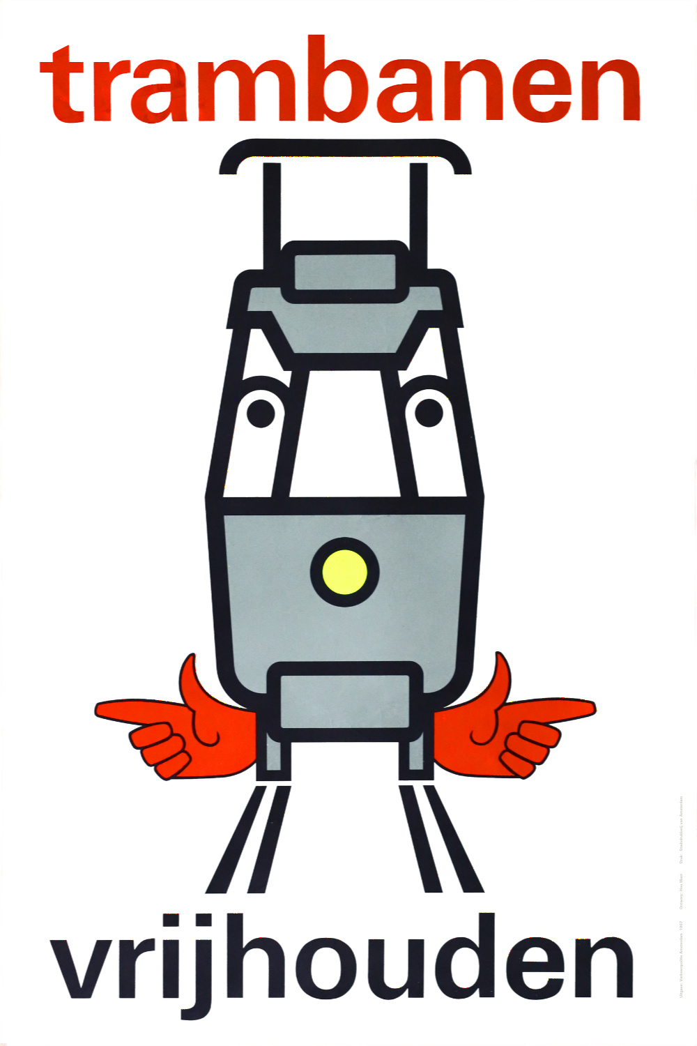
Keep tramways [American English: streetcar tracks] clear
This poster from 1967 by Amsterdam’s traffic police was designed by advertising agency Hou Maet, featuring an anthromorphic tram and Adrian Frutiger’s Univers in all-lowercase letters. Printed by Stadsdrukkerij Amsterdam.
Via Tim Boric’s Flickr photostream. Peter Eijkman recalls that these were also used as rear window decals. Henk Gralman has a photo from 1967 showing such an application. On the design with the red hands, he comments:
Some naughty and creative minds interpreted this as somebody being run over by a tram, which is somewhat the message, in a roundabout way. These notices could be seen on trams in Amsterdam and Rotterdam and some Belgium tram cities.

A sign as seen in the streets of Amsterdam, June 3rd, 1967

Police chief Van der Molen in front of a new information sign at the approach road Sloterweg in Amsterdam, August 27th, 1965. In this version, the message doesn’t use any type, but is lettering, and in all caps, featuring a compact IJ digraph.


")

")


