
Hard Frescos Brewing Co. (2017–2021)

The swishy-swashy Viktor Script has labeled many a beverage — from milk alternatives to beer — but perhaps its first drink, at age two, was fermented fruit.
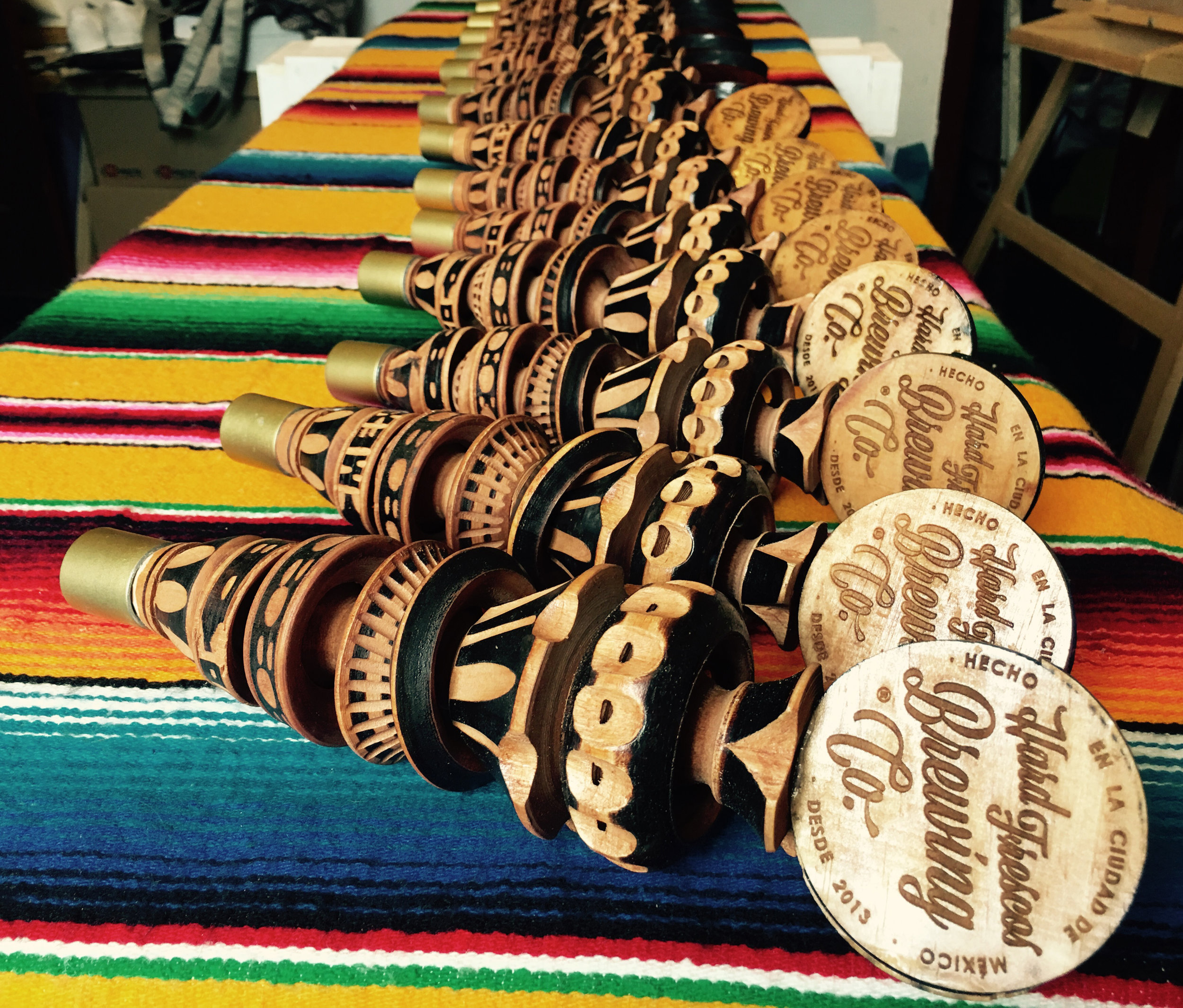
Founded in Mexico City in 2013, Hard Frescos Brewing Co. launched their first alcoholic aqua fresco in 2015. The initial bottle and can designs featured a somewhat illegible and uninspired block sans, but sometime in 2017 they rebranded with Viktor Script, which was fairly new at the time. The typeface, by San Franciscans Erik Marinovich and James Edmondson, was somewhat of a local choice as Hard Frescos has an office in the city. In designing Viktor Script, Marinovich was also inspired by the hand-painted signs of the Mexican-American Mission district, so there’s a connection to the company founders’ homeland too.
The supplementary sans in the most recent branding is the Latin American Alegreya Sans.
The website (currently offline) and print material were created by Knockout Design. It’s not clear if they were also responsible for the logo and packaging.


2017 logo.


")


