
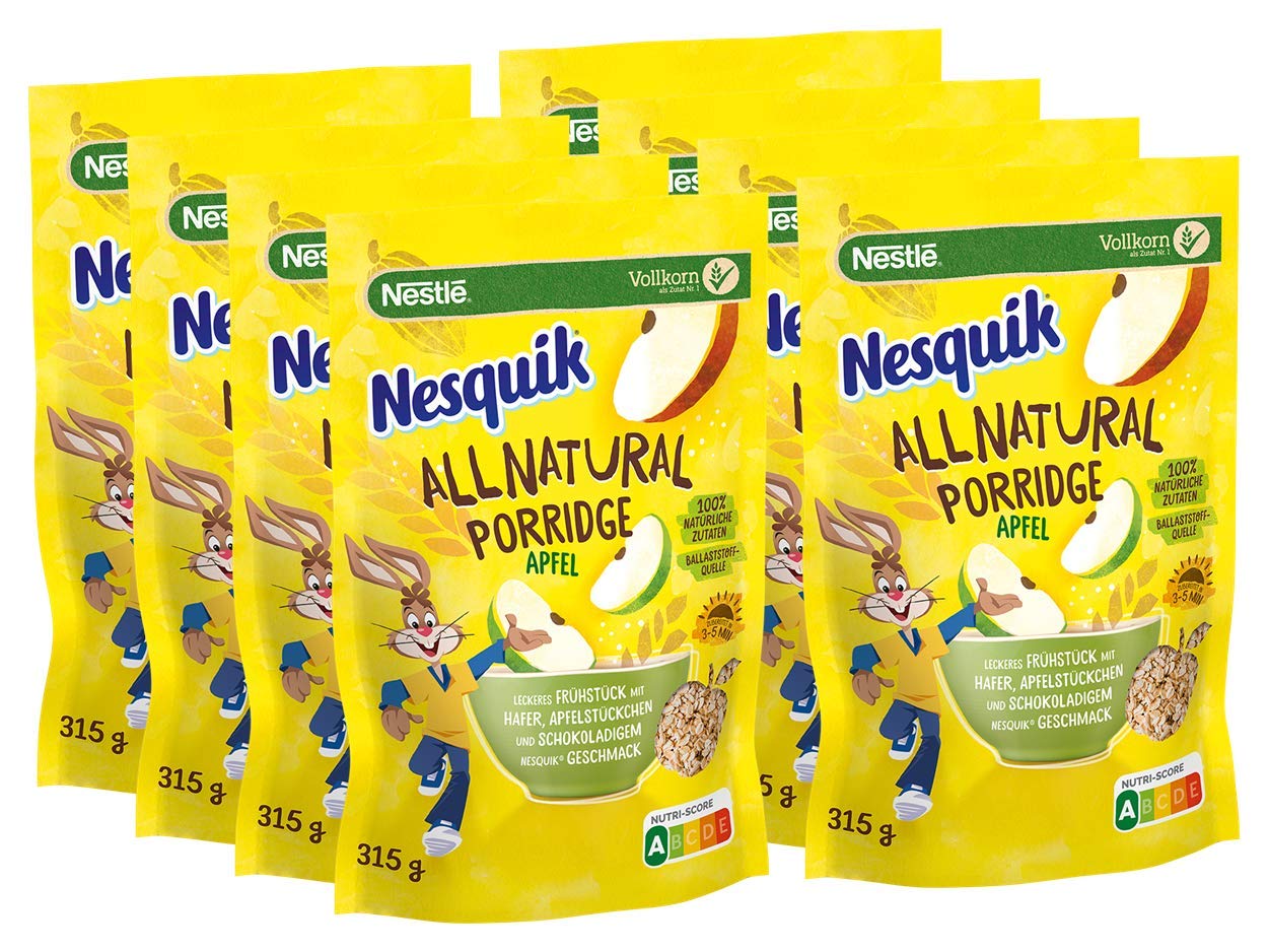
Nestlé Nesquik All Natural packaging and identity

With a simplified and natural ingredients list, the new take on Nesquik products comes in recyclable paper packaging. From the website of branding agency Roman Klis Design:
To convey the new sub brand’s story of sustainability and naturality, we created a human and friendly tone of voice that encourages recycling in a supportive and natural way versus lecturing and demanding. According to the design trend “be open, honest and transparent”, we not only talked about the origin and the naturality of the ingredients, but also highlighted the packaging’s sustainability approach verbally and visually. In addition, we created a most sustainable interpretation of the iconic brand properties of Nesquik® that turned mums from gatekeepers to advocates.
PintassilgoPrints fonts Daft Brush and Stick-A-Round were chosen to convey the packaging messages.


")


