
Zandschower Klinken by Thomas Kunst (Suhrkamp)
When looking at its regular weight only, one could get the impression that Alias Ano is just another straightforward geometric sans serif. In fact, it’s a multifaceted kit, or, as designer Gareth Hague put it, “a simple geometric, monoline framework”, which he originally drew for Another Man magazine. The type system spans six weights, four of which (Eighth, Quarter, Half, Regular) are mathematically defined to allow combinations with consistent line widths. Each weight includes three variations, always in upright, Italic, and Back Italic postures, for a total of 54 fonts.
In addition to the conventional Regular, the three variations include Upper Lower, in which the capitals have scaled-up minuscule forms, and Wide. Here, all caps are as wide as they are tall, whereas the lowercase offers caps that occupy exactly half the width. Ano Wide doubles down on the limitations of monospaced typeface designs: not only is there one fixed width for the caps and a second fixed width for the lowercase. The two are also unusually wide (full square) and narrow (half square), respectively. This concept leads to a unique neo-Art Deco look. Together with the monolinear strokes that pass on any perceivable optical correction, it yields a peculiar pattern with both open and dense glyphs, especially in the Black weight,
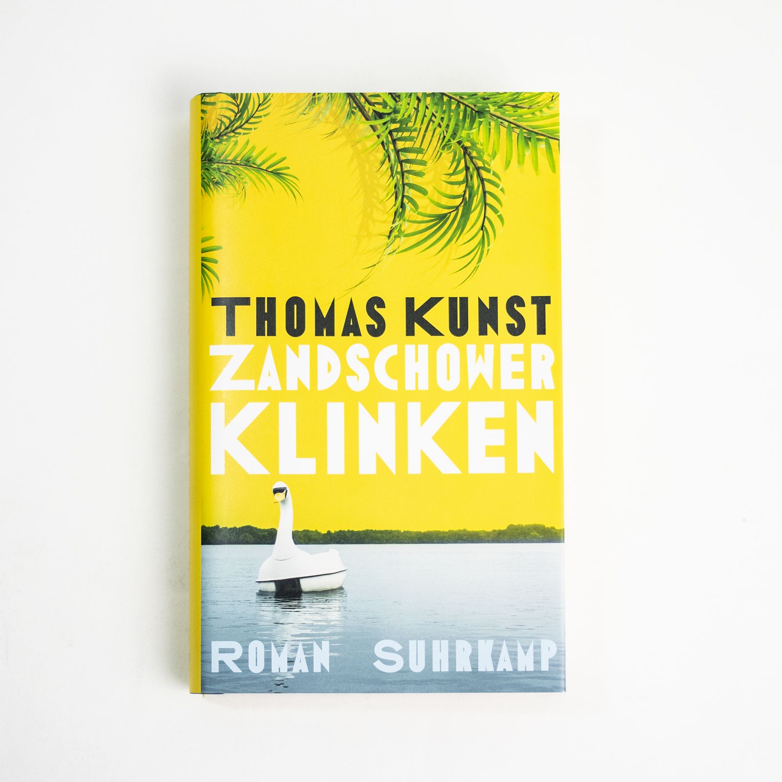
For Thomas Kunst’s novel Zandschower Klinken, the jacket designers worked with Ano Black Wide. Apparently, they weren’t quite happy with all the letterforms that result from Ano’s strict system: several of the glyphs were altered to make them less congested. This includes enlarging the counters and apertures (see D, H, O, R), redrawing the W, and, more strikingly, expanding the two K’s in “Klinken”. In fact, these are the uppercase full square form (as seen in “Kunst”), squooshed to around 75%. Unfortunately, this modification shows in the uneven line widths between the stems and the arms.

The jacket typography (top) compared to a resetting in unmodified Ano Black Wide (bottom).

All 54 styles of the Ano family


</cite>")


")


")


