
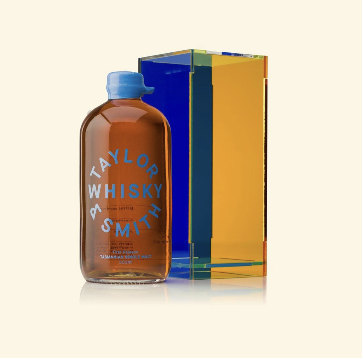
Taylor & Smith whiskey packaging

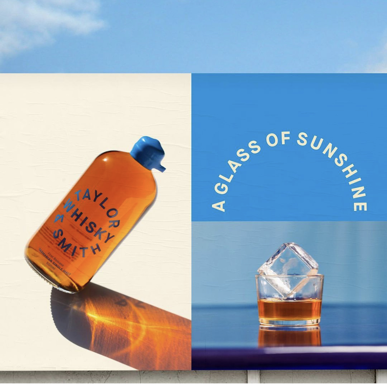
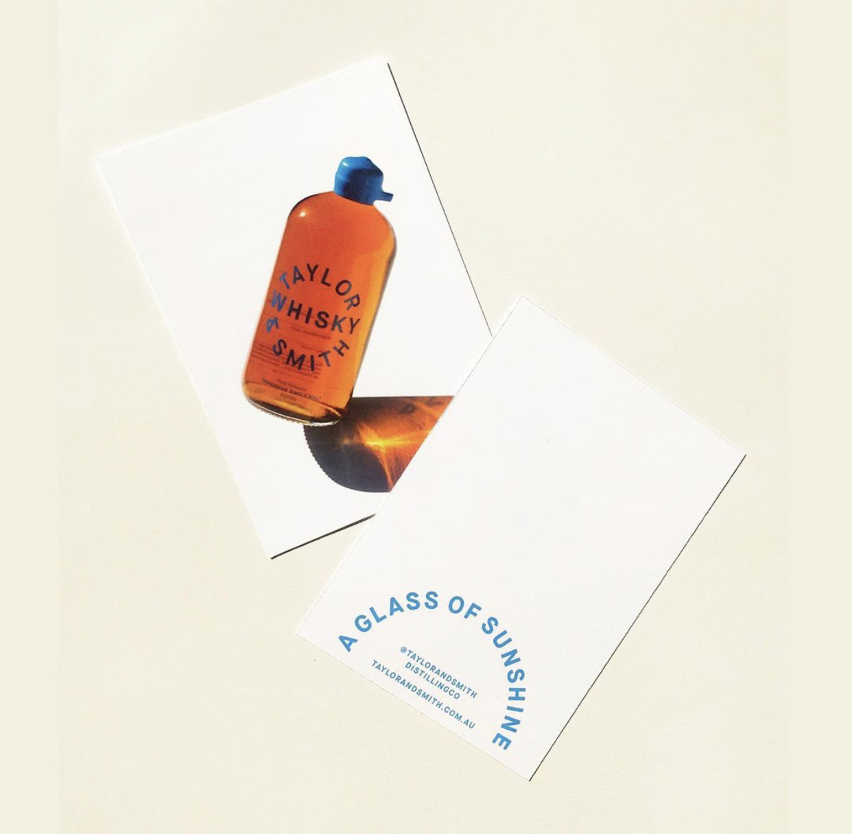
Packaging design and launch campaign by Megan Perkins for Taylor & Smith Distilling Co. The concept for the distillery identity is based on the contrasting qualities between the location and the product itself. Located in Moonah, the distillery produces experimental spirits that draw on the beautiful natural ingredients of Tasmania’s pristine landscape.
The solution works to hero and reinforce the distillery name. Perkins uses the juxtaposition of the bold typography with the beautiful materials with inherent color integrity to reflect the pure and natural ingredients implied by the Taylor & Smith name. Bold color is also used to achieve strong visibility and communicate the intensity of flavor of Tasmania’s botanicals.
In the word of owner Ben Taylor: “The scale of the season here is more compressed than it is on the mainland. So you get an intensity of flavor in the Botanicals – you get a stronger, more oily essence.”


Reference Image


")


")


")

