Picabia exhibition at Van Abbemuseum
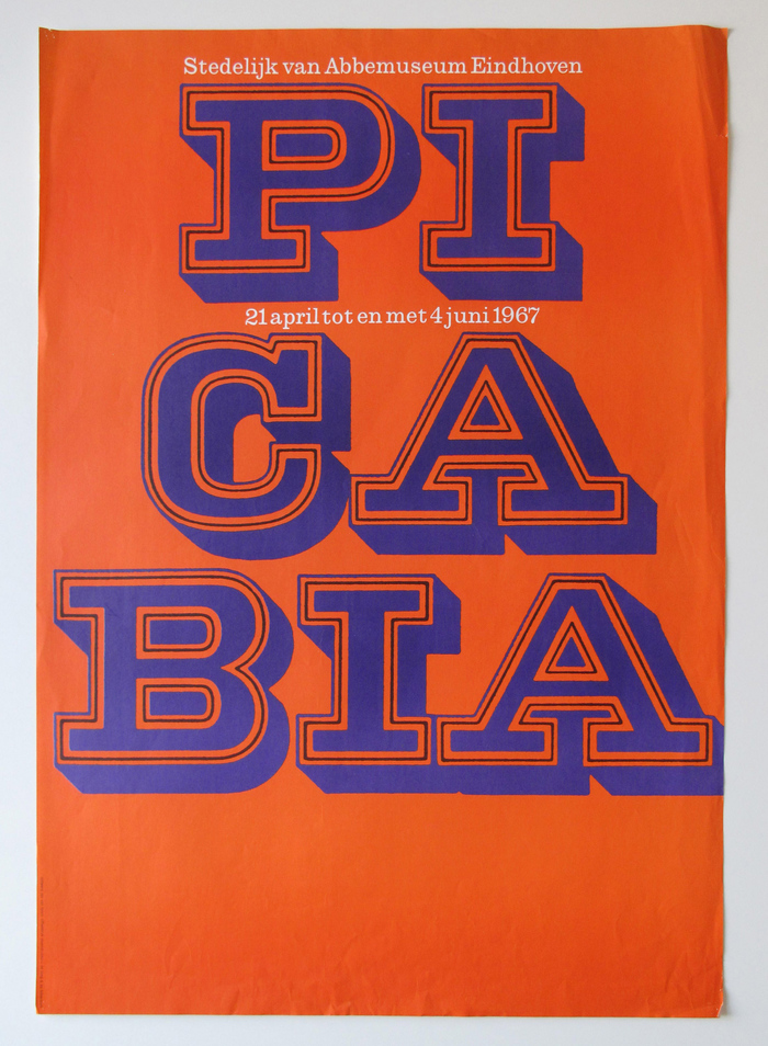
Poster with Picabia’s name broken into syllables. The slab-serif letterforms are printed in two colors, with the inner contour in black. Smaller text is shown in reversed New Clarendon. The poster was produced by Steendrukkerij de Jong & Co in Hilversum.
Poster and catalog to an exhibition of works by Francis Picabia at the Stedelijk van Abbemuseum Eindhoven in 1967, by Dutch graphic designer Jan van Toorn.
In a feature for Eye magazine from 1990, Gerard Forde writes about Van Toorn:
His first challenge to official culture came in a series of posters and catalogues for exhibitions organised by Jean Leering at the Van Abbemuseum in Eindhoven. Van Toorn saw the museum as a manufacturer of art-media ideology and sought a way of jarring consciousness through visual unorthodoxy. Where Modernist predecessors like Max Bill, Otto Treumann and Josef Müller-Brockmann had been content with the least ornate, most rational typefaces – a level of neutrality that Van Toorn viewed as naïve – he sought out the more idiosyncratic fonts, flaunting the typographic taboos of the then all-pervasive International Style. In Van Toorn’s eyes, the post-war period had witnessed the disciplining of graphic design into a gutless mediator between the interests of international economic and institutional forces, and an audience of passive consumers.
In the 1950s and 1960s, designers who yearned for more expressive typographic material struck gold in the Lettera series of alphabet source books. In the preface to the second edition of the first volume, editor Armin Haab characterizes the selection of display letters as “predominantly ornamental in character […], swimming against the current of ‘cold art’ in commercial work”, because “even the coolest variety of design cannot disperse with a touch of the exotic.”
And indeed Van Toorn was a Lettera user! For this exhibition, he worked with an alphabet design named Red Roses. This wide slab serif with double contour and shadow was drawn by Paul Sollberger, a graphic artist from Bern, Switzerland. It’s part of a series of five decorated capital alphabets reproduced in Lettera 1, first issued by Niggli in 1954.
On the poster, Van Toorn shows the magnificent capitals as large as possible, breaking up the artist’s name into three lines. On the catalog, the name takes up the full width of the front cover and the inner flap, and only becomes readable once the booklet is opened.
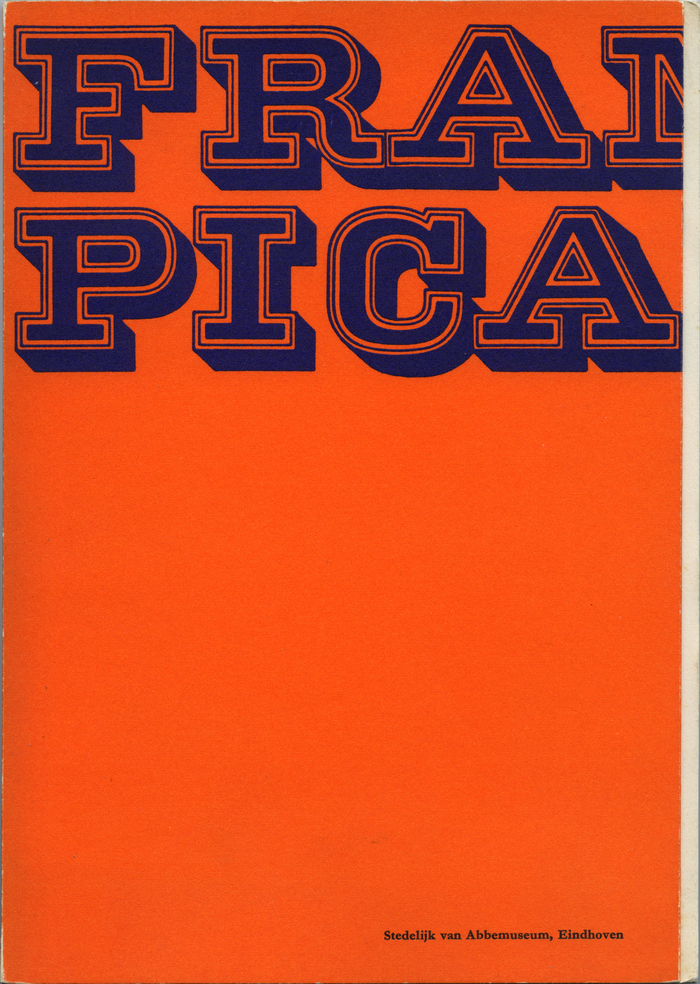
Catalog cover (closed). The catalog has 80 pages and measures 9.5×6.5 inches. It was edited by Jean Leering and printed by Lecturis nv, Eindhoven.
This weekend, Peter Biľak of Typotheque shared the sad news that Van Toorn died on 14 November 2020, aged 88, and commemorates him as “designer, author, educator, proponent of critical design and social engagement. One of the most significant Dutch designers with lasting influence on a generation of designers”.

Catalog cover and inner flap. The small text is set in what looks like a bold Garamond variant.
Formats
- Posters/Flyers (4742)
- Booklets/Pamphlets (1973)
Designers/Agencies
- Jan van Toorn (2)
Tagged with
- exhibition posters (543)
- Francis Picabia (1)
- Van Abbemuseum (5)
- Steendrukkerij de Jong & Co (5)
- big type (1492)
- mid-word linebreaks (622)
- chromatic (611)
- contoured type (363)
- shadow effects (978)
- all caps (5981)
- orange and blue (108)
- Dutch (language) (394)
- exhibition catalogs (675)
- paperbacks/softcovers (1494)
- paperback with flaps (69)
- inner flaps (78)
- cross-page type (286)
- book covers (4806)
- only type (1106)
Artwork location
- Netherlands (944)
- Eindhoven (32)
- Amsterdam (335)


