
Julius Hager ads (1902–04)
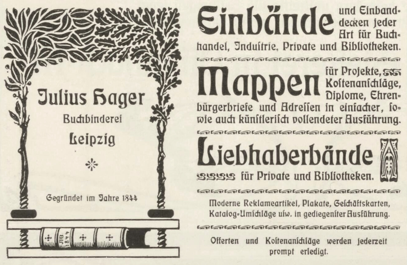
Small ad for Julius Hager in Buchgewerbe und Gebrauchsgraphik, Vol. 41, 1904.
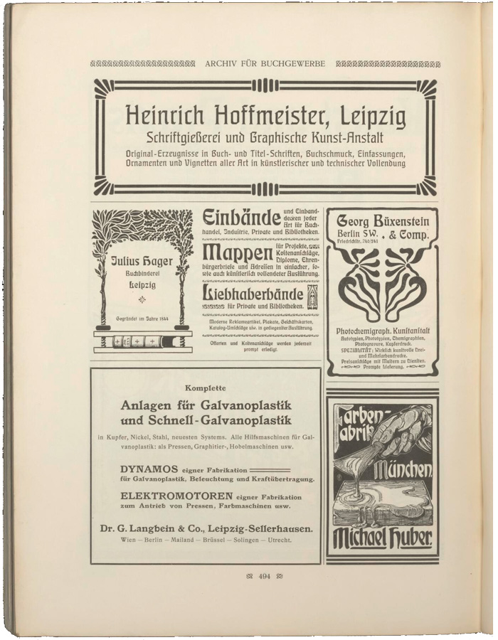
Eckmann was very hot in the first few years after its release in 1900. At the time, It seemed everyone wanted a piece of Jugendstil action, and Otto Eckmann’s design, cut by the Rudhard’sche foundry in many sizes, was probably the most comprehensive embodiment of German Art Nouveau as a typeface. Evidence of its popularity can be seen in the advertising section of the major printing annual Archiv für Buchgewerbe where the type makes a frequent appearance. In the 1904 edition there is a page showing Eckmann used by two different companies, side-by-side: Julius Hager and Georg Büxenstein.
Julius Hager was a prominent, Leipzig-based book binder with a long history. Earlier ads from the company featured another typeface that was trending in the decade before Eckmann, Bradley.

Full-page ad from the 1902 edition of Die Graphischen Künste der Gegenwart, a compilation of Jugendstil art and printing.

")


2 Comments on “Julius Hager ads (1902–04)”
It’s not the focus of this post, but in case anyone wonders: The typeface used in the ad by the Heinrich Hoffmeister foundry in Leipzig (above those by Hager and Büxenstein) is their Teutonia, first cast in 1903. The fett provided the basis for Schneekönigin.
When comparing the two ads by Hager, two inconsistencies can be observed.
At this time, and in the centuries before, the use of both forms of s – long ſ and round s – was mandatory for blackletter text in Germany, at least in the field of typography (lettering is a different thing, with less strict rules). Antiqua (i.e. roman) typefaces incl. slab serifs, sans serifs, and other non-blackletter styles typically were equipped with a long ſ (and the respective ligatures), too. However, the use of ſ in Antiqua text became increasingly uncommon. Some specimens from the 20th century mention that the sorts will be included in the font only upon special request.
Hybrid typefaces like Eckmann-Schrift sit between blackletter and Antiqua – not only in terms of the letterforms, but also regarding such preferences. The ad from 1902 doesn’t feature the ſ (and also skips the eszett in favor of a plain double s in “Breitkopfstrasse”). The typesetter apparently placed Eckmann more in the Antiqua category. The ad from 1904, however, uses the ſ – here, the typeface was regarded more a blackletter design.
The second inconsistency can be found right in the company’s name. Eckmann comes with two forms for I; a plain dotted one to be used in medial or final position in all-caps settings, and a standard one with top bar and hook. The J is distinguished from the latter by a crossbar. While the 1902 ad uses the J proper, the ad from 1904 technically spells the name as “Iulius”. It’s not really an error, though. After all, in German orthography, the J is rather a stylistic alternate for the initial I than a character in its own right.