Heaviko
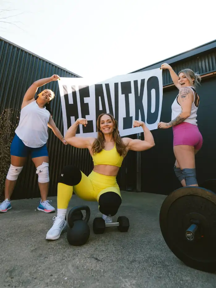
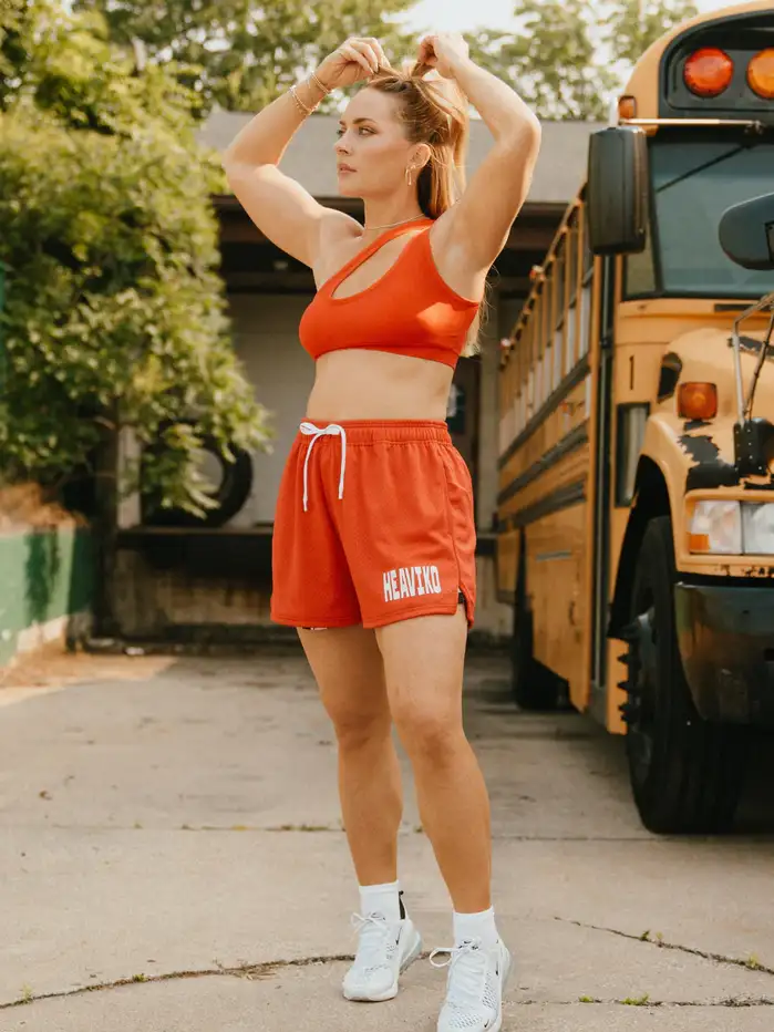
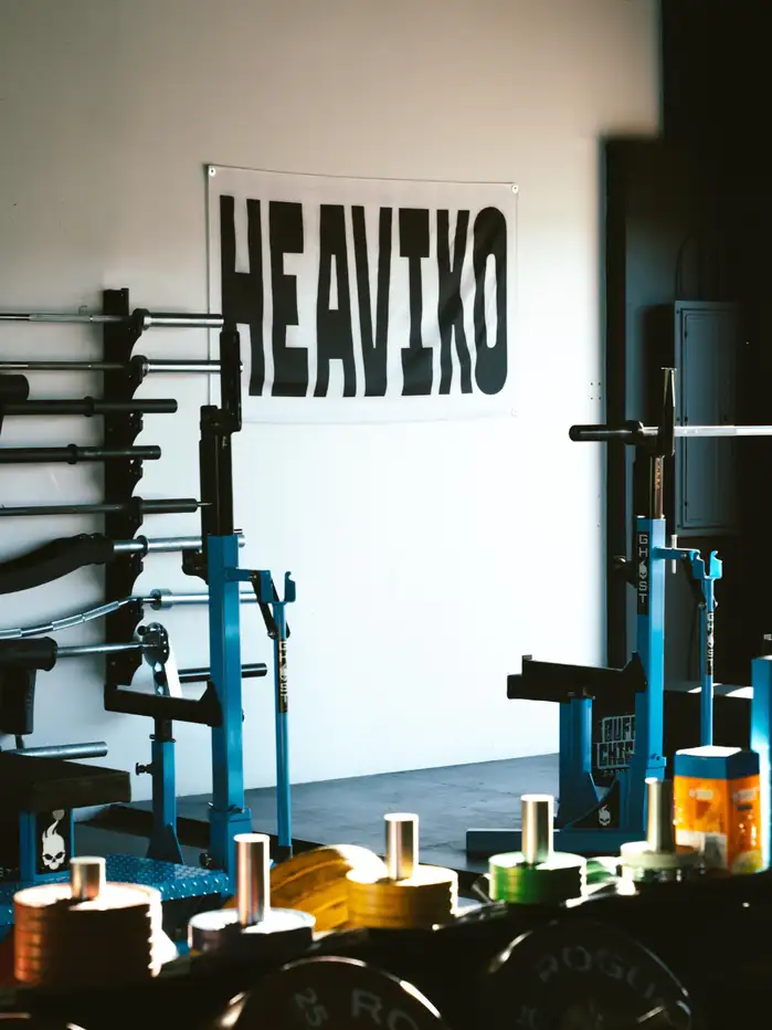
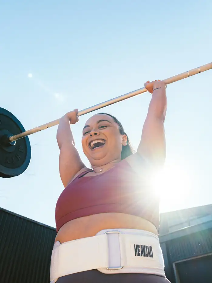
In some circles, weightlifting and other strength sports are still associated almost exclusively with male bodies. Heaviko set out to change that: their mission is “to create elite equipment for every lifter”, which explicitly includes women. Formerly known as Strong Strong Supply, they rebranded in early 2023 and launched a new logo.
Blurr Bureau comments on the challenge:
How can we redefine the concept of strength for women without resorting to societal clichés? Our research revealed a significant oversight in the fitness market—in a male-dominated space, brands aren’t speaking directly to women engaged in strength training. To stand out in the category, we need to elevate inclusivity and diversity within the femme fitness community
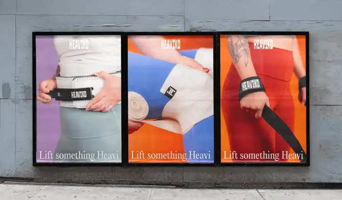
The directive was clear: forge a brand that transcends stereotypes, offering equipment for every lifter—regardless of where they stand in their training journey. Inspired by the harmonious tension between heavy lifting equipment and feminine aesthetic, Heaviko’s brand world utilizes a dense word mark paired with a refined typographic system built for expressive and lighthearted play.
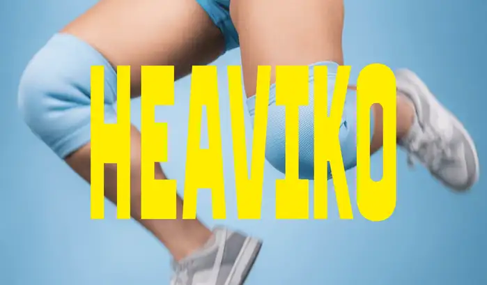
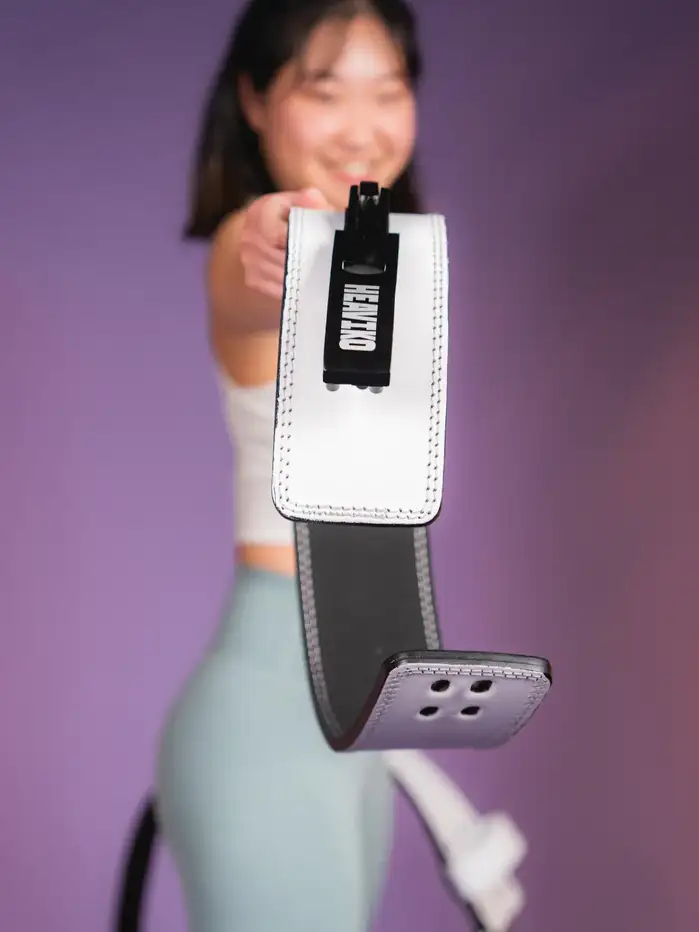
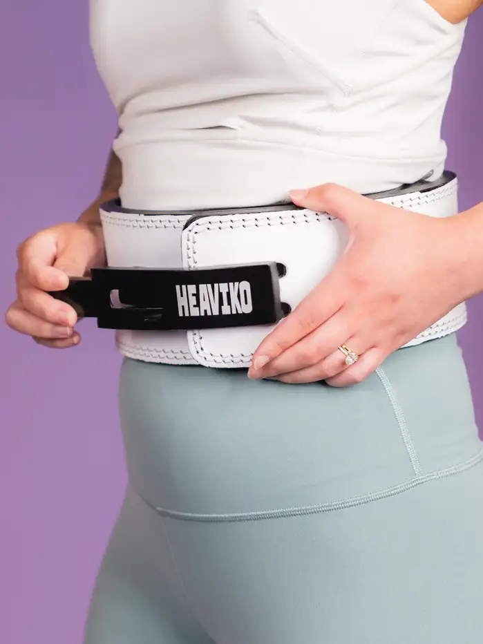
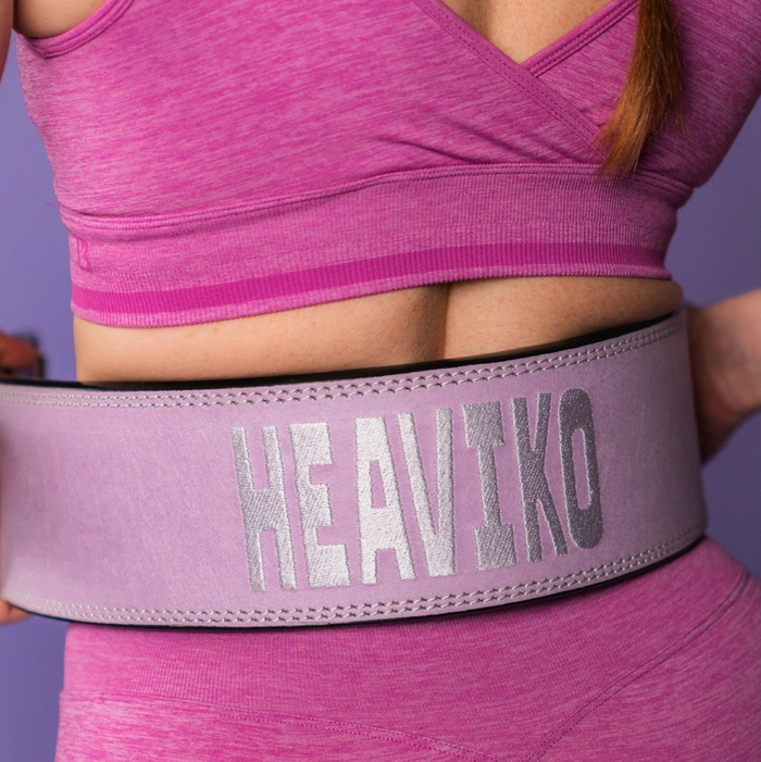
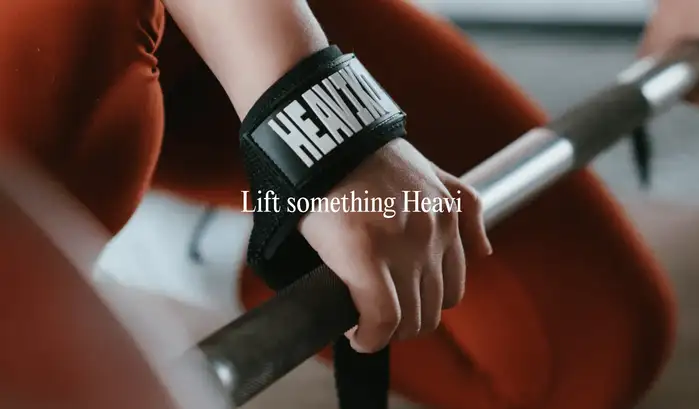
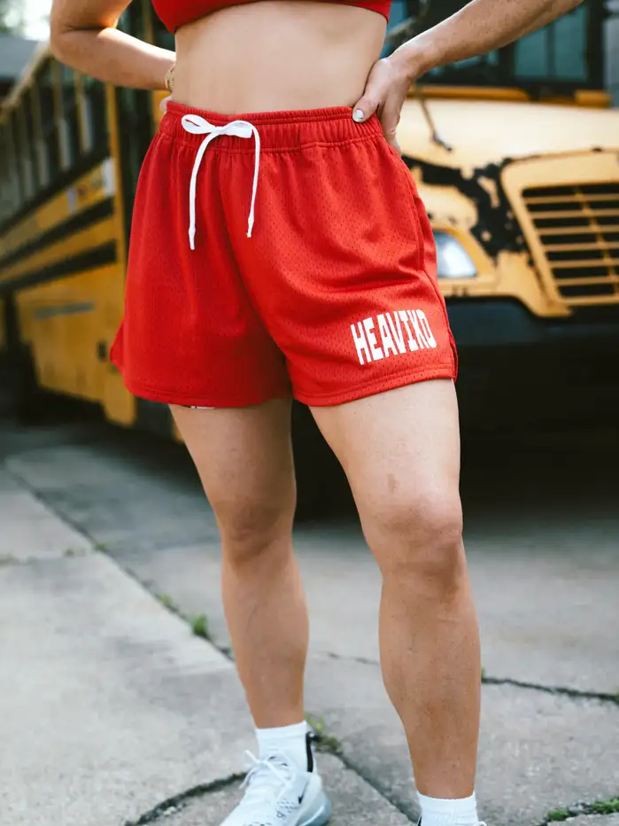
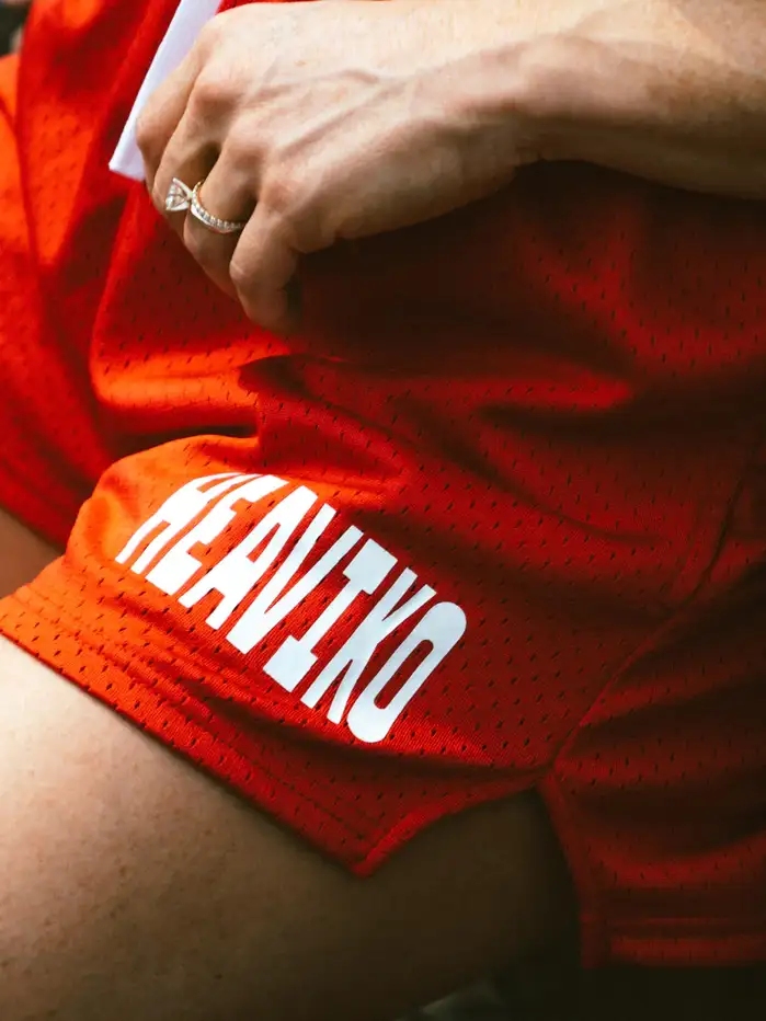
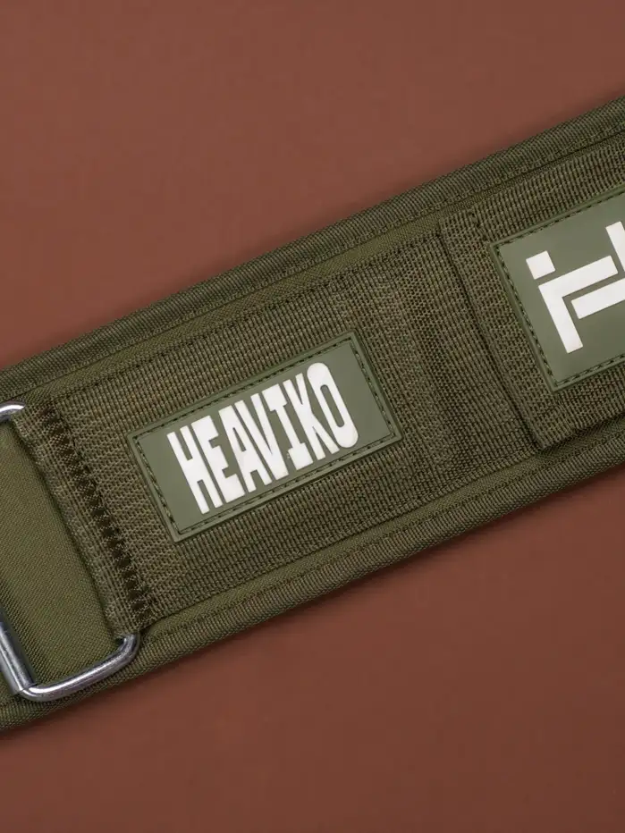
For said wordmark, the designers avoided the usual suspects like brawny slab serifs and stencils. Instead, they opted for a font that is more left-field and still communicates strength: it’s Signal Compressed by Production Type. With the stretched look, the reverse-contrast sans is a natural fit for Heaviko’s elastic wrist wraps, velcro belts, and neoprene knee sleeves. Thanks to its elongated proportions, it makes for a horizontally compact wordmark.
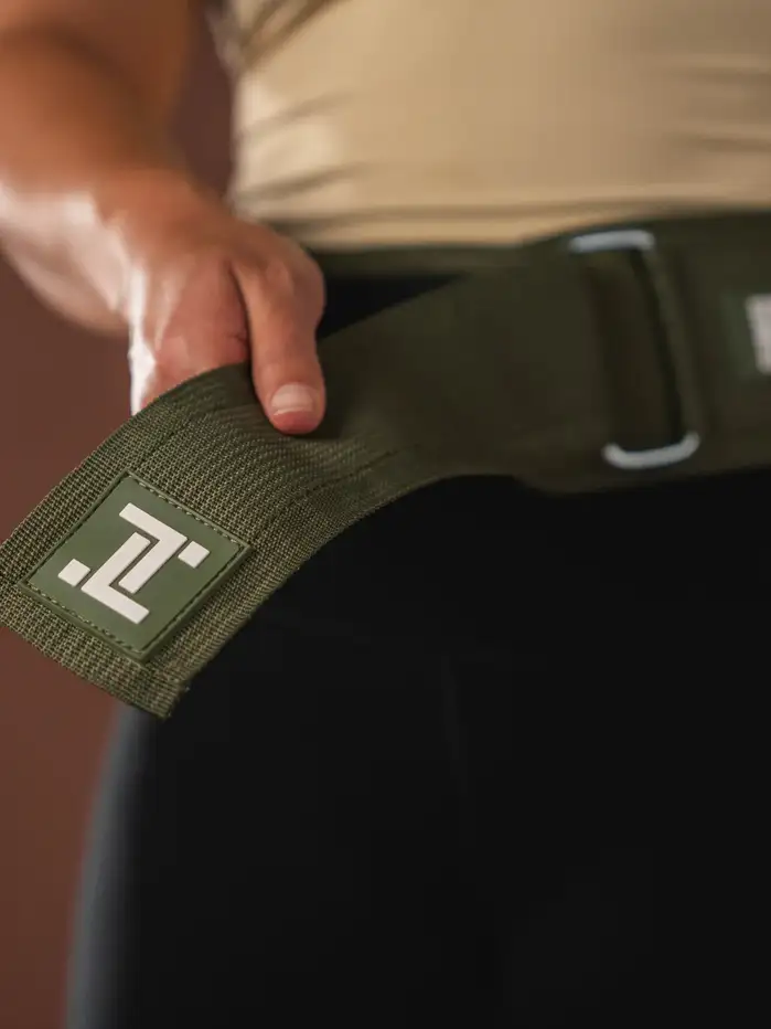
The Heaviko logo uses Signal Compressed in capital letters, with one apt modification: the letter I put up some weight at the top and bottom. Not only does this intervention nicely echo the outer horizontals in E – it also playfully references barbells.
The accompanying serif used in advertising is Pangram Pangram’s Editorial New.
Formats
- Packaging (1985)
- Advertising (1782)
- Object/Product (939)
- Branding/Identity (6685)
Topics
- Product (1594)
- Fashion/Apparel (1300)
- Sports (626)
Designers/Agencies
- Blurr Bureau (1)
Tagged with
- weightlifting (6)
- sports (138)
- fitness (33)
- women (194)
- inclusion (18)
- brands (1108)
- logos (3884)
- apparel (79)
- sportswear (65)
- athletic gear (7)
- all caps (5987)
- modified typeface (1471)
- banners (251)
- belts (4)
- pants (10)
- muscles (5)
Artwork location
- United States (8328)

