
Thalassa (1976) TV magazine logo
The Thalassa title card. Univers Condensed is used for the subtitle.
Thalassa – Le magazine de la mer is a reportage-centered TV magazine about all things sea (maritime animal life and human activities from France or all around the world). Created by Georges Pernoud in 1975 and still broadcast to this day on France 3 (a network of regional television channels), it is one of the longest running shows on French public television.
In a true 1970s fashion and for the most time after its creation, Thalassa’s logo has been set in Cooper Black, sometimes with condensed letterforms. The typeface is strongly associated to the TV show as it has been used on all kinds of tie-in objects. It’s still displayed on the barge tied up to the river Seine in Paris which is the floating studio of the show.
From the late 1970s through 2003, the program opened up with a morphing sequence of several sea-themed objects on a deep-blue background: a fish turning into boat, then a conch, a compass rose, a crab, a diving suit, ending in the shape of Jacques Rougerie’s futuristic underwater habitat project named Galathée. This sequence created by Gérard Marinelli has fascinated generations for decades not only because of the mesmerizing quality of the image morphing, but also because of the beautiful and dreamlike music accompanying the animation that has been composed by Guy Pedersen.
For the longest time the name of the designer behind the opening sequence has been little known by the vast majority of the audience, but last year the French design-related online review Strabic published a very interesting and must-read interview of Marinelli conducted by Tony Côme and Charles Villa. Marinelli there recounts his career (in which he met Raymond Loewy, Cassandre, and Savignac!) and comments on his works (he has designed the famous first France 3 logo, at the time called FR3, with a play on shapes as France is nicknamed “the hexagone”) as well as his technical tours de force, such as using a British army computer to digitally create Thalassa’s morphing thanks to an Oxford University professor, Tony Diment (who has for the first time on British television used computer-generated animation for the titles of the TV-series The New Avengers — starring Joanna Lumley!).

Georges Pernoud on the set in 1984.
The 1990s version of the logo, with Gill Sans for the subtitle.
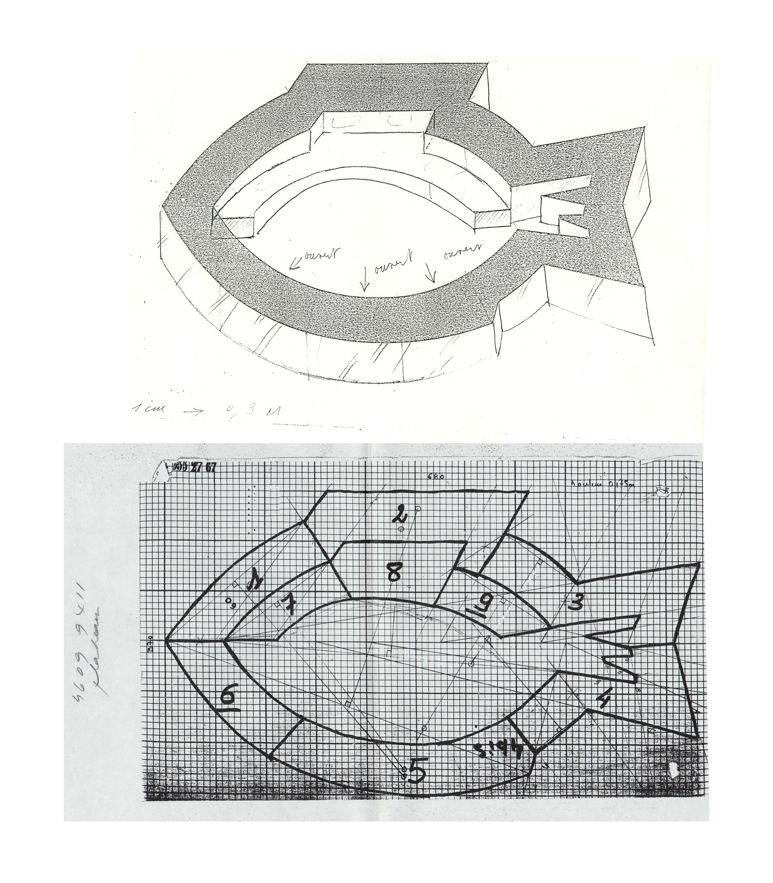
Gérard Marinelli’s constructed set design for the show.
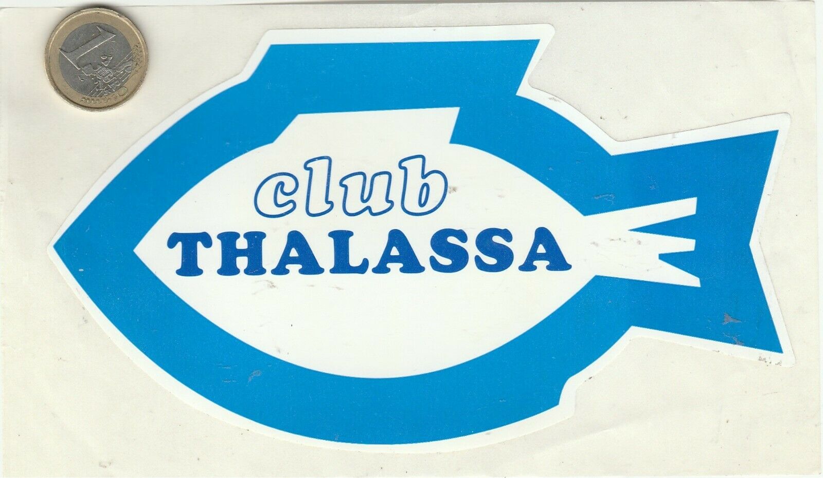
Club Thalassa sticker, with “club” in outlined Cooper Black Italic.
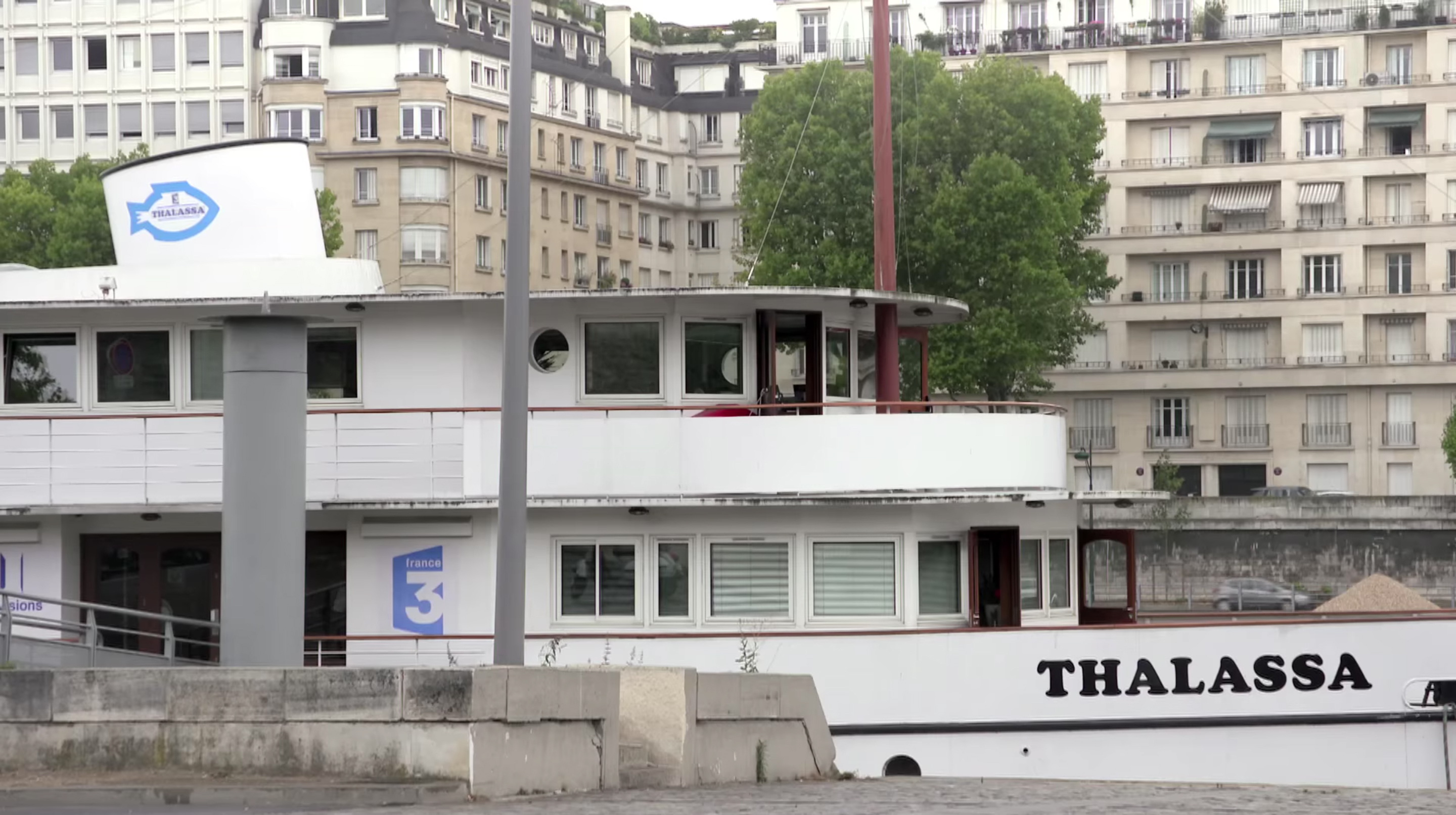
The barge/studio of Thalassa on the river Seine in Paris.

Thalassa’s board game.


 station sign of Kyiv Metro")


2 Comments on “Thalassa (1976) TV magazine logo”
Alice Savoie’s 2007 thesis on French typography in the twentieth century commented that advertising and font designer Albert Hollenstein (designer of ITC Eras) “shattered French habits” in design by importing Helvetica and Cooper Black into France. He died in an accident shortly before this show was first broadcast, in 1974.
To illustrate this point, here’s Cooper Black with stars and stripes on the cover of Hollenstein’s American Type Shop catalog from 1968.