
Quantum Wines

Quantum is the top-selling wine brand by Domaine Boyar. The company needed a fresh eye-catching wine label design and I was commissioned to create it. The old look of the wines was already out of time, so I was very sure they would need something completely new to continue with good sales.
I kept the brand name and the classic tapered bottle as a foundation of my new project and started dreaming of an amazing eye-catching wine label design. It was really easy and fun brainstorming with a mighty word like Quantum so I did more than five inspiring proposals based on different ideas. Luckily the one I liked the most was my client’s favorite design, too.
I created a very large label to cover most of the bottle with paper. I picked — like in many other projects of mine — the Snow Country paper by Arconvert for its very delicate texture, matt finish and excellent performance in different climate conditions.
The focal point of the label is an artistic modern letter Q stamped with different colors of hot foil, depending on whether the wine is white, red, or rose. The letter measures some 4 cm in height, so it’s really huge. The reflections of the hot foil are so tasty when you rotate the bottle in your hands that everyone is enchanted by this eye-catching wine label design.
I also created a linear pattern from the top right corner of the label towards the letter Q because I wanted somehow to concentrate more details, attention and even more energy around it. On the other hand, I did not want to make too much visual noise as I was looking for an elegant and clean look, so I decided to print these lines with transparent varnish. I like playing with varnish. Raised varnish gives very gentle reflections in different light conditions without changing dramatically the overall appearance of the artwork.
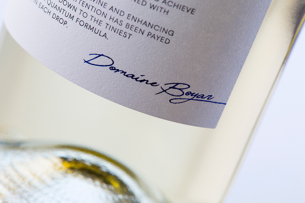
Having started with a typographic key element, I wanted to keep a very simple and good typography for the rest of the label. The bottom half holds the brand and a short message explaining the essence behind the Quantum name. I made a simple left-aligned composition of heading and body text using one of my favorite sans-serif font families – Quasimoda Pro by Lettersoup. I like using this family on my wine labels because it’s one of the best modern typefaces that can give you a clean, contemporary and legible look of your texts, and if needed, you can pick from a range of weights.
At the very bottom of this modern eye-catching wine label design I signed ‘Domaine Boyar’ using handwriting and stamped it with hot foil. I also tried to somehow match the color of the capsule with the color of the hot foil because I wanted to enhance the meaning of color scheme in the whole packaging.
As a result, from all my efforts I created a very modern and minimal-looking eye-catching wine label design where the play with different print processes along with good paper choice are almost everything that this packaging will need to shine among the others on the shelf.


 </cite>album art")


