
Covers for Archiv für Buchgewerbe und Gebrauchsgraphik, Vol. 69, Nos. 6 and 7
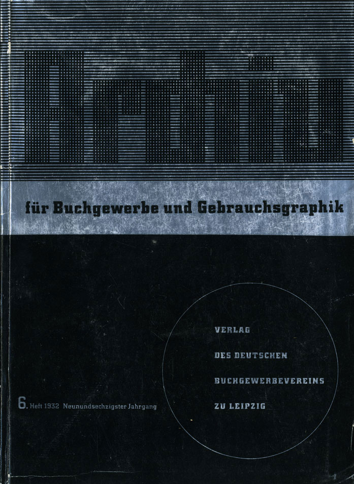
No. 6. Cover design by Karl Eckhardt, Berlin. Stefan Berndt pointed out some similarities to the specimen cover for City, which also features type in a circle in the bottom right quarter.
Covers for two subsequent issues of Archiv für Buchgewerbe und Gebrauchsgraphik, a journal of the graphic trade, from summer 1932. Both designs use Georg Trump’s City. The low-contrast slab serif was released by H. Berthold AG two years earlier, in 1930.
In the cover for the June issue, the word “Archiv” is composed from Dekora-Schmuck. This set of 46 geometric shapes, which can be assembled into letterforms or images, was issued by Schriftguss AG vorm. Brüder Butter around 1930.
The covers were made for a cover design competition, see the comments below.

No. 7. Cover design by Karl Franke, Berlin.


: 2011 Weight-Loss Supplement")


1 Comment on “Covers for Archiv für Buchgewerbe und Gebrauchsgraphik, Vol. 69, Nos. 6 and 7”
These cover designs were made as entries for a competition organized by the Deutscher Buchgewerbeverein (“German association of book trade”), the publisher of Archiv für Buchgewerbe und Gebrauchsgraphik, in 1931. The call for entries was published in Vol. 68, No. 7. The results were shown and discussed at length in Vol. 69, No. 1, including statements by Carl Wagner, president; Gottlieb Fischer, teacher in Nuremberg; and Emil Wetzig, teacher in Leipzig. The fourth jury member was Dr. Kurt Säuberlich, print shop owner and vice president of the association.
Of the total number of 803 entries, 120 were sent in from abroad (namely from Austria, Hungary, Czechoslovakia, and Switzerland), and 37 noncompetitive entries were submitted by type foundries.
All images courtesy IAADB.
The number was further itemized by type style: Grotesk (sans serif, 40%), Egyptienne (slab serif, 15.5%), Antiqua (serif, 16.5%), Fraktur (blackletter, 3%), Zeichnung (drawn letterforms, 10%), Photo-Typo (photographed typography, 13.5%). Entries that exclusively used lettering as opposed to typography had to be excluded for not meeting the rules. Wetzig notes a change of taste and bemoans that “the style-forming power of the sans serif” is on the retreat. The low percentage of blackletter uses is remarkable, especially when compared to their omnipresence on realized Archiv covers in the following years, after Hitler came to power.
Walter Höhnisch, who submitted a design using Futura-like letterforms, later made a career as typeface designer for Ludwig & Mayer. One year after the competition took place, his debut was released. National is one of the simplified texturas that mushroomed in the first years of the Nazi era.
The list of named competitors is dominated by men. There are three women, though: Ilse Schmidt, Leipzig; Pia Glaser, Wien, and Hanna Dallos, Budapest. Dallos, who was from a Jewish family, was murdered during the Holocaust in 1945.
Eckhardt and Franke each had four of their submissions reproduced in the competition retrospective. Shown below are two of them which also use City. Georg Trump’s typeface must have been hot among Berlin students – it appears in other entries, too. The one by Paul Zitzmann, Berlin, which, like Franke’s, falls into the Photo-Typo category, depicts metal sorts from City fett’s lowercase.
In addition to the two covers shown here, at least five other competition entries were realized over the course of the next months, some in slightly adjusted form. These include Vol. 69 No. 1 (Gerhard Dietrich, Leipzig), No. 4 (Rudolf Münster, Leipzig), No. 9 (Georg Schautz, Dresden), Vol. 70 No. 4 (Hans Rödel, Leipzig), and an unidentified issue (Alfred Adolf, Liegnitz).
See more Archiv covers in Kirsten Solveig Schneider’s collection.