
Sammlung Luchterhand series
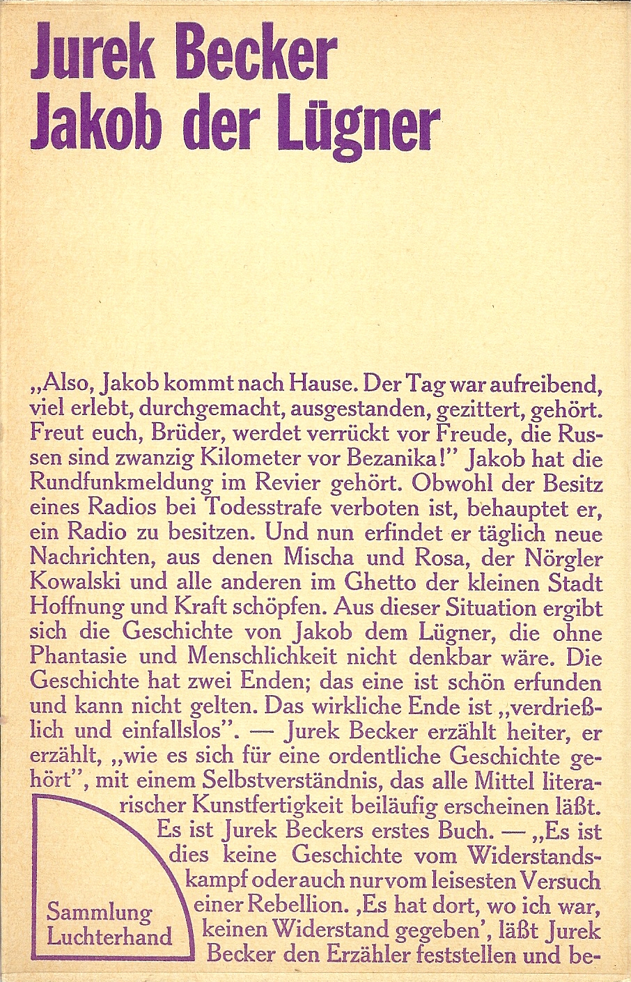
Jurek Becker: Jakob der Lügner, 1970
In the early 1970s, Hermann Luchterhand Verlag started the “Sammlung Luchterhand” paperback series with works on the subjects of literature, media theory, politics and social science.
The book cover designs are puristic and unconventional. First comes the author’s name and the title, all in one size of Franklin Gothic Extra Condensed, flush left. And then the content starts — right on the cover! The text typeface appears to be Sorbonne, Berthold’s Cheltenham follower.
Nowadays text on cover is one of the key ingredients of hip graphic design as collected by Trendlist.org. In the 1970s, it must have felt revolutionary. The groundbreaking concept was conceived by Hannes Jähn (1934–1987), a signpainter by trade and one of the most influential German book cover designers, incredibly prolific and highly versatile in style.

H.C.F. Mansilla: Faschismus und eindimensionale Gesellschaft, 1971

Ingomar von Kieseritzky: das eine wie das andere, 1971

Hans Magnus Enzensberger et al. (ed.): Klassenbuch 1. Ein Lesebuch zu den Klassenkämpfen in Deutschland 1756–1850, 1972

Ernst Jandl: Laut und Luise, 1971

Dieter Roth: Frühe Schriften und typische Scheiße, 1973


")
")
")


")


