Civic City Cahier series
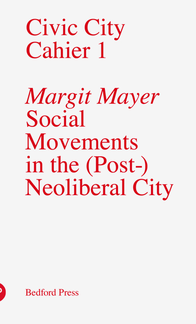

The type modification for Civic City Cahier 2 was provided by Milieu Grotesque.
The Civic City Cahier series intends to provide material for a critical discussion about the role of design for a new social city. It publishes short monographic texts by authors who specialise in urban and design theory and practice.
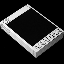
The first issue from September 2010 starts out with off-the-shelf (Linotype) Times. Civic City Cahier 2 not only introduces a different color, but also a number of slight — almost inconspicuous — modifications to the typeface: the ‘i’ dot is enlarged and diamond-shaped, the diagonals of ‘w’ overlap, ‘W’ has a low center vertex, ‘A’ gets a bent crossbar (as one can find in Romanesque inscriptions). Issue 3 picks up from there and adds several stencil-like letterforms. The typographical metamorphosis continues: For issue 4, ubiquituous Times has been turned into an odd hybrid with Latin (i.e. triangular) serifs. Civic City Cahier 5 interrupts the linear degradation and returns to the third stage, but not without implanting a new typographical interference: ‘wy’ is merged into an unignorable ligature. The last issue from September 2013 resumes the triangular serifs and throws in a ‘z’ with crossbar as well as an alien ampersand.
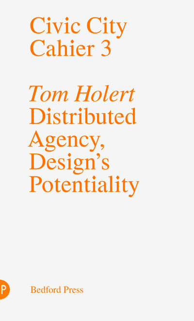
The counters were opened by Charalampos Lazos of Last Minute Panic.
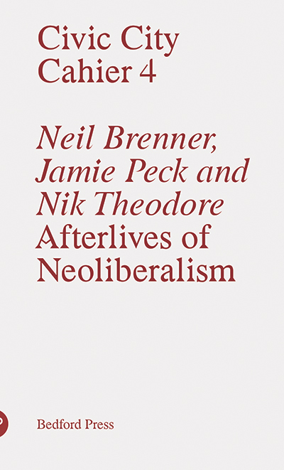
Studio Tobias Becker takes credit for the “Latinization” of the serifs. On their website, there are character set showings of “Axe Times”.

The type modding for the fifth issue is ascribed to Laqshmi Manolete Pellegrin.
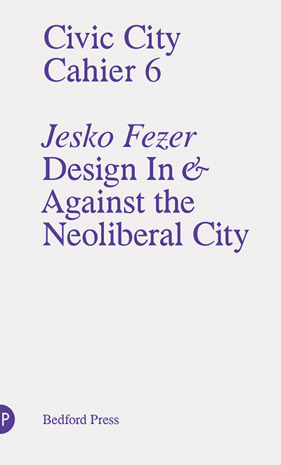
Formats
- Booklets/Pamphlets (1968)
Designers/Agencies
- Studio Görlich (1)
- Milieu Grotesque (1)
- Last Minute Panic (1)
- Laqshmi Manolete Pellegrin (1)
- Tobias Becker (1)
Tagged with
- Bedford Press (1)
- modified typeface (1465)
- book covers (4793)
- only type (1104)
- book series (428)
- metamorphosis (1)
- Design2Context (1)
- design theory (3)
- urbanism (189)
- Civic City Cahier (2)
Artwork location
- Switzerland (912)
- Germany (3265)
- United Kingdom (2760)
- Zürich (228)
- Darmstadt (16)
- London (1521)
In Sets
- Opaque (David Sima) (10)
















1 Comment on “Civic City Cahier series”
Brilliant—I’d love to see this multi-phase distortive treatment given to a few other typefaces.