
Macintosh logo and badge
Source: www.flickr.com Uploaded to Flickr by Grant Hutchinson and tagged with “itcgaramond” and “applegaramond”. License: CC BY-NC-ND.
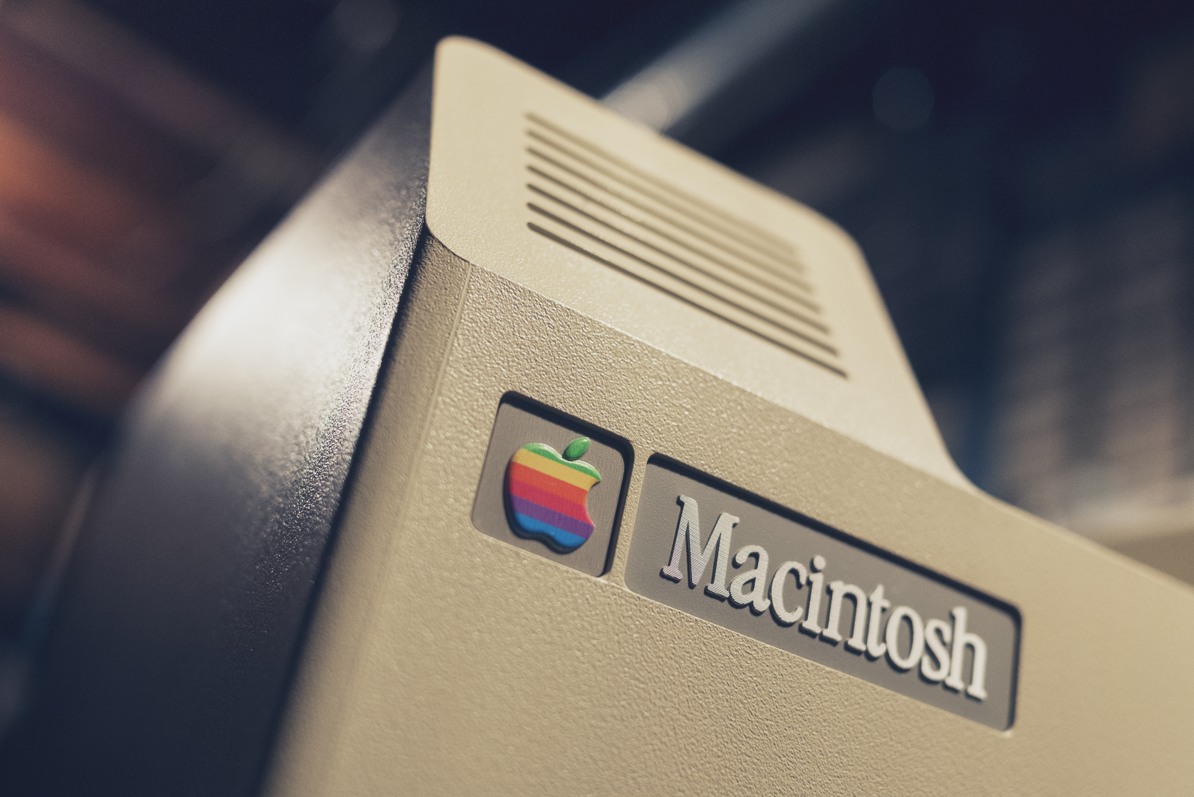
Happy 30th birthday, my little beige friend.


")


")


")
2 Comments on “Macintosh logo and badge”
In the OS 7 days, I remember staring at the Macintosh startup screen while waiting for the system to boot up, and wondering why the ‘a’ sat so low compared to the ‘M’. Little did I know (this was before I really got into type) I was seeing an example of overshoot in a typeface meant for text, not redrawn for the screen use at that size. Or maybe it was simply an unhinted font? That issue is corrected on the hardware badge above.
Speaking of hinting, we still need to dig into the differences between Apple Garamond and the squished version of ITC Garamond that Apple actually used for a while before Bitstream corrected it.
Letterform Archive has a significant collection of Apple material donated by Clement Mok who was on the design team throughout the 1980s. I’ll share more soon.
Hah, searching for screenshots I see that by Mac OS 9.2 they rethought the alignment, but slightly overcorrected, pushing the ‘M’ down a little too far.