Firestone logo
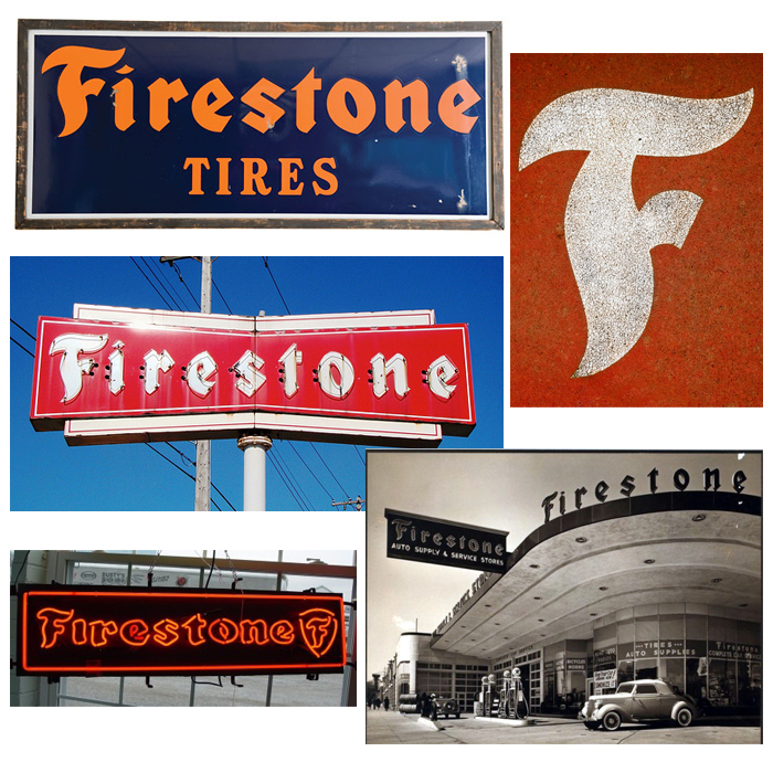
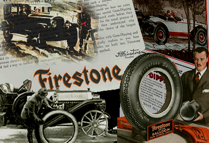
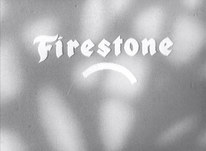
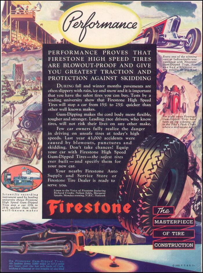
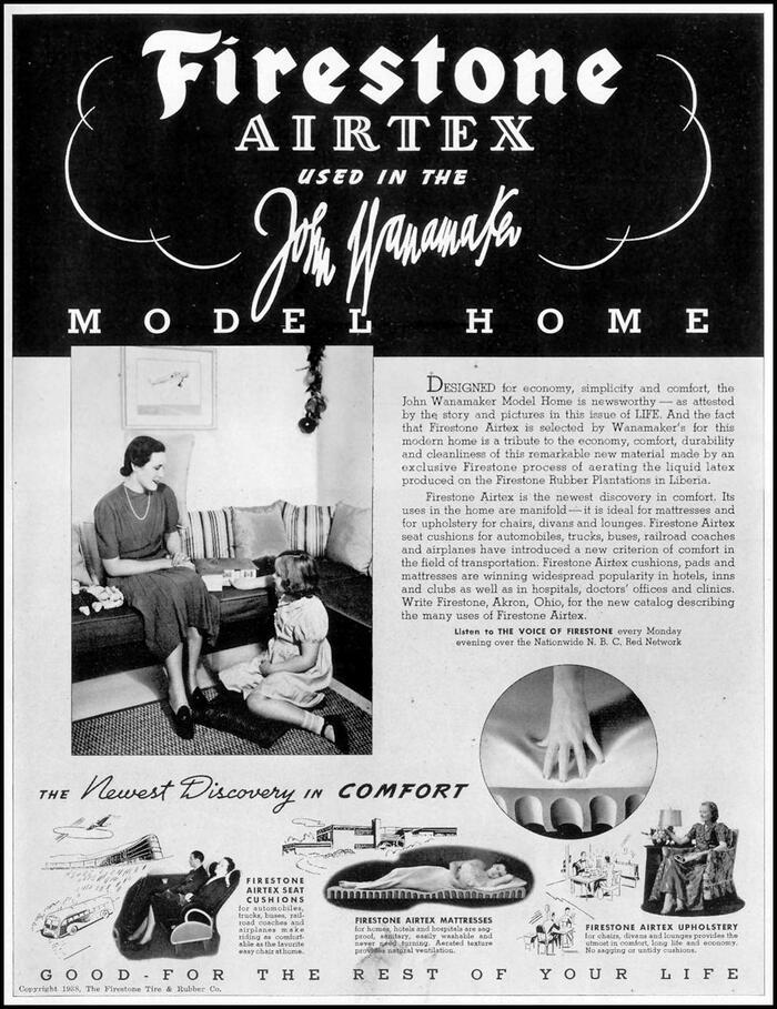
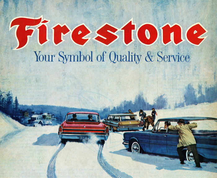
Compilation of Firestone ads from the company’s first few decades. The logo at this early stage very closely matches Bradley Extended.
With its signature flaming ‘F’, the Firestone logo is almost certainly based on the extended style of Bradley. Firestone was founded in 1900, a few years after the ATF typeface was released. The lettering in the original logo departs from Bradley most visibly in the ‘S’ (much darker and more symmetrical than the typeface) and the upstrokes on ‘i, r, n’.
Surviving with very few modifications for over 100 years – the current (2013) logo is much wider than previous versions – the Firestone mark is one of the most durable identities in America, a nation that impatiently scraps even the most iconic brands.
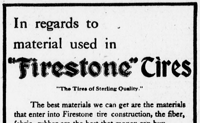
An ad in a 1908 edition of New York’s The Sun newspaper shows the Firestone logo with “Tires” in Bradley.
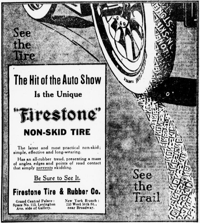
Non-Skid Tire ad, The Sun, 1909.
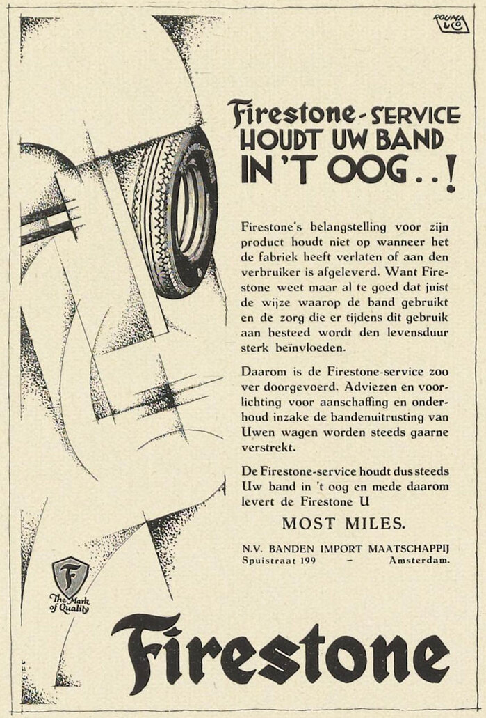
Ad reproduced in Dutch periodical De Reclame, May 1929.
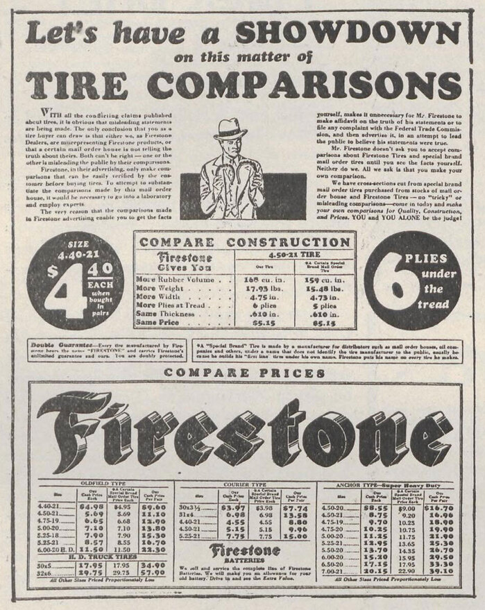
Ad reproduced in French periodical Vendre, Sep. 1931.
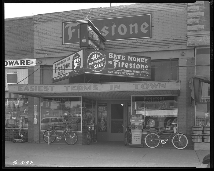
Firestone storefront, circa 1940.

Firestone Service Manual and Parts Catalog, 1949.
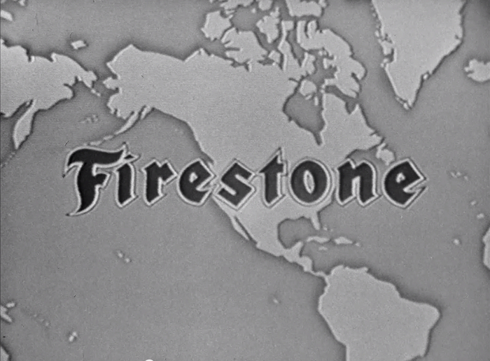
Corporate film from 1940s or ’50s.

A Firestone location in Los Angeles sports one of the many neon signs installed over the century and still in use today.

Formats
- Signs (1815)
- Branding/Identity (6664)
Topics
- Product (1592)
- Home/Interior (686)
- Automotive (273)
Designers/Agencies
Tagged with
- tires (7)
- rubber (1)
- industrial (52)
- Firestone (1)
- logos (3874)
- high profile (582)
- outlined type (1096)
- lettering derived from typeface (630)
- neon (138)
- logo evolution (60)
Artwork location
- United States (8300)
- Akron (2)
- Ohio (47)
In Sets
- 1900s (Arin Ringwald) (43)
- CGG (Becca Smith) (18)







5 Comments on “Firestone logo”
This was a fantastic little article. Thanks for the research!
I grew up in Akron, Ohio. This logo brings back a lot of memories
The Firestone logo was designed by Christian John Christiansen who worked in Akron, Ohio for Firestone.
Thank you, Robin. Added.
Did you know the phrase “where the rubber meets the road” was originally used by Firestone in its advertising?