
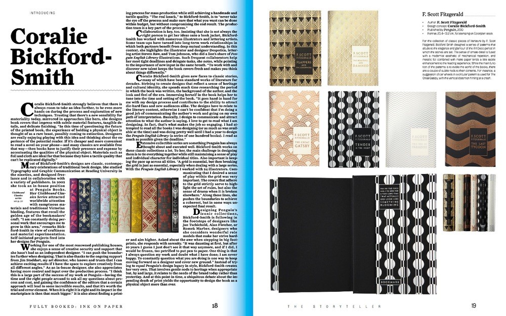
Fully Booked: Ink on Paper
Contributed by Stephen Coles on Jul 20th, 2013. Artwork published in
February 2013
.
Source: shop.gestalten.com License: All Rights Reserved.
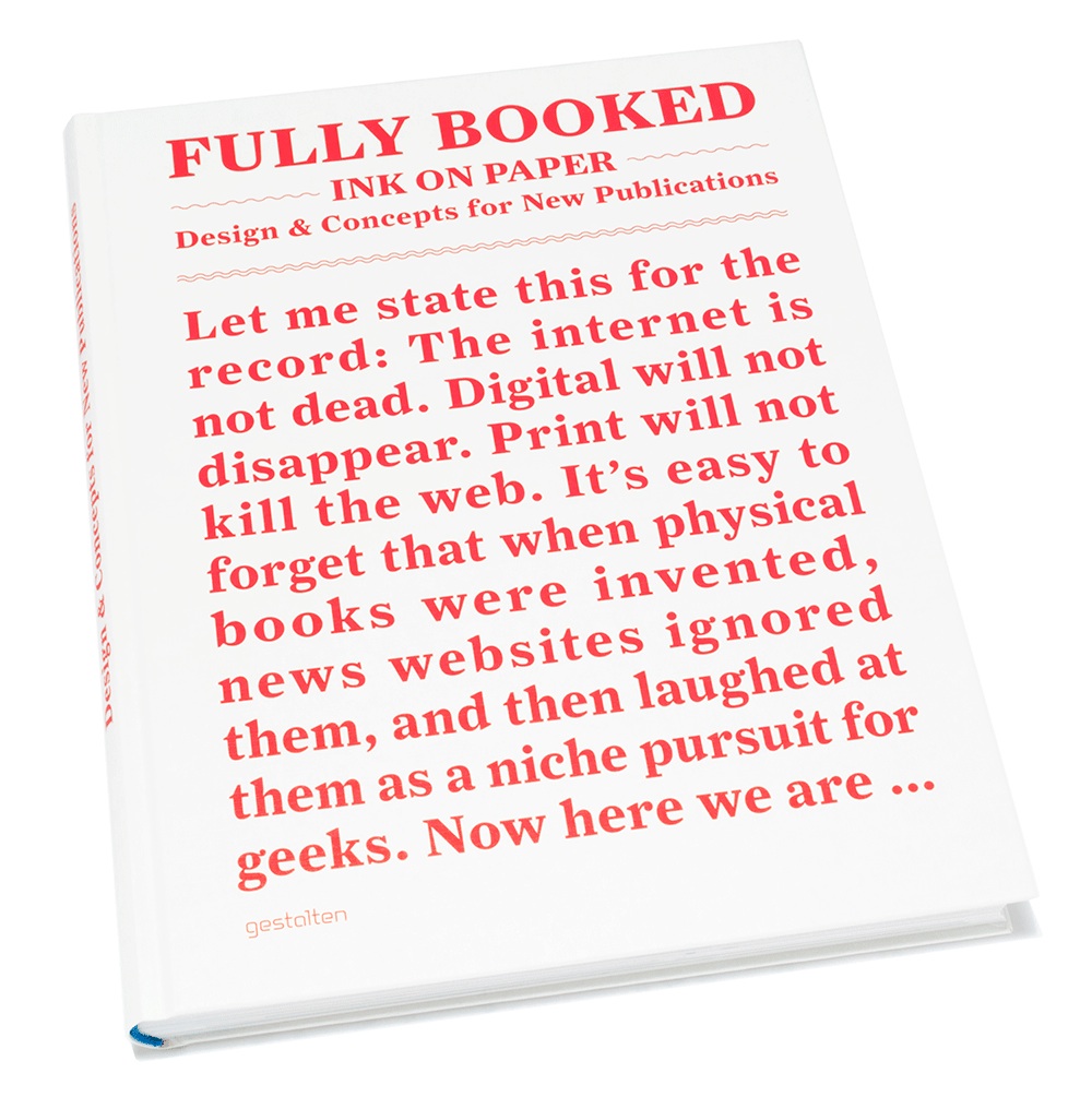
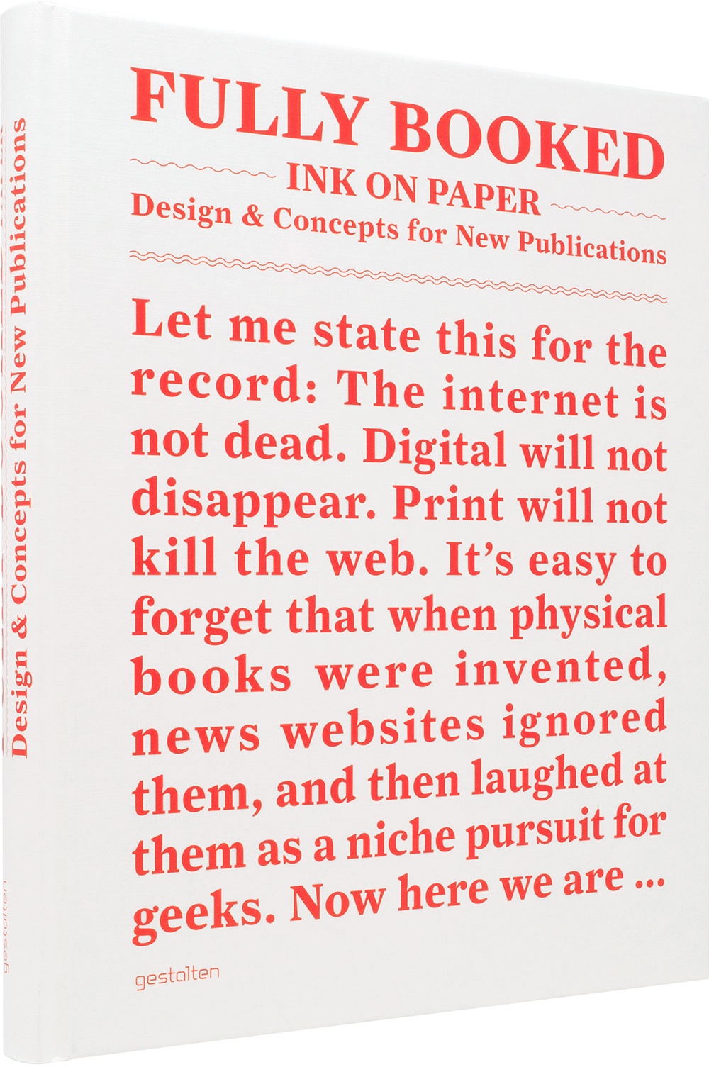
Fully Booked: Ink on Paper is a showcase of innovative books and other print products at the vanguard of a new era for printed publications.
Editors: Robert Klanten, Matthias Hübner, Andrew Losowsky
Design & editorial concept: Matthias Hübner

Source: shop.gestalten.com License: All Rights Reserved.
Exhibition poster.
Source: shop.gestalten.com License: All Rights Reserved.
Source: shop.gestalten.com License: All Rights Reserved.
Source: shop.gestalten.com License: All Rights Reserved.
Source: shop.gestalten.com License: All Rights Reserved.
Source: shop.gestalten.com License: All Rights Reserved.

Source: shop.gestalten.com License: All Rights Reserved.

Source: shop.gestalten.com License: All Rights Reserved.

")


")


 for FHNW Academy of Art and Design")


")


")

2 Comments on “Fully Booked: Ink on Paper”
Unjustifiable justification, says the Type 101 teacher. Know the rule, break the rule, some might say. But why, I wonder.
Yeah, it’s kind of a shame isn’t it? I like the idea of starting the funny, provocative intro in big type right there on the cover, but there was no reason to force the justification.
@Stephen: You’re right, no reason, but i was forced to do it anyhow…
I agree, it would have been so much better without the justification…