
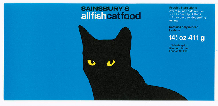
Sainsbury’s packages, 1962–1977

In 1962 Peter Dixon joined the Design Studio at the British supermarket Sainsbury as an Art Director. From 1962 until 1977 the Sainsbury Design Studio created the packaging for the supermarket’s own label. The designs developed by Peter Dixon were simple and modern, completely different from anything that had been created before for those simple products. Almost all the designs show the containing product using simple geometric representations: a yellow circle for a Lemon Pie, half orange cirlces for mandarin oranges, etc.
The supermarket name is set in Venus, and the majority of the products shown here use Helvetica as the main typeface. However, other typefaces were also used, as seen in the last three images.
This is only a small portion of all the packages that were designed during these years. A book about the work of the Sainsbury Design Studio has been published by Fuel: Own Label: Sainsbury’s Design Studio 1962–1977, written by Johnny Trunk. It provides a more in-depth view of the packaging design during that period.


")


6 Comments on “Sainsbury’s packages, 1962–1977”
These are just brilliant. What could be more eggy than Windsor Elongated?
Very much of the time. Here’s a Ministry of Health flyer extolling the benefits of orange juice from the Wellcome Trust collection. The artist is the very versatile Eileen Evans. Wellcome dates it to c. 1960. The poster and complementary leaflet make for a wonderful mixture of various oddball grotesques.
If it’s Washing Powder, it must be Compacta, right?
Yep! Added. Thanks, Bryson.