
Slaughterhouse-Five, first edition

Iconic first edition cover, designed by Paul Bacon, for Kurt Vonnegut’s seminal novel, Slaughterhouse-Five.
The serif face on the cover – Century Bold Condensed – has been revived in digital format as Century FB Bold Condensed from Font Bureau. The other narrow sans serif, however, is a bit trickier. It follows a long line of related sans serifs from various European letterpress foundries, all with different names and no digitizations worth mentioning that have the same forms as shown on this cover. The closest contemporary fonts are things like Bitstream’s Aurora and Canada Type’s Wagner Grotesk, both of which have curved diagonal strokes.
Note that the title’s second S, set on a curve, seems to have been placed upside down – perhaps intentionally, to counteract the extra white space that results from fanning letters out in this way.

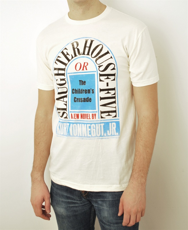
Bacon’s iconic book jacket has been made into posters and t-shirts.


 poster")


")


6 Comments on “Slaughterhouse-Five, first edition”
The Children’s Crusade is Anzeigen-Grotesk (aka Neue Aurora IX).
Right you are. Thanks, Jay!
Could you explain what you mean when you say that the second S is upside down? When you vertically flip an S, it looks like a 2 in that the direction of each opening should change: the top should open to the left (as the bottom formerly did) and the bottom should open to the right (as the top formerly did). If, instead of inverting the letter, you simply rotate the “S” 180 degrees, it should basically stay the same, which it does. What am I missing here? Thanks!
In most typefaces, the S is not rotational symmetrical: the upper half is often shorter and also narrower, so that it looks balanced.
It still does not appear to be truly upside down in the book cover. Since the poster was referring to tshirts with cover art -Maybe the person’s shirt was stretched (in that area) when the author noticed what the s appearing upside down.
Nick did refer to the book jacket – the T-shirt simply reproduces the cover art. The image below shows …
1. the first S (in SLAUGHTER), rotated 90 degrees so that the baseline is horizontal
2. the same letterform, but rotated another 180 degrees, so that it’s upside-down
3. the second S (in HOUSE), rotated –79 degrees, so that the baseline is horizontal
Nos. 2 and 3 are not identical – the latter has a bolder spine – but I hope it becomes clear that 3 is closer to 2 than to 1.